Styling and Style Selectors
This topic describes the properties you can use to customize the default look-and-feel of the RadDiagram items.
The RadDiagram exposes the following Style properties to allow you to easily customize its Shapes, Connections, Connectors as well as the default selection and grouping rectangles.
ShapeStyle - applies a Style on all RadDiagramsShapes defined in the RadDiagram. Further information about the RadDiagramShape you can find here.
ShapeStyleSelector - defines a StyleSelector, which can be used to apply different Styles on different RadDiagramShape instances inside the RadDiagram.
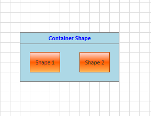
ContainerShapeStyle - applies a Style on all RadDiagramContainerShape objects defined in the RadDiagram instance. Further information about the RadDiagramContainerShape you can find here.
ConnectionStyle - applies a Style on all RadDiagramsConnections defined in the RadDiagram. Further information about the RadDiagramConnection you can find here.
ConnectionStyleSelector - defines a StyleSelector, which can be used to apply different Styles on different RadDiagramsConnection instances inside the RadDiagram.
ConnectorStyle - this property gives you the ability to apply a customized style on all RadDiagramConnectors inside the RadDiagram. Further information about the RadDiagramConnector you can find here.
GroupStyle - this property allows you to create a custom style targeting the Rectangle object that visualizes the RadDiagramItems grouping. This RadDiagram feature is described in more details here.
SelectionRectangleStyle - this property allows you to create a custom style targeting the Rectangle object that visualizes the RadDiagramItems selection. More information about this RadDiagram feature you can find here.
Customize the RadDiagramShape Style
You can apply a customized Style targeting the RadDiagramShape class through the RadDiagram.ShapeStyle property. This way you'll be able to apply one style for all shapes created inside the RadDiagram instance:
<Grid>
    <Grid.Resources>
        <Style TargetType="telerik:RadDiagramShape" x:Key="CustomShapeStyle">
            <Setter Property="Background" Value="LightGreen" />
            <Setter Property="FontWeight" Value="Bold" />
        </Style>
    </Grid.Resources>
    <telerik:RadDiagram x:Name="xDiagram" ShapeStyle="{StaticResource CustomShapeStyle}">
        <telerik:RadDiagramShape x:Name="shape1" Position="20,20" Content="Shape 1" />
        <telerik:RadDiagramShape x:Name="shape2" Position="220,20" Content="Shape 2" />
        <telerik:RadDiagramConnection Source="{Binding ElementName=shape1}"
                Target="{Binding ElementName=shape2}" />
    </telerik:RadDiagram>
</Grid>

However, if you have different shapes and/or you prefer to display shapes with different styles, then you should use the ShapeStyleSelector property. The most common use of the "selectors" is to display different kind of data based on custom logic defined inside a selector class. This is why they are usually used when implementing MVVM approach in an application. In the RadDiagram you can use the ShapeStyleSelector to apply different styles on different types of shapes when the RadDiagram.GraphSource collection is populated with business items. This tutorial can guide you through such a scenario.
Customize the RadDiagramContainerShape Style
The RadDiagram.ContainerShapeStyle property allows you to apply a custom style on all RadDiagramContainerShape objects displayed on the diagramming surface:
<Grid>
    <Grid.Resources>
        <Style TargetType="telerik:RadDiagramContainerShape" x:Key="CustomContainerShapeStyle">
            <Setter Property="Background" Value="LightBlue" />
            <Setter Property="FontWeight" Value="Bold" />
            <Setter Property="Foreground" Value="Blue" />
        </Style>
    </Grid.Resources>
    <telerik:RadDiagram x:Name="xDiagram"
            ContainerShapeStyle="{StaticResource CustomContainerShapeStyle}">
        <telerik:RadDiagramContainerShape Position="120,120" Content="Container Shape">
            <telerik:RadDiagramShape Content="Shape 1" Position="140,160"/>
            <telerik:RadDiagramShape Content="Shape 2" Position="240,160"/>
        </telerik:RadDiagramContainerShape>
    </telerik:RadDiagram>
</Grid>

Customize the RadDiagramConnection Style
You can apply a customized Style targeting the RadDiagramConnection class through the RadDiagram.ConnectionStyle property. This way you'll be able to apply one style for all connections created inside the RadDiagram instance:
<Grid>
    <Grid.Resources>
        <Style TargetType="telerik:RadDiagramConnection" x:Key="CustomConnectionStyle">
            <Setter Property="Stroke" Value="Red" />
            <Setter Property="StrokeThickness" Value="2" />
            <Setter Property="StrokeDashArray" Value="2 2" />
        </Style>
    </Grid.Resources>
    <telerik:RadDiagram x:Name="xDiagram"
            ConnectionStyle="{StaticResource CustomConnectionStyle}">
        <telerik:RadDiagramShape x:Name="shape1" Position="20,20" Content="Shape 1" />
        <telerik:RadDiagramShape x:Name="shape2" Position="220,20" Content="Shape 2" />
        <telerik:RadDiagramConnection Source="{Binding ElementName=shape1}"
                Target="{Binding ElementName=shape2}" />
    </telerik:RadDiagram>
</Grid>

However, if you have different connections and/or you prefer to display connections with different styles, then you should use the ConnectionStyleSelector property. This property is very handy when creating an MVVM diagramming solution where you'd like to populate the RadDiagram with multiple types of connections and visualize each type differently. This tutorial can guide through the implementation of such an example.
Customize the RadDiagramConnector Style
You can also apply a customized Style targeting the RadDiagramConnector class through the RadDiagram.ConnectorStyle property. This way you'll be able to apply one style for all connectors displayed inside a RadDiagram instance:
<Grid>
    <Grid.Resources>
        <Style TargetType="telerik:RadDiagramConnector" x:Key="CustomConnectorStyle">
            <Setter Property="Background" Value="Green" />
        </Style>
    </Grid.Resources>
    <telerik:RadDiagram x:Name="xDiagram" ConnectorStyle="{StaticResource CustomConnectorStyle}">
        <telerik:RadDiagramShape x:Name="shape1" Position="20,20" Content="Shape 1" />
        <telerik:RadDiagramShape x:Name="shape2" Position="220,20" Content="Shape 2" />
        <telerik:RadDiagramConnection Source="{Binding ElementName=shape1}"
                Target="{Binding ElementName=shape2}" />
        <telerik:RadDiagramConnection Source="{Binding ElementName=shape2}"
                EndPoint="360,40" TargetCapType="Arrow1Filled"/>
    </telerik:RadDiagram>
</Grid>

Customize the RadDiagram Grouping Rectangle
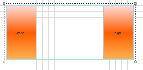
Grouping, in the context of the Telerik Diagramming Framework, is a way of organizing shapes and connections in logical groups. Groups are non-visual, logical collections of shapes and/or connections and/or other groups. A grouping is visualized through a blue grouping Rectangle object:

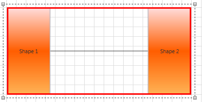
And if you need to customize the default style settings of this rectangle, you can use the GroupStyle property. In the following example, the Stroke and StrokeThickness properties of the rectangle are modified to create a different look of the grouping feature:
<Grid>
    <Grid.RowDefinitions>
        <RowDefinition Height="Auto" />
        <RowDefinition Height="*" />
    </Grid.RowDefinitions>
    <Grid.Resources>
        <Style TargetType="Rectangle" x:Key="CustomGroupStyle">
            <Setter Property="StrokeThickness" Value="3" />
            <Setter Property="Stroke" Value="Red" />
        </Style>
    </Grid.Resources>
    <telerik:RadButton Content="Group" Click="Group" />
    <telerik:RadDiagram Grid.Row="1" x:Name="xDiagram"
            GroupStyle="{StaticResource CustomGroupStyle}">
        <telerik:RadDiagramShape x:Name="shape1" Position="20,20" Content="Shape 1" />
        <telerik:RadDiagramShape x:Name="shape2" Position="220,20" Content="Shape 2" />
        <telerik:RadDiagramConnection Source="{Binding ElementName=shape1}"
                Target="{Binding ElementName=shape2}" />
    </telerik:RadDiagram>
</Grid>

Customize the RadDiagram Selection Rectangle
The RadDiagram gives you the ability to select one or multiple RadDiagramItems. The default representation of this selection is a single Rectangle object:

If you need to customize the style settings of the selection rectangle, you can use the SelectionRectangleStyle property. In the following example, you can see how to change the Stroke property of the rectangle to red:
<Grid>
    <Grid.RowDefinitions>
        <RowDefinition Height="Auto" />
        <RowDefinition Height="*" />
    </Grid.RowDefinitions>
    <Grid.Resources>
        <Style TargetType="Rectangle" x:Key="CustomSelectionRectangleStyle">
            <Setter Property="Stroke" Value="Red" />
        </Style>
    </Grid.Resources>
    <telerik:RadButton Content="Group" Click="Group" />
    <telerik:RadDiagram Grid.Row="1" x:Name="xDiagram" SelectionMode="Multiple"
            SelectionRectangleStyle="{StaticResource CustomSelectionRectangleStyle}">
        <telerik:RadDiagramShape x:Name="shape1" Position="20,20" Content="Shape 1" />
        <telerik:RadDiagramShape x:Name="shape2" Position="220,20" Content="Shape 2" />
        <telerik:RadDiagramConnection Source="{Binding ElementName=shape1}"
                Target="{Binding ElementName=shape2}" />
    </telerik:RadDiagram>
</Grid>
