Responsive, Adaptive and Elastic Capabilities
This article explains the responsive design capabilities RadSlider offers. The Lightweight RenderMode of RadSlider supports responsive design since Q2 2014 and fluid design since Q3 2014.
Generally, responsive design means that the page and its content are able to adapt to different screen resolutions without deteriorating the user experience. This often includes changing the font size and having dimensions set in percent.
Elastic Design with RadSlider
The Lightweight RenderMode of the slider supports changing the font size without breaking the control's appearance - if the new size is larger than the original, the elements in the control will simply increase their size as well to accommodate the text. This fluid layout is achieved by using em units for setting dimensions and paddings in the control, instead of px because em units are tied to the font size.This allows dimensions and sizes to scale with the font size.
As of 2016 Q1 SP1 RadSlider takes the font-size of the page automatically. If the developer does not set it explicitly (Example 1), this is up to the client's browser and a common default value is 16px.
Example 1: Setting default font for the page with the default value for the Telerik controls.
body {
    font-size: 20px;
    font-family: "Segoe UI", Arial, Sans-serif;
}
The following sample shows how to increase the font size of a slider and the effect can be seen in comparison in Figure 1.
Figure 1: Comparison between appearance of a slider with regular font size and with increased font size.
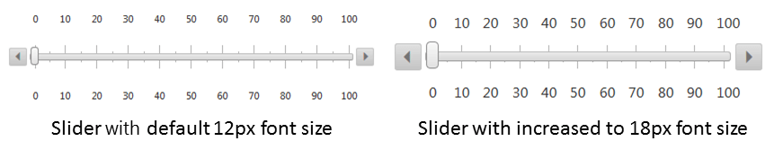
Example 2: Slider with increased font size to 18px.
<style type="text/css">
    div.RadSlider {
        font-size: 18px;
    }
</style>
<telerik:RadSlider ID="RadSlider1" runat="server" RenderMode="Lightweight" Width="400px" Height="100px"
    ItemType="Tick" SmallChange="5" LargeChange="10">
</telerik:RadSlider>
Fluid Design with RadSlider
RadSlider supports setting its Width property in percentage only when Lightweight render mode is enabled as of the Q3 2014 release of UI for ASP.NET AJAX.This means that the slider changes its width according to the current screen resolution when you set its Width property in percentage as shown in Example 2. The actual width of the slider is calculated from its parent element, so if you place the slider from Example 2 in an HTML div element that is 300px wide, the width of the slider should also be 300px.
Example 1: Slider with 100% width.
<telerik:RadSlider ID="RadSlider1" runat="server" Width="100%" RenderMode="Lightweight">
</telerik:RadSlider>
There are controls and elements that allow you to resize them by dragging their borders, such as the RadDock and RadWindow Telerik controls, or HTML elements with drag resizing, enabled via client scripts. If you place a fluid slider in such a container, you need to get the client-side object of the slider and call its repaint() method when you change the size of the container. Example 2 shows how to achieve this when you have placed a slider in a RadDock control.
If you place a slider in a RadSplitter control, you will not have to call its repaint() method, because the splitter does this automatically.
Example 2: Slider with 100% width in a resizable RadDock.
<script type="text/javascript">
    var slider = null;
    function OnSliderLoad(sender, eventArgs) {
        slider = sender;
    }

    function OnDockResizeEnd(sender, eventArgs) {
        if (slider != null) slider.repaint();
    }
</script>
<telerik:RadDock runat="server" ID="RadDock1" Resizable="true" OnClientResizeEnd="OnDockResizeEnd">
    <ContentTemplate>
        <telerik:RadSlider ID="RadSlider1" runat="server" Width="100%" RenderMode="Lightweight" OnClientLoad="OnSliderLoad">
        </telerik:RadSlider>
    </ContentTemplate>
</telerik:RadDock>