Layout of Root Items
There are a number of ways you can customize the look & feel of your RadMenu control:
Layout
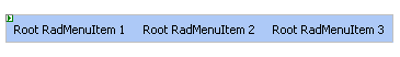
Use the Flow property to control the basic orientation of the menu. Flow can be Horizontal (the default):
or Vertical:

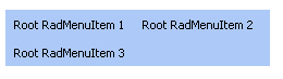
Use the Height and Width properties to limit the dimensions of the menu. If the Width of a horizontal menu is too small to display all of its root items, the menu automatically creates additional rows:
Use the GroupSettings property of a RadMenuItem object to control the layout of its child items.
Add separators to a list of items by creating an item with the IsSeparator property set to True.
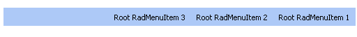
Use the dir="rtl" attribute to give the menu a right-to-left orientation:
Look and Feel
To change the overall look and feel of the combobox, set the Skin property.
To change the way the child menu items appear or disappear, use Animations.
To change the look of an individual item in the menu, including reflecting the item's state, use a CSS class property.
Use the item properties to add images to items.
Use templates to add controls to menu items.
Use RepeatColumns property to enable the multi-column menu.