Column Chart
The Column chart, as part of the ASP NET AJAX Chart, shows data as vertical bars whose heights vary according to their value. It can be useful for showing a comparison between several sets of data (e.g., snapshots of data across different points in time). Column charts are very similar to Bar charts, but the orientation of the bars is vertical instead of horizontal. This help article describes how to set some properties in a Column chart and Example 1 (near the end of this article) shows the code used to create Figure 1.
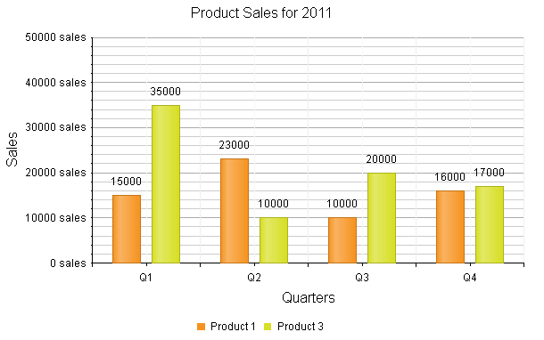
Figure 1: A basic Column chart showing product sales numbers by quarters.
You can customize a Column chart in several ways:
The color of each series is controlled via the BackgroundColor property of the ColumnSeries > Appearance > FillStyle inner tag.
The name that is shown in the legend is set via the
Nameproperty of the series. You can hide the series from the legend either by omitting it, or by setting theVisibleInLegendproperty tofalse.The height of a column is controlled by its Y property of the CategorySeriesItem.
Each item can have a label and a tooltip which follow the common pattern defined in the DataFormatString property of the LabelsAppearance and TooltipsAppearance sections of the series. The format string uses the Y of the item. You can also load custom text from data source fields in labels and tooltips by using the composite ClientTemplate property.
-
The axes are also fully customizable — they automatically adjust their scale to accommodate the data that comes in and for finer tuning,there are numerous properties that can change each aspect:
Directly in the axis tag you can use its properties to control color, major and minor tick types and sizes,minimal and maximal values for the y-axis (plus a step size), whereas the x-axis requires a set of items to match the number of SeriesItems the series have. This is also the place where the crossing value with the other axis can be set (the index of an item for an item axis) and whether the axis will be reversed.
The inner tags of the axis tag can control the major and minor grid lines in terms of color and size and the labels can have a DataFormatString, position and visibility set through each inner tag's properties.
Setting the Stacked property of the first series stacks them all next to each other. Series that will be stacked in separate clusters must have the same cluster name set in their GroupName property.
The title, background colors and legend are controlled via the inner properties of the RadHtmlChart control and are common for all charts.You can find more information in the Server-side Programming Basic Configuration and in the Element structure articles.
Example 1 demonstrates how to configure the Column chart shown in Figure 1.
Not all properties are necessary. The RadHtmlChart will match the axes to the values if you do not declare explicit values, steps and tick properties (although the Items for axes that need them are necessary).
Example 1: Configuring a Column chart to show product sales data.
<telerik:RadHtmlChart runat="server" ID="ColumnChart1" Transitions="true">
    <PlotArea>
        <Series>
            <telerik:ColumnSeries Name="Product 1">
                <TooltipsAppearance BackgroundColor="Orange" DataFormatString="{0} sales" />
                <SeriesItems>
                    <telerik:CategorySeriesItem Y="15000" />
                    <telerik:CategorySeriesItem Y="23000" />
                    <telerik:CategorySeriesItem Y="10000" />
                    <telerik:CategorySeriesItem Y="16000" />
                </SeriesItems>
            </telerik:ColumnSeries>
            <telerik:ColumnSeries Name="Product 3">
                <TooltipsAppearance BackgroundColor="Orange" DataFormatString="{0} sales" />
                <SeriesItems>
                    <telerik:CategorySeriesItem Y="35000" />
                    <telerik:CategorySeriesItem Y="10000" />
                    <telerik:CategorySeriesItem Y="20000" />
                    <telerik:CategorySeriesItem Y="17000" />
                </SeriesItems>
            </telerik:ColumnSeries>
        </Series>
        <XAxis AxisCrossingValue="0" Color="Black" MajorTickType="Outside" MinorTickType="Outside"
            Reversed="false">
            <Items>
                <telerik:AxisItem LabelText="1" />
                <telerik:AxisItem LabelText="2" />
                <telerik:AxisItem LabelText="3" />
                <telerik:AxisItem LabelText="4" />
            </Items>
            <LabelsAppearance DataFormatString="Q{0}" RotationAngle="0" />
            <MajorGridLines Color="#EFEFEF" Width="1" />
            <MinorGridLines Color="#F7F7F7" Width="1" />
            <TitleAppearance Position="Center" RotationAngle="0" Text="Quarters" />
        </XAxis>
        <YAxis AxisCrossingValue="0" Color="Black" MajorTickSize="1" MajorTickType="Outside"
            MaxValue="50000" MinorTickSize="1" MinorTickType="Outside" MinValue="0" Reversed="false"
            Step="10000">
            <LabelsAppearance DataFormatString="{0} sales" RotationAngle="0" />
            <TitleAppearance Position="Center" RotationAngle="0" Text="Sales" />
        </YAxis>
    </PlotArea>
    <ChartTitle Text="Product Sales for 2011">
    </ChartTitle>
    <Legend>
        <Appearance Position="Bottom" />
    </Legend>
</telerik:RadHtmlChart>