Command Item Template
This article explains how to customize the Command Item and Buttons of RadGrid. The following sections point to specific scenarios:
Handling Custom Commands:Delete Command (CommandItem Example)
How to Customize the Add New Record/Refresh Text in the CommandItem Area
Setting Preferences for Controls Inside the CommandItemTemplate at Runtime
Display Different Controls in a CommandItemTemplate with CommandItemDisplay = "TopAndBottom"
CommandItem Overview
In order to show the command item, you should set the CommandItemDisplay property of the GridTableView. The CommandItemDisplay property can take four values: None, Top, Bottom and TopAndBottom, corresponding to the place where it will appear. You can customize the command item content using the template of a GridTableView.CommandItemTemplate as shown in Example 1.
Custom CommandItemTemplate
You can define our own controls that will perform the same actions as the built-in ones.
Example 1: Shows how custom commands could be implemented via the CommandItemTemplate.
<CommandItemTemplate>
    Custom command item template
    <asp:LinkButton Style="vertical-align: bottom" ID="btnEditSelected" runat="server"
        CommandName="EditSelected" Visible='<%# RadGrid1.EditIndexes.Count == 0 %>'><img style="border:0px" alt="" src="../../DataEditing/Img/Edit.gif" /> Edit Selected Customers</asp:LinkButton>
    <asp:LinkButton ID="btnUpdateEdited" runat="server" CommandName="UpdateEdited" Visible='<%# RadGrid1.EditIndexes.Count > 0 %>'><img style="border:0px" alt="" src="../../DataEditing/Img/Update.gif" /> Update Customers</asp:LinkButton>
    <asp:LinkButton ID="btnCancel" runat="server" CommandName="CancelAll" Visible='<%# RadGrid1.EditIndexes.Count > 0 || RadGrid1.MasterTableView.IsItemInserted %>'><img style="border:0px" alt="" src="../../DataEditing/Img/Cancel.gif" /> Cancel editing</asp:LinkButton>
    <asp:LinkButton ID="LinkButton3" runat="server" CommandName="InitInsert" Visible='<%# !RadGrid1.MasterTableView.IsItemInserted %>'><img style="border:0px" alt="" src="../../DataEditing/Img/AddRecord.gif" /> Add new Customer</asp:LinkButton>
    <asp:LinkButton ID="LinkButton4" runat="server" CommandName="PerformInsert" Visible='<%# RadGrid1.MasterTableView.IsItemInserted %>'><img style="border:0px" alt="" src="../../DataEditing/Img/Insert.gif" /> Add this Customer</asp:LinkButton>
    <asp:LinkButton ID="LinkButton5" OnClientClick="javascript:return confirm('Delete all selected customers?')"
        runat="server" CommandName="DeleteSelected"><img style="border:0px" alt="" src="../../DataEditing/Img/Delete.gif" /> Delete Selected Customers</asp:LinkButton>
    <asp:LinkButton ID="LinkButton6" runat="server" CommandName="Re bindGrid"><img style="border:0px" alt="" src="../../DataEditing/Img/Refresh.gif" /> Refresh customer list</asp:LinkButton>
    <br />
</CommandItemTemplate>
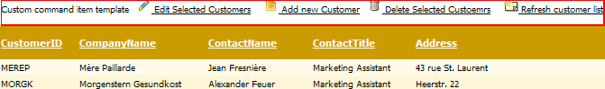
Running the code from Example 1 will generate Figure 1.
Figure 1: Show the result of the custom commands implementation from Example 1.
In the CommandItemTemplate you can add any type of buttons that raise a command event and Telerik RadGrid will fire the ItemCommandEvent (see below) on the server when this button is clicked.
<asp:LinkButton ID="LinkButton2" runat="server" CommandName="InitInsert">Add New</asp:LinkButton>
When a user clicks the link in the previous code snippet, it will automatically set RadGrid in "Insert" mode because the "InitInsert" command is processed internally by RadGrid. You can also fetch the command in the ItemCommandEvent and check the value of the event argument CommandName for the value of "InitInsert" (corresponding to the value of the static member RadGrid.InitInsertCommandName).
Handling Custom Commands:Delete Command (CommandItem Example)
Generally, you can handle any command using the ItemCommandEvent. Example 2 shows how to handle a custom command "DeleteSelected".It will delete all selected Items. In the ASPX file, we set the CommandName property to "DeleteSelected". Then in the ItemCommandEventhandler, we check if the CommandName was "DeleteSelected" and call the PerformDelete method, which will delete all selected items.Note that you will need to set AllowAutomaticDeletes property to true.
Example 2: Shows how to implement a custom "DeleteSelected" command.
<CommandItemTemplate>
    <asp:LinkButton ID="LinkButton7" OnClientClick="javascript:return confirm('Delete all selected customers?')"
        runat="server" CommandName="DeleteSelected"><img style="border:0px" alt="" src="../../DataEditing/Img/Delete.gif" /> Delete Selected Custoemrs</asp:LinkButton>
</CommandItemTemplate>
protected void RadGrid1_ItemCommand(object source, Telerik.Web.UI.GridCommandEventArgs e)
{
  if (e.CommandName == "DeleteSelected")
    {
      if (RadGrid1.SelectedIndexes.Count == 0)
      {
        return;
      }

      foreach (GridDataItem item in RadGrid1.SelectedItems)
      {
        e.Item.OwnerTableView.PerformDelete(item, true);
      }

      e.Item.OwnerTableView.Rebind();
      return;
    }
}
Protected Sub RadGrid1_ItemCommand(ByVal source As Object, ByVal e As Telerik.Web.UI.GridCommandEventArgs) Handles RadGrid1.ItemCommand
    If e.CommandName = "DeleteSelected" Then

        If RadGrid1.SelectedIndexes.Count = 0 Then
            Return
        End If

        For Each item As GridDataItem In RadGrid1.SelectedItems
            e.Item.OwnerTableView.PerformDelete(item, True)
        Next
        e.Item.OwnerTableView.Rebind()
        Return
    End If
End Sub
How to Customize the Add New Record/Refresh Text in the CommandItem Area
You can use the CommandItemTemplate to customize the “Add new item/refresh” text in the CommandItem Area as shown in Example 3.
Example 3: Shows how to customize the text of the command buttons.
<telerik:RadGrid RenderMode="Lightweight" ID="RadGrid1" runat="server">
  <MasterTableView CommandItemDisplay="Top">
      <CommandItemTemplate>
          <asp:Button ID="Button1" Text="Add new item" runat="server" CommandName="InitInsert">
          </asp:Button>
      </CommandItemTemplate>
  </MasterTableView>
</telerik:RadGrid>
If you have two buttons, you can place the buttons in a HTML table embedded inside the CommandItemTemplate. Example 4 shows a sample structure:
Example 4: Shows how to organize the command buttons in an HTML table element.
<CommandItemTemplate>
    <table>
        <tr>
            <td width="30%">
                <asp:LinkButton ID="LinkButton8" Text="Add new item" CommandName="InitInsert" runat="server"></asp:LinkButton>
            </td>
            <td width="40%">
            </td>
            <td width="30%">
                <asp:LinkButton ID="LinkButton9" Text="Refresh data" CommandName="RebindGrid" runat="server"></asp:LinkButton>
            </td>
        </tr>
    </table>
</CommandItemTemplate>
Setting Preferences for Controls Inside the CommandItemTemplate at Runtime
There are cases in which you may want to access the controls inside your CommandItemTemplate from the code-behind and dynamicallychange their preferences (for example, with some particular restrictions/certain conditions). Here are the steps you can perform to reference controls inside the CommandItemTemplate programmatically:
Subscribe to the ItemCreated event of RadGrid.
Check whether the currently bound item is GridCommandItem.
Locate the respective control using the FindControl method of the command item.
Change its attributes according to your needs.
Example 5 shows how to change the Text and CommandName properties for a LinkButton insidethe CommandItemTemplate object.
Example 5: Changing properties of a LinkButton in a CommandItemTemplate.
<telerik:RadGrid RenderMode="Lightweight" ID="RadGrid1" DataSourceID="SqlDataSource1" runat="server" OnItemCreated="RadGrid1_ItemCreated">
  <MasterTableView Width="100%" CssClass="MasterTable" DataSourceID="SqlDataSource1"
    CommandItemDisplay="Top">
    <CommandItemTemplate>
      <asp:LinkButton ID="LinkButton1" runat="server">Default Text</asp:LinkButton>
    </CommandItemTemplate>
  </MasterTableView>
</telerik:RadGrid>
<asp:SqlDataSource ID="SqlDataSource1" runat="server" ConnectionString="<%$ ConnectionStrings:NorthwindConnectionString %>"
   SelectCommand="SELECT * FROM [Customers]">
</asp:SqlDataSource>
protected void RadGrid1_ItemCreated(object sender, GridItemEventArgs e)
{
         if (e.Item is GridCommandItem)
        {
            GridCommandItem commandItem = e.Item as GridCommandItem;
            LinkButton button = commandItem.FindControl("LinkButton1")as LinkButton;

            button.CommandName = "MyCommandName";
            button.Text = "Perform custom operation";
        }
}
Protected Sub RadGrid1_ItemCreated(ByVal sender As Object, ByVal e As GridItemEventArgs)

    If TypeOf e.Item Is GridCommandItem Then

        Dim commandItem As GridCommandItem = CType(e.Item, GridCommandItem)
        Dim button As LinkButton = CType(commandItem.FindControl("LinkButton1"), LinkButton)

        button.CommandName = "MyCommandName"
        button.Text = "Perform custom operation"
    End If
End Sub
Display Different Controls in a CommandItemTemplate with CommandItemDisplay = "TopAndBottom"
There are cases in which you may want to display different controls inside the top/bottom command item when choosing the CommandItemDisplay="TopAndBottom" option.You can do this by switching the visibility of the controls in ItemCreated. Note that you can determine whether the command item will be displayed in theheader/footer of the grid by checking the NamingContainer for the GridCommandItem object (it will be GridTHeadfor the header and GridTFoot for the footer). Example 6 illustrates a sample implementation.
Example 6: Showing and hiding command controls dynamically.
<telerik:RadGrid RenderMode="Lightweight" ID="RadGrid2" runat="server" AllowSorting="true" AllowMultiRowSelection="true"
    AllowMultiRowEdit="true">
    <MasterTableView CommandItemDisplay="TopAndBottom">
        <CommandItemTemplate>
            <table>
                <tr>
                    <td width="30%">
                        <asp:LinkButton ID="btnAdd" Text="Add new item" CommandName="InitInsert" runat="server"></asp:LinkButton>
                        <asp:LinkButton ID="btnEdit" Text="Edit selected" CommandName="EditSelected" runat="server"></asp:LinkButton>
                    </td>
                    <td width="40%">
                    </td>
                    <td width="30%">
                        <asp:LinkButton ID="btnRefresh" Text="Refresh data" CommandName="RebindGrid" runat="server"></asp:LinkButton>
                        <asp:LinkButton ID="btnUpdate" Text="Update edited" CommandName="UpdateEdited" runat="server"></asp:LinkButton>
                    </td>
                </tr>
            </table>
        </CommandItemTemplate>
    </MasterTableView>
    <ClientSettings>
        <Selecting AllowRowSelect="true" />
    </ClientSettings>
</telerik:RadGrid>
Private Sub RadGrid1_ItemCreated(ByVal sender As Object, ByVal e As Telerik.Web.UI.GridItemEventArgs) Handles RadGrid1.ItemCreated
    If (TypeOf e.Item Is GridCommandItem) Then
        Dim commandItem As GridCommandItem = CType(e.Item, GridCommandItem)

        If (TypeOf commandItem.NamingContainer Is GridTHead) Then
            commandItem.FindControl("btnEdit").Visible = False
            commandItem.FindControl("btnUpdate").Visible = False

        ElseIf (TypeOf commandItem.NamingContainer Is GridTFoot) Then

            commandItem.FindControl("btnAdd").Visible = False
            commandItem.FindControl("btnRefresh").Visible = False
        End If
    End If
End Sub
protected void RadGrid1_ItemCreated(object sender, Telerik.Web.UI.GridItemEventArgs e)
{
    if (e.Item is GridCommandItem)
    {
        GridCommandItem commandItem = (GridCommandItem)e.Item;

    if (commandItem.NamingContainer is GridTHead)
    {
       commandItem.FindControl("btnEdit").Visible = false;
       commandItem.FindControl("btnUpdate").Visible = false;
    }
    else if (commandItem.NamingContainer is GridTFoot)
    {
       commandItem.FindControl("btnAdd").Visible = false;
       commandItem.FindControl("btnRefresh").Visible = false;
    }
    }
}
Define CommandItemTemplate Programmatically
If you want to define a CommandItemTemplate programmatically, you need to design your custom class (holding the set of controls forthe CommandItemTemplate) which implements theITemplate interface. Then you can assign an instance of this classto the CommandItemTemplate of the corresponding GridTableView.
Example 7 shows how to embed LinkButtons (for add record and refresh) in the CommandItemTemplate of the MasterTableView at runtime. It also demonstrates programmatic creation of a custom class that defines the CommandItemTemplate.
protected RadGrid RadGrid1;

private class MyCommandItemTemplate : ITemplate
{

    protected LinkButton addButton;

    protected LinkButton refreshButton;

    public MyCommandItemTemplate()
    {
    }

    public void InstantiateIn(System.Web.UI.Control container)
    {
        addButton = new LinkButton();
        addButton.ID = "addButton";
        addButton.Text = "Add record";
        addButton.CommandName = "InitInsert";

        refreshButton = new LinkButton();
        refreshButton.ID = "refreshButton";
        refreshButton.Text = "Refresh grid";
        refreshButton.CommandName = "RebindGrid";

        container.Controls.Add(addButton);
        container.Controls.Add( new LiteralControl("      "));
        container.Controls.Add(refreshButton);
    }
}

    protected override void OnInit(EventArgs e)
    {
        InitializeComponent;
        DefineGridStructure();
        base.OnInit(e);
    }

    private void DefineGridStructure()
    {
        this.RadGrid1 = new RadGrid();
        this.RadGrid1.AutoGenerateColumns = false;
        this.RadGrid1.MasterTableView.CommandItemDisplay = GridCommandItemDisplay.Top;

        RadGrid1.NeedDataSource += new System.EventHandler(this.RadGrid1_NeedDataSource);

        RadGrid1.MasterTableView.CommandItemTemplate = new MyCommandItemTemplate();
         // runtime column definitions
    }
Protected WithEvents RadGrid1 As RadGrid

Private Class MyCommandItemTemplate
    Implements ITemplate

    Protected addButton As LinkButton
    Protected refreshButton As LinkButton

    Public Sub New()
        MyBase.New()

    End Sub

    Public Sub InstantiateIn(ByVal container As System.Web.UI.Control) Implements System.Web.UI.ITemplate.InstantiateIn
        addButton = New LinkButton
        addButton.ID = "addButton"
        addButton.Text = "Add record"
        addButton.CommandName = "InitInsert"

        refreshButton = New LinkButton
        refreshButton.ID = "refreshButton"
        refreshButton.Text = "Refresh grid"
        refreshButton.CommandName = "RebindGrid"

        container.Controls.Add(addButton)
        container.Controls.Add(New LiteralControl("      "))
        container.Controls.Add(refreshButton)
    End Sub
End Class

Protected Overrides Sub OnInit(ByVal e As EventArgs)
    InitializeComponent()
    DefineGridStructure()
    MyBase.OnInit(e)
End Sub

Private Sub DefineGridStructure()
    Me.RadGrid1 = New RadGrid
    Me.RadGrid1.AutoGenerateColumns = False
    Me.RadGrid1.MasterTableView.CommandItemDisplay = GridCommandItemDisplay.Top

    AddHandler RadGrid1.NeedDataSource, AddressOf Me.RadGrid1_NeedDataSource

    RadGrid1.MasterTableView.CommandItemTemplate = New MyCommandItemTemplate()
    'runtime column definitions
End Sub
You can find detailed information about how to create templates programmatically in this MSDN article.
Custom CommandItemTemplate for Batch Edit Mode
The Batch Edit Mode works on the client, so the command buttons use JavaScript—the Client-side API the BatchEditingManager offers.
To customize the CommandItemTemplate (Example 8), you need to use the provided API (Example 9) and attach it to the HTML elements you place there.
Example 8: Custom Batch Edit Command buttons
<telerik:RadGrid RenderMode="Lightweight" ID="RadGrid1" GridLines="None" runat="server" AllowAutomaticDeletes="True"
                 AllowAutomaticInserts="True" PageSize="10" AllowAutomaticUpdates="True" AllowPaging="True"
                 AutoGenerateColumns="False" DataSourceID="SqlDataSource1">
    <MasterTableView CommandItemDisplay="TopAndBottom" DataKeyNames="ProductID"
                     DataSourceID="SqlDataSource1" HorizontalAlign="NotSet" EditMode="Batch" AutoGenerateColumns="False">
        <CommandItemTemplate>
            <telerik:RadPushButton runat="server" ID="AddNewRecordButton" OnClientClicked="addRecordToGrid" AutoPostBack="false" Text="Add new record" ToolTip="Add new record">
                <Icon CssClass="rgAddIcon" />
            </telerik:RadPushButton>
            <telerik:RadPushButton runat="server" ID="SaveChangesButton" OnClientClicked="saveChangesToGrid" AutoPostBack="false" Text="Save changes" ToolTip="Save changes">
                <Icon CssClass="rgSaveIcon" />
            </telerik:RadPushButton>
            <telerik:RadPushButton runat="server" ID="CancelChangesButton" OnClientClicked="cancelChangesToGrid" AutoPostBack="false" Text="Cancel changes" ToolTip="Cancel changes">
                <Icon CssClass="rgCancelIcon" />
            </telerik:RadPushButton>
            <telerik:RadPushButton runat="server" ID="RefreshButton" OnClientClicked="refreshGrid" AutoPostBack="false" Text="Refresh" ToolTip="Refresh">
                <Icon CssClass="rgRefreshIcon" />
            </telerik:RadPushButton>
        </CommandItemTemplate>
        <BatchEditingSettings EditType="Cell" />
    </MasterTableView>
</telerik:RadGrid>
Example 9: JavaScript code that provides functionality to the custom command buttons
function addRecordToGrid() {
    var grid = $find('<%=RadGrid1.ClientID%>');
    grid.get_batchEditingManager().addNewRecord(grid.get_masterTableView());
    return false;
}
function saveChangesToGrid() {
    var grid = $find('<%=RadGrid1.ClientID%>');
    grid.get_batchEditingManager().saveChanges(grid.get_masterTableView());
    return false;
}
function cancelChangesToGrid() {
    var grid = $find('<%=RadGrid1.ClientID%>');
    grid.get_batchEditingManager().cancelChanges(grid.get_masterTableView());
    return false;
}
function refreshGrid() {
    var grid = $find('<%=RadGrid1.ClientID%>');
    grid.get_masterTableView().rebind();
}
The markup in Example 8 emulates the actual HTML RadGrid outputs by default and uses the built-in icon classes to provide the same font icons RadGrid uses. You can use them with Telerik buttons or with your own elements prepared for font icons. Alternatively, you can add your own images, text and layout.