Phone Layout End User Experience
This article shows some basic examples how the end user can interact with the phone-optimized RadEditor control:
Start Editing
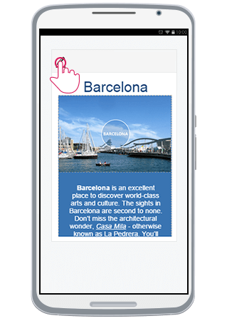
Initially, RadEditor is loaded in Preview mode (Figure 1). In order to start editing the content (full screen mode), the user should tap either the content, or the Edit Content button ( ).
).
Figure 1: Phone Layout in Preview mode and how to start editing
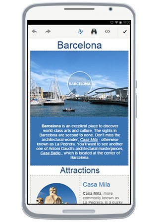
In full screen mode, user can edit the text and operate with the header tools.
Figure 2: Full screen mode where you can edit the content
Using the Tools
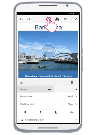
The ToolZone can be shown by pressing the Toggle ToolZone button from the Header Tools ( ). Using the tools will affect the current selection.
Figure 3: Toggling the ToolZone.
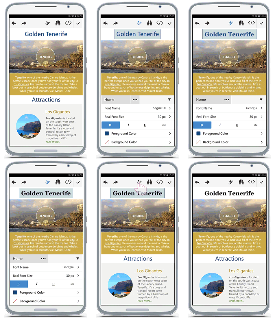
The animation in Figure 4 shows how a user would be able to use the tools and edit or format the content.
Figure 4: User experience with content editing.
Using Tabs and Contextual Tabs
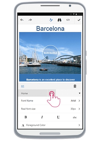
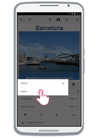
To change the current tab, the user should press the Tab Chooser button ( ). As shown in Figure 5, a pop-up with all available tabs will be shown. Tapping on one of them, will load the corresponding tools from this tab into the ToolZone.
Figure 5: Changing the Tab.
Additionally, tabs can be configured to be shown only when a certain element is selected. This can be controlled via the Context property of the EditorToolGroup items. You can read more about that in the Toolbar Configuration article.
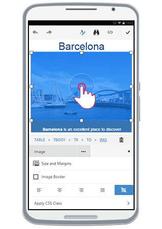
In Figure 6, you can see how selecting an <img> element in the content and opening the ToolZone, automatically shows the built-in Image tab.
Figure 6: Working with contextual tabs.
Toggling HTML Mode
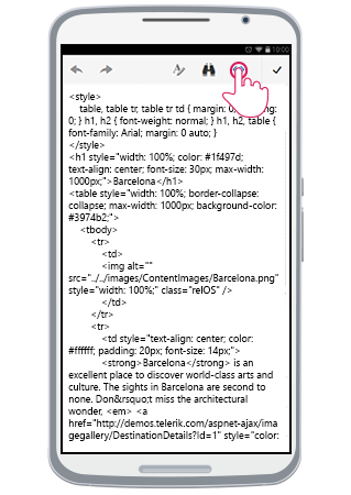
The user can edit the content as HTML by switching to HTML mode. This is done by tapping the Toggle HTML button ( ) from the header tools. This will show the content's HTML. Once user is done, tapping the same button will switch the mode back to Design.
Figure 7: Toggling HTML mode.
Using Built-in Mobile Dialogs
With the creation of the phone-optimized RadEditor, the built-in dialogs also have also been re-designed in order to expose a more user-friendly UI under phone devices. You can learn more details about how to configure the built-in dialogs in the Mobile Dialogs article.
Figure 8: Built-in Mobile Dialogs (Insert Table, Insert Image, Insert Link, Find and Replace).

The following sections explain the specific elements for each mobile dialog.
Common Elements
All built-in dialogs have OK/Insert and Cancel buttons that are used to perform the dialog's action and to cancel the operation. With the mobile-optimized dialogs, these buttons are placed at the top toolbar of the dialog.
Figure 9: OK and Cancel buttons of the mobile-optimized built-in dialogs.

Hyperlink Manager
- Url (text input)—the URL of the link to be inserted.
- Link Text (text input)—the text of the link.
- Target (select input)—the target attribute of the link.
File Browser Dialogs
 Upload—opens an UI for the user to upload a file (available if the UploadPaths property is set).
 Delete—deletes the selected file (available if the DeletePaths property is set).
 List View—toggles the view mode to List.
 Thumbnail View—toggles the view mode to Thumbnails.
Insert Table
 Increase/Decrease (spin buttons)—enables the user to increase or decrease the value in the numeric text-box.
Columns (numeric text-box)—sets the number of the table's columns.
Rows (numeric text-box)— sets the number of the table's rows.
Cell Padding (numeric text-box)—adds a padding to the table's cells.
Cell Spacing (numeric text-box)—adds spacing between the table's cells.
Find and Replace
- Find and Find and Replace (radio buttons)—Toggles between the two modes.
-
Match Case (check-box)—Defines whether to match the case.