Phone Layout Getting Started
This article showcases the basic steps needed to get started with the Phone Layout of RadEditor in your project.
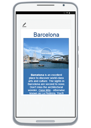
Figure 1: Preview mode of RadEditor
with Phone Layout under a mobile device.

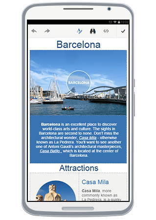
Figure 2: Full screen (editable) mode
of RadEditor with Phone Layout.

Phone Layout is supported only under browsers where Flex Model is available.
You can utilize the Phone Layout by following these steps:
Set up RadEditor on an ASP.NET page by following the general Getting Started article.
Set the RenderMode property of RadEditor either to Auto or Mobile (You can find out more about the differences of these two options in the Render Modes help article);
-
Adjust the viewport of your page by putting this meta tag in the
<head>element of the page:<meta name="viewport" content="width=device-width, initial-scale=1" />(You can read more about why this is needed in MDN's Using the viewport meta tag to control layout on mobile browsers article)
Run the created page under your phone's browser.
Initially, the RadEditor will load in Preview mode (Figure 1). Clicking the Edit Content button ( ) will enable editing and the Phone Layout will switch to full screen mode(Figure 2).
You can find further details about using the Phone Layout as end-user in the End User Experience article.
You can continue reading the Toolbar Configuration article to learn how to rearrange, add or remove tools regarding Phone Layout.