RadTimeView Structure
The RadTimeView control works only as a popup embedded in RadTimePicker or RadDateTimePicker controls. The main reason to add a RadTimeView control from the toolbox to the Web page is when using it as a shared popup control.
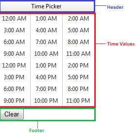
The following image shows the structure of the RadTimeView control:

Header - displays the title of the time view control. You can hide the header using the ShowHeader property, or alter its content and appearance using a header template.
Time Values - allow the user to select a time value by clicking with the mouse. You can configure the layout of the time values, as well as apply different styles for alternating time values.
Footer - by default has no content, and does not appear, even if the ShowFooter property is true. You can provide content to the footer using a template.