RadComboBox Item Builder
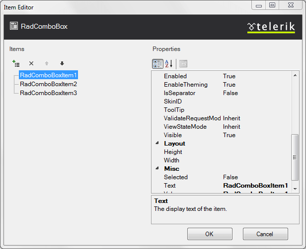
The RadComboBox Item Editor lets you define items inline (in the aspx page).
RadComboBox Item Editor
There are two ways to bring up the RadComboBox Item Editor:
From the RadComboBox Smart Tag , click on the Build RadComboBox link.
Right-click on the RadComboBox control and select Build RadComboBox from its pop-up menu.
You can add, edit, delete and re-arrange items:
| Button | Description |
|---|---|
 |
Click the Add button to append a ComboBoxItem to the list. |
 |
Use the up and down arrow buttons to rearrange the items in the list. This order determines the order the items appear in the drop-down list. |
| Select an item and click the Delete button to delete it from the list. | |
 |
Select individual items to change their properties using the property pane on the right of the RadComboBox Item Editor . Use the sorting controls above the property paneto sort the properties by category or alphabetically. |

RadComboBoxItem Properties
For each RadComboBoxItem,
Text is the string that the user sees for the item in the drop-down list.
ToolTip is a string that appears in the tooltip window when the user hovers the mouse over the item in the drop-down list.
Setting the tooltip can enable an accessibility feature: Special accessibility readers like JAWS can pronounce the tooltip of the highlighted item.
Value is the value associated with the item. It determines the value of the combobox's SelectedValue property when the item is selected. By default it is equal to the Text of the item.
Selected lets you control which item is initially selected when the RadComboBox first appears.
Only one item can be selected at a time. If you set Selected to True for an item, the Selected property of all other items is automatically set to False .
Enabled determines whether the user can select the item from the drop-down list.
CssClass is the name of a CSS style to be applied to the combobox item. The style can be declared in the CSS file of the applied skin.
You can also customize the appearance of items usingtemplates.