Default Cards
Rich cards are complex attachment messages that can contain additional message styling, templates, and images. The RadChat control supports the default heroCards template which can be displayed in the chat flow when calling the renderAttachments method of the control and pass heroCard as a value for the contentType property of an attachment.
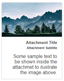
Figure 1: A default HeroCard template.
<telerik:RadChat runat="server" ID="RadChat1">
    <ClientEvents OnLoad="OnLoad"/>
    <MessagesSettings Placeholder="Type your message here..." />
    <UserSettings Name="John" IconUrl="avatar.png" />
</telerik:RadChat>
function OnLoad(sender, args) {
    var chat = sender;
    chat.renderAttachments({
        attachments: [{
            contentType: "heroCard",
            content: {
                title: "Attachment Title",
                subtitle: "Attachment Subtitle",
                text: "Some sample text to be shown inside the attachment to illustrate the image above.",
                images: [{
                    url: "mountain.png",
                    alt: "mountain"
                }]
            }
        }],
        attachmentLayout: "carousel"
    }, chat.get_user());
}
The layout of a collection of attachments can be:
- Carousel - displays multiple cards horizontally. In this mode, you can browse the available cards with left/right swipe or with a click on a card and dragging sideways;
- List - displays multiple cards vertically;
Figure 2: A Carousel cards layout.
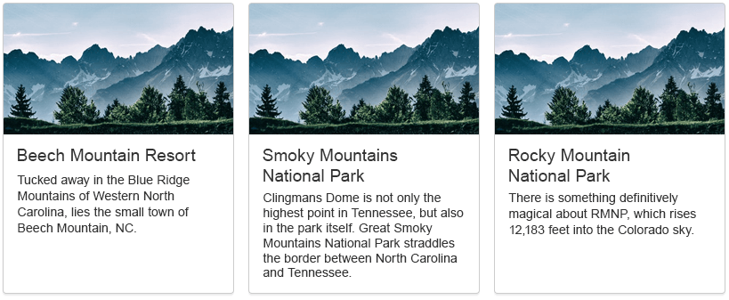
Figure 3: A List cards layout.

To further customize the appearance of a card, you can also use Custom Templates and Custom Components articles.