Navigation Controls Settings
The ASP NET AJAX Calendar provides a number of properties to let you customize the appearance of the navigation controls that appear in the calendar title bar.
Navigation buttons
You can enable or disable the navigation buttons in the title bar by setting the EnableNavigation property. When EnableNavigation is True (the default), the navigation buttons appear in the title bar on either side of the title. When EnableNavigation is False, the buttons do not appear on the title bar.
Each navigation button has three properties you can use to control its appearance: an image property, a text property, and a tooltip property. When the image property is set, the image is used to represent the button. The tooltip property specifies the tooltip that appears when the user hovers the mouse over the button. The following table lists these properties for each of the navigation buttons:
| Image property | Text property | Tooltip property | Description | |
|---|---|---|---|---|
 |
NavigationPrevImage | NavigationPrevText | NavigationPrevToolTip | Move to the previous view. |
 |
FastNavigationPrevImage | FastNavigationPrevText | FastNavigationPrevToolTip | Move back the number of views that the FastNavigationStep property specifies. |
 |
NavigationNextImage | NavigationNextText | NavigationNextToolTip | Move to the next view. |
 |
FastNavigationNextImage | FastNavigationNextText | FastNavigationNextToolTip | Move forward the number of views that the FastNavigationStep property specifies. |
If you do not want to remove all the navigation buttons using the EnableNavigation property, you can remove any of the individual navigation buttons from the title bar with a CSS rule. For example if RadCalendar has a custom CSS class called MyClass, the CSS rule for hiding the fast navigation buttons will be: .MyClass.rcTitlebara.rcFastPrev ,.MyClass.rcTitlebara.rcFastNext { display: none; } You should keep in mind that the correct CSS specificity (at least 31) should be used in order to override the skin's display style. The CSS classes of the four navigation buttons are rcFastPrev , rcPrev , rcNext and rcFastNext .
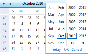
Month/Year popup
The month/year popup appears when the user clicks the title area of the title bar. It allows the user to change the current view by selecting a specific month and year, or to move to the view that contains the current date:
Setting the EnableMonthYearFastNavigation property lets you enable or disable this popup. When EnableMonthYearFastNavigation is False, the popup does not appear when the user clicks in the title area.
The FastNavigationStyle property lets you configure the appearance of the month/year popup. For information about using style properties, see Styles.
The FastNavigationSettings property lets you further configure the month/year popup. FastNavigationSettings is a composite property, with the following sub-properties:
CancelButtonCaption specifies the caption of the Cancel button.
OkButtonCaption specifies the caption of the OK button.
TodayButtonCaption specifies the caption of the Today button.
EnableTodayButtonSelection specifies whether clicking the today button selects the current day as well as moving to the view that contains the current day.
DateIsOutOfRangeMessage specifies the text of the message that appears when the user tries to move to a date that is out of range.
If you set any of the FastNavigationSettings sub-properties to an empty string, the month/year popup reverts to its default text value. If you set the DateIsOutOfRangeMessage to an empty string, the alert that appears when the user selects a date which is out of range will be disabled.
If the navigation control is part of RadMonthYearPicker and you need to set the Today , Ok and Cancel button captions programmatically, you should use a server-side event handler which executes no later than Page_Load, as the values cannot be applied correctly after that stage of the page lifecycle.