OHLC Stock Chart
The OHLC (open-high-low-close) chart is typically used to illustrate movements in the price of a financial instrument over time. Each vertical line on the chart shows the price range (the highest and lowest prices) over a period of time.
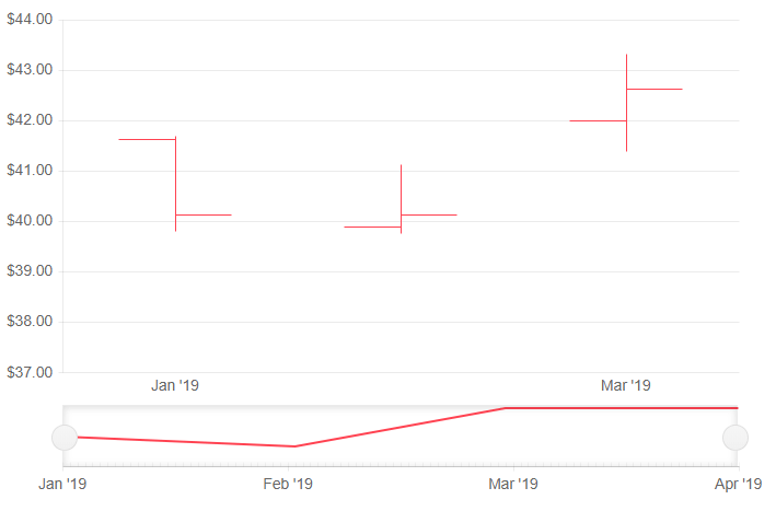
OHLC series in a stock chart. Results from the first code snippet below.
This article assumes you are familiar with the stock chart basics and data binding.
To add a OHLC chart to a stock chart component:
- set the
DateFieldproperty of the<TelerikStockChart>to the corresponding field in the model that carry the value. - add a
<StockChartSeries>to the<StockChartSeriesItems>collection. - set its
Typeproperty toStockChartSeriesType.OHLC. - provide a data model collection to its
Dataproperty. - set the
OpenField,ClosedField,HighFieldandLowFieldproperties to the corresponding fields in the model that carry the values.
An OHLC chart that shows the deviation of stocks
@* OHLC stock chart *@

<TelerikStockChart Height="450px"
                   Width="700px"
                   DateField="@nameof(StockDataPoint.Date)">

    <StockChartCategoryAxes>
        <StockChartCategoryAxis BaseUnit="@ChartCategoryAxisBaseUnit.Months"></StockChartCategoryAxis>
    </StockChartCategoryAxes>

    <StockChartSeriesItems>
        <StockChartSeries Type="StockChartSeriesType.OHLC"
                          Name="Product 1"
                          Data="@StockChartProduct1Data"
                          OpenField="@nameof(StockDataPoint.Open)"
                          CloseField="@nameof(StockDataPoint.Close)"
                          HighField="@nameof(StockDataPoint.High)"
                          LowField="@nameof(StockDataPoint.Low)">
        </StockChartSeries>
    </StockChartSeriesItems>

    <StockChartNavigator>
        <StockChartNavigatorSeriesItems>
            <StockChartNavigatorSeries Type="StockChartSeriesType.Line"
                                       Name="Product 1"
                                       Data="@StockChartProduct1Data"
                                       Field="@(nameof(StockDataPoint.High))"
                                       CategoryField="@(nameof(StockDataPoint.Date))">
            </StockChartNavigatorSeries>
        </StockChartNavigatorSeriesItems>
    </StockChartNavigator>

</TelerikStockChart>

@code {
    public List<StockDataPoint> StockChartProduct1Data { get; set; }

    protected override async Task OnInitializedAsync()
    {
        await GenerateChartData();
    }

    public async Task GenerateChartData()
    {
        StockChartProduct1Data = new List<StockDataPoint>()
        {
            new StockDataPoint(new DateTime(2019, 1, 1), 41.62m, 40.12m, 41.69m, 39.81m, 2632000),
            new StockDataPoint(new DateTime(2019, 2, 1), 39.88m, 40.12m, 41.12m, 39.75m, 3584700),
            new StockDataPoint(new DateTime(2019, 3, 1), 42m, 42.62m, 43.31m, 41.38m, 7631700),
            new StockDataPoint(new DateTime(2019, 4, 1), 42.25m, 43.06m, 43.31m, 41.12m, 4922200)
        };

        await Task.FromResult(StockChartProduct1Data);
    }

    public class StockDataPoint
    {
        public StockDataPoint() { }

        public StockDataPoint(DateTime date, decimal open, decimal close, decimal high, decimal low, int volume)
        {
            Date = date;
            Open = open;
            Close = close;
            High = high;
            Low = low;
            Volume = volume;
        }
        public DateTime Date { get; set; }

        public decimal Open { get; set; }

        public decimal Close { get; set; }

        public decimal High { get; set; }

        public decimal Low { get; set; }

        public int Volume { get; set; }
    }
}
OHLC Chart Specific Appearance Settings
Gap and Spacing
You can control the distance between the categories that cluster a data point from each series. To do this, use the Gap property of the series. It is the distance between categories expressed as a percentage of the bar width.
To set the distance between the bars of different series in the same category, use the Spacing property. It is the space between the series items in one series category as a proportion of the width of a single series item.
To create overlap, set negative values.
You can configure the values of Gap and Spacing for the whole chart in the first series and they are applied for all categories and series items.
Customize Chart Elements - Nested Tags Settings
When configuring nested properties and child elements in your chart, the inner tags will contain their parent tag name and add specifics to its end. In general the structure of such nested tags will be <Chart*Category**Specifics*> where the Category can be one of the following:
- CategoryAxis
- ChartArea
- Legend
- PlotArea
- SeriesItems
- Title
- Tooltip
- ValueAxis
- XAxes
- YAxes
- and others
To customize the chart, look for nested tags and their properties - the inner tags will contain their parent tag name and add specifics to its end. For example, the
ChartSeriestag has aChartSeriesLabelstag that exposes configuration options and more child tags.