Appearance Settings
This article explains how to control the LoaderContainer look and feel.
The LoaderContainer component provides multiple parameters that control its appearance:
The LoaderContainer uses a nested internal Loader component to show the animated indicator. The LoaderContainer exposes parameters, which directly control the Loader's appearance:
You can see the appearance settings in action in the LoaderContainer Appearance live demo.
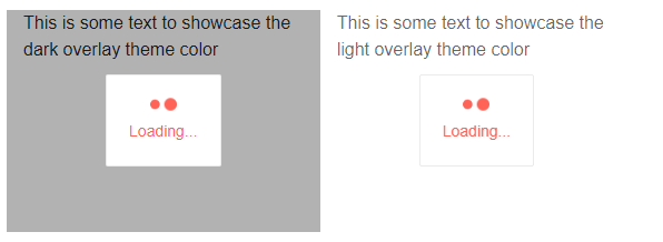
OverlayThemeColor
The OverlayThemeColor parameter sets the color of the LoaderContainer's semi-transparent overlay. It takes a string from the options below. To make the overlay fully transparent, set the value to String.Empty or null.
-
"dark"(default) - black semi-transparent background -
"light"- white background color with opacity
Change the OverlayThemeColor
@*This example shows the difference between the light and dark overlay theme colors*@

<div class="row">
    <div class="col-4" style="position: relative; height: 200px">
        <TelerikLoaderContainer OverlayThemeColor="dark"></TelerikLoaderContainer>

        <div>
            This is some text to showcase the dark overlay theme color
        </div>
    </div>
    <div class="col-4" style="position: relative; height: 200px">
        <TelerikLoaderContainer OverlayThemeColor="light"></TelerikLoaderContainer>

        <div>
            This is some text to showcase the light overlay theme color
        </div>
    </div>
</div>
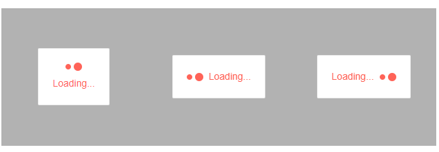
LoaderPosition
The LoaderPosition parameter controls the position of the animated loading indicator in relation to the loading Text. There are three predefined options, which are members of the LoaderPosition enum:
-
Top(default) - the loading animation is above the text -
Start- the loading animation is to the left of the text -
End- the loading animation is to the right of the text
The position of the Loader indicator
@*The different positions of the loader indicator based on the predefault values.*@

<div class="row">
    <div class="col-4" style="position: relative; height: 200px">
        <TelerikLoaderContainer LoaderPosition="@LoaderPosition.Top"></TelerikLoaderContainer>
    </div>
    <div class="col-4" style="position: relative; height: 200px">
        <TelerikLoaderContainer LoaderPosition="@LoaderPosition.Start"></TelerikLoaderContainer>
    </div>
    <div class="col-4" style="position: relative; height: 200px">
        <TelerikLoaderContainer LoaderPosition="@LoaderPosition.End"></TelerikLoaderContainer>
    </div>
</div>
LoaderType
The LoaderType parameter of the LoaderContainer will affect the shape of animated loading indicator. The parameter works only when there is no <Template>.
See the Loader Type documentation for the possible values and how the component looks.
Setting TelerikLoaderContainer LoaderType
<TelerikLoaderContainer LoaderType="@LoaderType.InfiniteSpinner" />
Size
The Size parameter of the LoaderContainer will affect the dimensions of animated loading indicator. The parameter works only when there is no <Template>.
See Loader Size for a list of possible values and how to set them more easily.
Setting TelerikLoaderContainer Size
<TelerikLoaderContainer Size="@ThemeConstants.Loader.Size.Large" />
ThemeColor
The ThemeColor parameter of the LoaderContainer will affect the text color and the loading indicator color. The parameter works only when there is no <Template>.
See Loader ThemeColor for a list of possible values and how the component looks.
Setting TelerikLoaderContainer ThemeColor
<TelerikLoaderContainer ThemeColor="@ThemeConstants.Loader.ThemeColor.Info" />
Custom LoaderContainer Colors
The following example shows how to override the CSS styles in the theme and apply custom colors to all LoaderContainer elements.
Custom LoaderContainer colors
<TelerikLoaderContainer Class="custom-loading-colors" />

<style>
    /* overlay */
    .custom-loading-colors .k-loader-container-overlay {
        background-color: yellow;
    }

    /* panel */
    .custom-loading-colors .k-loader-container-panel {
        background-color: pink;
    }

    /* animation */
    .custom-loading-colors .k-loader {
        color: blue;
    }

    /* text */
    .custom-loading-colors .k-loader-container-label {
        color: purple !important;
        font-weight: bold;
    }
</style>
ThemeBuilder
To take full control over the appearance of the Telerik UI for Blazor components, you can create your own styles by using ThemeBuilder.
ThemeBuilder is a web application that enables you to create new themes and customize existing ones. Every change that you make is visualized almost instantly. Once you are done styling the UI components, you can export a ZIP file with the styles for your theme and use them in your Blazor app.