Appearance Settings
The loader component provides the following parameters that control its appearance:
You can use all three together to get the desired appearance. This article will explain their effect one by one.
Type
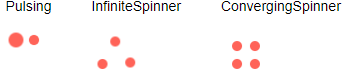
The Type parameter controls the loading animation shape. It takes a member of the Telerik.Blazor.Components.LoaderType enum:
-
Pulsing(default) InfiniteSpinnerConvergingSpinner
See them in action in the Loader Overview live demo.
Loader Types
@foreach (LoaderType type in Enum.GetValues(typeof(Telerik.Blazor.Components.LoaderType)))
{
    <div style="float: left; margin: 20px;">
        @type
        <br /><br />
        <TelerikLoader Type="@type"></TelerikLoader>
    </div>
}
Size
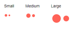
The Size parameter accepts a string and there are three predefined sizes for the Loader. You can use the predefined properties in the Telerik.Blazor.ThemeConstants.Loader.Size static class:
-
Small(equals"sm") -
Medium(equals"md") - default -
Large(equals"lg")
See them in action in the Loader Overview live demo.
Loader Size
@foreach (string size in LoaderSizes)
{
    <div style="float: left; margin: 20px;">
        @size
        <br /><br />
        <TelerikLoader Size="@size"></TelerikLoader>
    </div>
}

@code {
    List<string> LoaderSizes { get; set; } = new List<string>() {
        ThemeConstants.Loader.Size.Small,
        ThemeConstants.Loader.Size.Medium,
        ThemeConstants.Loader.Size.Large
    };
}
ThemeColor
The ThemeColor parameter sets the color of the animated loading indicator. You can set it to a string property of the static class ThemeConstants.Loader.ThemeColor:
PrimarySecondaryTertiarySuccessInfoWarningErrorDarkLightInverse
These predefined options match the main Telerik Theme and you can see that in action in the Loader Appearance live demo.
Built-in Theme Colors

@{
    var fields = typeof(ThemeConstants.Loader.ThemeColor)
                    .GetFields(System.Reflection.BindingFlags.Public | System.Reflection.BindingFlags.Static |
                       System.Reflection.BindingFlags.FlattenHierarchy)
                    .Where(fi => fi.IsLiteral && !fi.IsInitOnly).ToList();
    foreach (var f in fields)
    {
        string color = f.GetValue(null).ToString();
        <div style="display: inline-block; margin: 20px;">
            @color
            <br /><br />
            <TelerikLoader ThemeColor="@color"></TelerikLoader>
        </div>
    }
}
Custom Loader Colors
The ThemeColor parameter renders as the k-loader-<ThemeColor> CSS class on the wrapping element and you can set it to a custom value to cascade through and set the color to a setting of your own without customizing the entire theme.
Custom Loader color without customizing the Telerik Theme

<style>
    .k-loader-custom-color .k-loader-segment {
        background-color: cyan;
    }
</style>
<TelerikLoader ThemeColor="custom-color"></TelerikLoader>
ThemeBuilder
To take full control over the appearance of the Telerik UI for Blazor components, you can create your own styles by using ThemeBuilder.
ThemeBuilder is a web application that enables you to create new themes and customize existing ones. Every change that you make is visualized almost instantly. Once you are done styling the UI components, you can export a ZIP file with the styles for your theme and use them in your Blazor app.