Linear Gauge Pointers
The pointers are the values that will be marked on the scale. You can customize them through the parameters they expose:
The examples in this article are using the Arrow shape of the Pointers, but you can use BarIndicator too.
Shape
The Shape parameter controls the shape of the pointer and takes a member of the LinearGaugePointerShape enum:
BarIndicator- by default a bar indication will be rendered as the pointer shapeArrow
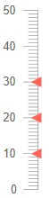
Change the shape of the pointer. The result from the code snippet below.
@* Use arrows as pointers in the Linear Gauge *@

<TelerikLinearGauge>
    <LinearGaugePointers>
        <LinearGaugePointer Value="10" Shape="@LinearGaugePointerShape.Arrow">
        </LinearGaugePointer>

        <LinearGaugePointer Value="20" Shape="@LinearGaugePointerShape.Arrow">
        </LinearGaugePointer>

        <LinearGaugePointer Value="30" Shape="@LinearGaugePointerShape.Arrow">
        </LinearGaugePointer>

    </LinearGaugePointers>
</TelerikLinearGauge>
Color
The Color (string) parameter controls the color of the pointers. It accepts CSS, HEX and RGB colors.
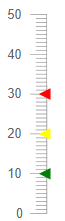
Change the color of the arrow pointers. The result from the code snippet below
@* Change the color of the pointers *@

<TelerikLinearGauge>
    <LinearGaugePointers>
        <LinearGaugePointer Value="10" Color="#008000" Shape="@LinearGaugePointerShape.Arrow">
        </LinearGaugePointer>

        <LinearGaugePointer Value="20" Color="rgb(255,255,0)" Shape="@LinearGaugePointerShape.Arrow">
        </LinearGaugePointer>

        <LinearGaugePointer Value="30" Color="red" Shape="@LinearGaugePointerShape.Arrow">
        </LinearGaugePointer>

    </LinearGaugePointers>
</TelerikLinearGauge>
Opacity
The Opacity (double) parameter controls the opacity of the pointers. The value passed to it should be between 0 and 1.
@* Change the opacity of a pointer *@

<TelerikLinearGauge>
    <LinearGaugePointers>
        <LinearGaugePointer Value="10" Opacity="0.4" Color="green" Shape="@LinearGaugePointerShape.Arrow">
        </LinearGaugePointer>

        <LinearGaugePointer Value="20" Color="yellow" Shape="@LinearGaugePointerShape.Arrow">
        </LinearGaugePointer>

        <LinearGaugePointer Value="30" Color="red" Shape="@LinearGaugePointerShape.Arrow">
        </LinearGaugePointer>

    </LinearGaugePointers>
</TelerikLinearGauge>
Size
The Size (double) parameter controls the size of the pointers.
@* Change the sizes of the pointers *@

<TelerikLinearGauge>
    <LinearGaugePointers>
        <LinearGaugePointer Value="10" Color="green" Shape="@LinearGaugePointerShape.Arrow" Size="15">
        </LinearGaugePointer>

        <LinearGaugePointer Value="20" Color="yellow" Shape="@LinearGaugePointerShape.Arrow" Size="10">
        </LinearGaugePointer>

        <LinearGaugePointer Value="30" Color="red" Shape="@LinearGaugePointerShape.Arrow" Size="5">
        </LinearGaugePointer>

    </LinearGaugePointers>
</TelerikLinearGauge>
Margin
The Margin (double) parameter controls the margin between the Scale and the pointers.
@* Change the margin between the scale and the pointers *@

<TelerikLinearGauge>
    <LinearGaugePointers>
        <LinearGaugePointer Value="10" Margin="10" Shape="@LinearGaugePointerShape.Arrow" >
        </LinearGaugePointer>

        <LinearGaugePointer Value="20" Margin="8" Shape="@LinearGaugePointerShape.Arrow">
        </LinearGaugePointer>

        <LinearGaugePointer Value="30" Margin="6" Shape="@LinearGaugePointerShape.Arrow">
        </LinearGaugePointer>

    </LinearGaugePointers>
</TelerikLinearGauge>
Additional Customization
To further customize the elements of the linear gauge you can use nested tags. When configuring nested properties and child elements in your Linear Gauge, the inner tags will contain their parent tag name and add specifics to its end. In general the structure of such nested tags will be <LinearGauge*Category**Specifics*> where the Category can be one of the following:
- Scale
- GaugeArea
- Pointers
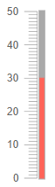
Customize the Pointer Track. The result from the code snippet below.
@* Customize the pointer track *@

<TelerikLinearGauge>
    <LinearGaugeScales>
        <LinearGaugeScale></LinearGaugeScale>
    </LinearGaugeScales>
    <LinearGaugePointers>

        <LinearGaugePointer Value="30">
            <LinearGaugePointerTrack Color="#a9a9a9" Visible="true"></LinearGaugePointerTrack>
        </LinearGaugePointer>

    </LinearGaugePointers>
</TelerikLinearGauge>