Arc Gauge Labels
You can customize the appearance of the labels rendered on the scale of the Arc Gauge by using the <ArcGaugeScaleLabels>, child tag of the <ArcGaugeScale>, and the parameters it exposes:
Format
The Format (string) parameter allows you to customize the rendering of the labels by using the standard numeric format strings. You can set the values of the labels to showcase, for example, currency, percentage, and so on.
Use the Format parameter to showcase percentage. The result from the code snippet below.
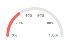
@* Use the {0:P0} format string to format the values of the labels as percentage. *@

<TelerikArcGauge>
    <ArcGaugeScales>
        <ArcGaugeScale Min="0" Max="1">
            <ArcGaugeScaleLabels Visible="true" Format="{0:P0}" />
        </ArcGaugeScale>
    </ArcGaugeScales>

    <ArcGaugePointers>

        <ArcGaugePointer Value="0.3">

        </ArcGaugePointer>

    </ArcGaugePointers>
</TelerikArcGauge>
Center Template
The center template allows you to take control of the rendering of the central section of the Arc Gauge. To use it, add the <ArcGaugeCenterLabel> a child of the <TelerikArcGauge> It provides a context object (GaugeCenterLabelTemplateContext) which exposes a list with the pointer in the component.
Use the Center Template to display the Value of the pointer. The result from the code snippet below.
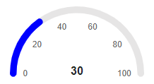
@* Print the value of the pointer in the center of the component *@

<TelerikArcGauge>
    <ArcGaugeCenterLabel>
        <Template>
            @{
                var pointer = context.Pointers.FirstOrDefault();

                <div style="font-weight: bold">@pointer.Value</div>
            }
        </Template>
    </ArcGaugeCenterLabel>
    <ArcGaugeScales>
        <ArcGaugeScale Min="0" Max="100">
            <ArcGaugeScaleLabels Visible="true" />
        </ArcGaugeScale>
    </ArcGaugeScales>

    <ArcGaugePointers>

        <ArcGaugePointer Value="30" Color="blue">

        </ArcGaugePointer>

    </ArcGaugePointers>
</TelerikArcGauge>
Color
The Color (string) parameter controls the color of the labels. It accepts CSS, HEX and RGB colors.
Change the color of the labels. The result from the code snippet below.
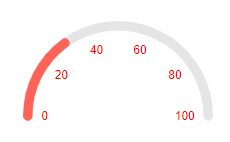
@* Change the color of the labels to red *@

<TelerikArcGauge>
    <ArcGaugeScales>
        <ArcGaugeScale Min="0" Max="100">
            <ArcGaugeScaleLabels Visible="true" Color="red" />
        </ArcGaugeScale>
    </ArcGaugeScales>

    <ArcGaugePointers>

        <ArcGaugePointer Value="30">

        </ArcGaugePointer>

    </ArcGaugePointers>
</TelerikArcGauge>
Visible
The Visible (bool) parameter controls whether the labels will be rendered. By default the labels would not be rendered.
Show the labels by using the Visible parameter. The result from the code snippet below
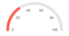
@* Set the Visible parameter to true to show the labels *@

<TelerikArcGauge>
    <ArcGaugeScales>
        <ArcGaugeScale Min="0" Max="100">
            <ArcGaugeScaleLabels Visible="true" />
        </ArcGaugeScale>
    </ArcGaugeScales>

    <ArcGaugePointers>

        <ArcGaugePointer Value="30">

        </ArcGaugePointer>

    </ArcGaugePointers>
</TelerikArcGauge>
Additional Customization
To further customize the elements of the Arc Gauge you can use nested tags. When configuring nested properties and child elements in your Arc Gauge, the inner tags will contain their parent tag name and add specifics to its end. In general the structure of such nested tags will be <ArcGauge*Category**Specifics*> where the Category can be one of the following:
- Scale
- GaugeArea
Customize the borders of the Labels. The result from the code snippet below.
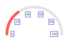
@* Provide color, solid outline and custom width to the label borders *@

<TelerikArcGauge>
    <ArcGaugeScales>
        <ArcGaugeScale Min="0" Max="100">
            <ArcGaugeScaleLabels Visible="true">
                <ArcGaugeScaleLabelsBorder Color="blue" DashType="@DashType.Solid" Width="1"></ArcGaugeScaleLabelsBorder>
            </ArcGaugeScaleLabels>
        </ArcGaugeScale>
    </ArcGaugeScales>

    <ArcGaugePointers>

        <ArcGaugePointer Value="30">

        </ArcGaugePointer>

    </ArcGaugePointers>
</TelerikArcGauge>