Getting Started with the Drawer
This tutorial explains how to set up a basic Telerik UI for ASP.NET MVC Drawer and highlights the major steps in the configuration of the component.
You will initialize a drawer with four items. To display dedicated textual content for each Drawer item, you will add event handling.
Prerequisites
To successfully complete the tutorial, you need a project that is already configured to use the Telerik UI for ASP.NET MVC components:
To create a new pre-configured project for the Telerik UI for ASP.NET MVC components, you can use a project template.
To manually configure an existing project by using NuGet, see the Adding Telerik UI through NuGet.
1. Prepare the CSHTML File
The first step is to add the required directives at the top of the .cshtml document:
- To use the Telerik UI for ASP.NET MVC HtmlHelpers:
@using Kendo.Mvc.UI
2. Initialize the Drawer
Use the Drawer HtmlHelper to add the component to a page:
The
Name()configuration method is mandatory as its value is used for theidand the name attributes of the Drawer element.The
Mini()configuration method enables the compact view of the drawer. You can use the mini mode to display the icons of the items when the Drawer is collapsed.-
The
Templates()allow you to configure the individual Drawer items and their rendering:- To define each item that you want to render, use the
drawer-itemdata role. - To render separators between the items, use the
drawer-separatordata role. - To add icons with a span, use the
k-iconclass combined with the desired Kendo UI for jQuery web font icon class. -
To ensure that the icons and the text have sufficient padding, wrap the item template text in a span with the
k-item-textclass.To learn more about the CSS and state classes that you can use to customize the appearance of the components, see the Components Rendering article.
- To define each item that you want to render, use the
    @using Kendo.Mvc.UI

    @(Html.Kendo().Drawer()
        .Name("drawer")
        .Mini(true)
        .Template(@"
            <ul>
                <li data-role='drawer-item' class='k-selected'><span class='k-icon k-i-inbox'></span><span class='k-item-text' data-id='Inbox'>Inbox</span></li>
                <li data-role='drawer-separator'></li>
                <li data-role='drawer-item'><span class='k-icon k-i-notification k-i-bell'></span><span class='k-item-text' data-id='Notifications'>Notifications</span></li>
                <li data-role='drawer-item'><span class='k-icon k-i-calendar'></span><span class='k-item-text' data-id='Calendar'>Calendar</span></li>
                <li data-role='drawer-separator'></li>
                <li data-role='drawer-item'><span class='k-icon k-i-star-outline k-i-bookmark-outline'></span><span class='k-item-text' data-id='Favorites'>Favorites</span></li>
                <li data-role='drawer-separator'></li>
            </ul>
        "))
3. Configure the Drawer Interaction Mode
You can define how the Drawer interacts with the content in its items. In this tutorial, you will configure the drawer to push the content to the side by using Mode("push").
In addition, you can use the AutoCollapse method to stop the Drawer from automatically collapsing when the user clicks an item.
    @using Kendo.Mvc.UI

    @(Html.Kendo().Drawer()
        .Name("drawer")
        .Mini(true)
        .Mode("push")
        .AutoCollapse(false)
        .Template(@"
            <ul>
                <li data-role='drawer-item' class='k-selected'><span class='k-icon k-i-inbox'></span><span class='k-item-text' data-id='Inbox'>Inbox</span></li>
                <li data-role='drawer-separator'></li>
                <li data-role='drawer-item'><span class='k-icon k-i-notification k-i-bell'></span><span class='k-item-text' data-id='Notifications'>Notifications</span></li>
                <li data-role='drawer-item'><span class='k-icon k-i-calendar'></span><span class='k-item-text' data-id='Calendar'>Calendar</span></li>
                <li data-role='drawer-separator'></li>
                <li data-role='drawer-item'><span class='k-icon k-i-star-outline k-i-bookmark-outline'></span><span class='k-item-text' data-id='Favorites'>Favorites</span></li>
                <li data-role='drawer-separator'></li>
            </ul>
        "))
4. Add Content
Next, add some basic content to the Drawer items by using the Content() method. Later in this tutorial, you will configure the Drawer to show only the content for the selected Drawer item.
@using Kendo.Mvc.UI
@(Html.Kendo().Drawer()
.Name("drawer")
.Mini(true)
.Template(@"
<ul>
<li data-role='drawer-item' class='k-selected'><span class='k-icon k-i-inbox'></span><span class='k-item-text' data-id='Inbox'>Inbox</span></li>
<li data-role='drawer-separator'></li>
<li data-role='drawer-item'><span class='k-icon k-i-notification k-i-bell'></span><span class='k-item-text' data-id='Notifications'>Notifications</span></li>
<li data-role='drawer-item'><span class='k-icon k-i-calendar'></span><span class='k-item-text' data-id='Calendar'>Calendar</span></li>
<li data-role='drawer-separator'></li>
<li data-role='drawer-item'><span class='k-icon k-i-star-outline k-i-bookmark-outline'></span><span class='k-item-text' data-id='Favorites'>Favorites</span></li>
<li data-role='drawer-separator'></li>
</ul>
")
.Content(@"
<div id='drawer-content'>
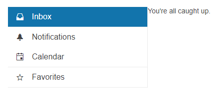
<div id='Inbox' >
<p>You're all caught up.</p>
</div>
<div id='Notifications' class='hidden'>
<p>You don't have any notifications.</p>
</div>
<div id='Calendar' class='hidden'>
<p>Nothing scheduled for today.</p>
</div>
<div id='Favorites' class='hidden'>
<p>Your favorites will appear here.</p>
</div>
</div>
"))
5. Handle a Drawer Event
The Drawer exposes an ItemClick() event that you can handle and assign specific functions to the component. In this tutorial, you will use the ItemClick() event to display the content in the selected Drawer item.
To hide the content for the items that aren't currently selected, you will apply the hidden CSS style.
    @using Kendo.Mvc.UI

    @(Html.Kendo().Drawer()
        .Name("drawer")
        .Mini(true)
        .Mode("push")
        .AutoCollapse(false)
        .Template(@"
            <ul>
                <li data-role='drawer-item' class='k-selected'><span class='k-icon k-i-inbox'></span><span class='k-item-text' data-id='Inbox'>Inbox</span></li>
                <li data-role='drawer-separator'></li>
                <li data-role='drawer-item'><span class='k-icon k-i-notification k-i-bell'></span><span class='k-item-text' data-id='Notifications'>Notifications</span></li>
                <li data-role='drawer-item'><span class='k-icon k-i-calendar'></span><span class='k-item-text' data-id='Calendar'>Calendar</span></li>
                <li data-role='drawer-separator'></li>
                <li data-role='drawer-item'><span class='k-icon k-i-star-outline k-i-bookmark-outline'></span><span class='k-item-text' data-id='Favorites'>Favorites</span></li>
                <li data-role='drawer-separator'></li>
            </ul>
        ")
        .Content(@"
            <div id='drawer-content'>
                <div id='Inbox' >
                    <p>You're all caught up.</p>
                </div>
                <div id='Notifications' class='hidden'>
                    <p>You don't have any notifications.</p>
                </div>
                <div id='Calendar' class='hidden'>
                    <p>Nothing scheduled for today.</p>
                </div>

                <div id='Favorites' class='hidden'>
                    <p>Your favorites will appear here.</p>
                </div>
            </div>
        ")
        .Events(x => x.ItemClick("onItemClick")))

    <script>
        function onItemClick(e) {
            if(!e.item.hasClass("k-drawer-separator")){
                e.sender.drawerContainer.find("#drawer-content > div").addClass("hidden");
                e.sender.drawerContainer.find("#drawer-content").find("#" + e.item.find(".k-item-text").attr("data-id")).removeClass("hidden");
            }
        }
    </script>

    <style>
        .hidden {
            display: none;
        }
    </style>
6. (Optional) Reference Existing Drawer Instances
You can reference the Drawer instances that you have created and build on top of their existing configuration:
-
Use the
idattribute of the component instance to establish a reference.<script> var drawerReference = $("#drawer").data("kendoDrawer"); // drawerReference is a reference to the existing instance of the helper. </script> -
Use the Drawer client-side API to control the behavior of the widget. In this example, you will use the
hidemethod to hide the Drawer.<script> var drawerReference = $("#drawer").data("kendoDrawer"); // drawerReference is a reference to the existing instance of the helper. drawerReference.show(); // Show (expand) the Drawer instance. </script>
For more information on referencing specific helper instances, see the Methods and Events article.