Getting Started with the PropertyGrid
This tutorial explains how to set up the Telerik UI for ASP.NET MVC PropertyGrid and goes through the steps in the configuration of the component.
You will declare a view model and bind it to an instance of the PropertyGrid component. Next, you will configure the PropertyGrid items and their editors. Then, you will use the template options to enhance the items appearance and learn how to handle the JavaScript events of the component.
After completing this guide, you will achieve the following results:
Prerequisites
To successfully complete the tutorial, you need a project that is already configured to use the Telerik UI for ASP.NET MVC components:
To create a new pre-configured project for the Telerik UI for ASP.NET MVC components, you can use a project template.
To manually configure an existing project by using NuGet, see the Adding Telerik UI through NuGet.
1. Prepare the CSHTML File
The first step is to add the required directives at the top of the .cshtml document:
-
To use the Telerik UI for ASP.NET MVC HtmlHelpers:
@using Kendo.Mvc.UI
Optionally, you can structure the document by adding the desired HTML elements like headings, divs, paragraphs, and others.
    @using Kendo.Mvc.UI

    <h4>Review element properties</h4>
    <div>

    </div>
2. Declare the View Model
Binding a model to the PropertyGrid will set the PropertyGrid items internally to the Telerik Editor components that are suitable for the bound data. In addition, the DataAnnotation attributes of the model properties will be automatically applied to the PropertyGrid items.
using System;
using System.ComponentModel.DataAnnotations;
public class PropertyViewMiodel
{
[Display(GroupName = "Styles", Description = "Select a different color that will be applied in the template.")]
public string color { get; set; }
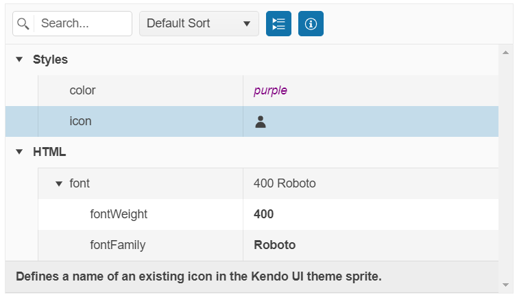
[Display(GroupName = "Styles", Description = "Defines a name of an existing icon in the Kendo UI theme sprite.")]
public string icon { get; set; }
[Display(GroupName = "HTML")]
public FontViewModel font { get; set; }
}
public class FontViewModel
{
[Required]
[Display(GroupName = "font", Description = "Sets how thick or thin characters in text must be displayed.")]
public int fontWeight { get; set; }
[Required]
[Display(GroupName = "font", Description = "Specifies the font family name for the element.")]
public string fontFamily { get; set; }
}
    public ActionResult Index()
    {
        return View(new PropertyViewMiodel() {
            color = "red",
            icon = "star",
            font = new FontViewModel()
            {
                fontWeight = 400,
                fontFamily = "Roboto"
            }
        });
    }
3. Initialize the PropertyGrid
Use the PropertyGrid HtmlHelper to configure the component.
- The
Name()configuration method is mandatory as its value is used for theidand thenameattributes of the PropertyGrid element. - The
Modeloption defines the model to which the PropertyGrid binds. - The
EditMode()method enables the component editing. - The
Columns()configuration specifies the widths of the field and value columns.
    @model PropertyViewMiodel

    @(Html.Kendo().PropertyGrid<PropertyViewMiodel>()
        .Name("propertyGrid")
        .Model(Model)
        .Columns(columns => columns.FieldColumn(fieldCol => fieldCol.Width(200)).ValueColumn(valueCol => valueCol.Width(250)))
        .EditMode(true)
    )
4. Configure the Items Editors
The next step is to configure custom editors for the property values.
-
Use a DropDownList editor for the color and icon properties.
@model PropertyViewMiodel @(Html.Kendo().PropertyGrid<PropertyViewMiodel>() .Name("propertyGrid") .Model(Model) .Columns(columns => columns.FieldColumn(fieldCol => fieldCol.Width(200)).ValueColumn(valueCol => valueCol.Width(250))) .EditMode(true) .Items(items => { items.Add().Field(f => f.color) .Editor(editor => editor .DropDownList() .BindTo(new string[] { "red", "green", "blue", "purple", "orange" })); items.Add().Field(f => f.icon) .Editor(editor => editor .DropDownList() .DataTextField("Text") .DataValueField("Value") .BindTo(new List<SelectListItem>() { new SelectListItem() { Text = "gear", Value = "gear" }, new SelectListItem() { Text = "star", Value = "star" }, new SelectListItem() { Text = "folder", Value = "folder" }, new SelectListItem() { Text = "user", Value = "user" }, new SelectListItem() { Text = "info-circle", Value = "info-circle" } })); }) ) -
Use an AutoComplete editor for the fontFamily property.
    @model PropertyViewMiodel

    @(Html.Kendo().PropertyGrid<PropertyViewMiodel>()
        .Name("propertyGrid")
        .Model(Model)
        .Columns(columns => columns.FieldColumn(fieldCol => fieldCol.Width(200)).ValueColumn(valueCol => valueCol.Width(250)))
        .EditMode(true)
        .Items(items =>
        {
            ... //Additional configuration
            items.Add().Field("font")
            .Items(childItems =>
            {
                childItems.Add().Field("fontFamily").Editor(editor => editor
                .AutoComplete()
                .BindTo(new string[] { "Arial", "Roboto", "Georgia", "Calibri", "Cursive", "Monospace", "Fantasy" }));
            });
        })
    )
5. Customize the Appearance of the PropertyGrid
To alter the appearance of the PropertyGrid values, use the template options of the items. By using the TemplateHandler() method, you can return the desired template through a JavaScript function. Another option is to pass the template as a string to the Template() method.
    @model PropertyViewMiodel

    @(Html.Kendo().PropertyGrid<PropertyViewMiodel>()
        .Name("propertyGrid")
        .Model(Model)
        .Columns(columns => columns.FieldColumn(fieldCol => fieldCol.Width(200)).ValueColumn(valueCol => valueCol.Width(250)))
        .EditMode(true)
        .Items(items =>
        {
            items.Add().Field(f => f.color)
            .Template("<span style='color:#=value#'>#=value#</span>")
            .Editor(...);

            items.Add().Field(f => f.icon)
            .TemplateHandler("iconTemplate")
            .Editor(...);

            items.Add().Field("font").TemplateHandler("fontTemplate")
            .Items(...);
        })
    )
    <script>
        function iconTemplate(data) {
            return `${kendo.ui.icon(data.value)}`;
        }

        function fontTemplate(data) {
            var propertyGridModel = $("#propertyGrid").data('kendoPropertyGrid').model();
            return `<span class="fontWeight">${propertyGridModel.font["fontWeight"]}</span> <span class="fontFamily">${propertyGridModel.font["fontFamily"]}</span>`;
        }
    </script>
In addition, you can control the width and height of the PropertyGrid by setting the respective Width() and Height() options.
    @model PropertyViewMiodel

    @(Html.Kendo().PropertyGrid<PropertyViewMiodel>()
        .Name("propertyGrid")
        .Model(Model)
        .Width(600)
        .Height(800)
        .Columns(columns =>
        {
            columns.FieldColumn(fieldCol => fieldCol.Width(200));
            columns.ValueColumn(valueCol => valueCol.Width(250));
        })
        ... //Additional configuration
    )
6. Handle the PropertyGrid Events
The PropertyGrid exposes events that you can handle and further customize the functionality of the component. In this tutorial, you will use the exposed Edit event to log the current state of the model in the browser's console.
    @model PropertyViewMiodel

    @(Html.Kendo().PropertyGrid<PropertyViewMiodel>()
        .Name("propertyGrid")
        .Model(Model)
        .Events(ev => ev.Edit("onEdit"))
        .... //Additional configuration
    )

    <script>
        function onEdit(e) {
            console.log(e.model);
        }
    </script>
7. (Optional) Reference Existing PropertyGrid Instances
Referencing existing component instances allows you to build on top of their configuration. To reference an existing PropertyGrid instance, use the jQuery.data() method.
-
Use the
Name()option of the component to establish a reference.<script> var propertyGridReference = $("#propertyGrid").data("kendoPropertyGrid"); // propertyGridReference is a reference to the existing instance of the helper. </script> -
Use the PropertyGrid client-side API to control the behavior of the widget. In this example, you will see how to toggle the expanded or collapsed state of the first group (for example, when a button is clicked).
    @(Html.Kendo().Button()
        .Name("btn")
        .Content("Toggle first PropertyGrid group")
        .Events(ev => ev.Click("onBtnClick")))

    <script>
        function onBtnClick() {
            var propertyGridReference = $("#propertyGrid").data("kendoPropertyGrid");
            propertyGridReference.toggleGroup($("#propertyGrid .k-table-group-row.k-grouping-row:nth-child(1)"));
        }
    </script>
For more information on referencing specific helper instances, see the Methods and Events article.
Next Steps
- Configuring the PropertyGrid Columns
- Configuring the Items in the PropertyGrid
- Handling JavaScript Events of the User Interactions