Getting Started with the Button
This tutorial explains how to set up a basic Telerik UI for ASP.NET Core Button and highlights the major steps in the configuration of the component.
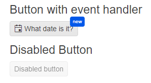
You will initialize two buttons, one of them will have an event handler, an icon, and a badge. The other one will be rendered as disabled. Finally, you can run the sample code in Telerik REPL and continue exploring the components.
Prerequisites
To successfully complete the tutorial, you need a project that is already configured to use the Telerik UI for ASP.NET Core components:
You can use the Telerik REPL playground and skip installing the components on your system and configuring a project.
-
You can prepare a Visual Studio project by following the following guide:
- Creating a new pre-configured project for the Telerik UI for ASP.NET Core components from a project template.
1. Prepare the CSHTML File
The first step is to add the required directives at the top of the .cshtml document:
-
To use the Telerik UI for ASP.NET Core HtmlHelpers:
@using Kendo.Mvc.UI -
To use the Telerik UI for ASP.NET Core TagHelpers:
@addTagHelper *, Kendo.Mvc
Optionally, you can structure the document by adding the desired HTML elements like headings, divs, paragraphs, and others.
    @using Kendo.Mvc.UI

    <h4>Button with event handler</h4>
    <p>

    </p>
    <p id="date"></p>

    <h4>Disabled Button</h4>
    <p>

    </p>
    @addTagHelper *, Kendo.Mvc

    <h4>Button with event handler</h4>
    <p>

    </p>
    <p id="date"></p>

    <h4>Disabled Button</h4>
    <p>

    </p>
2. Initialize the Button
Use the Button HtmlHelper or TagHelper to add the component to a page:
- The
Name()configuration method is mandatory as its value is used for theidand the name attributes of the Button element. - The
Content()configuration specifies the text that is rendered within the button. This option accepts only string values and no HTML. - The
Enable()configuration defines if the component is enabled or disabled.
    @using Kendo.Mvc.UI

    <h4>Button with event handler</h4>
    <p>
        @(Html.Kendo().Button()
            .Name("dateButton")
            .Content("What date is it?"))
    </p>
    <p id="date"></p>

    <h4>Disabled Button</h4>
    <p>
        @(Html.Kendo().Button()
            .Name("disabledButton")
            .Content("Disabled button")
            .Enable(false))
    </p>
    @addTagHelper *, Kendo.Mvc

    <h4>Button with event handler</h4>
    <p>
        <kendo-button name="dateButton">
            What date is it?
        </kendo-button>
    </p>
    <p id="date"></p>

    <h4>Disabled Button</h4>
    <p>
    <kendo-button name="disabledButton"
        enable="false">
        Disabled button
    </kendo-button>
    </p>
3. Add an Icon and a Badge
The next step is to display an icon and a badge within the Button. This allows you to enhance its visual representation.
    @using Kendo.Mvc.UI

    <h4>Button with event handler</h4>
    <p>
        @(Html.Kendo().Button()
            .Name("dateButton")
            .Content("What date is it?")
            .Icon("calendar")
            .Badge(b => b
                .Text("new")
                .Shape(BadgeShape.Pill)
                .Size(BadgeSize.Medium)
                .ThemeColor(BadgeColor.Info)))
    </p>
    <p id="date"></p>

    <h4>Disabled Button</h4>
    <p>
        @(Html.Kendo().Button()
            .Name("disabledButton")
            .Content("Disabled button")
            .Enable(false))
    </p>
    @addTagHelper *, Kendo.Mvc

    <h4>Button with event handler</h4>
    <p>
        <kendo-button name="dateButton"
            icon="calendar">
            <badge
            text="new"
            shape="@BadgeShape.Pill"
            theme-color="@BadgeColor.Info"/>
            What date is it?
        </kendo-button>
    </p>
    <p id="date"></p>

    <h4>Disabled Button</h4>
    <p>
    <kendo-button name="disabledButton"
        enable="false">
        Disabled button
    </kendo-button>
    </p>
4. Handle a Button Event
The Button exposes a Click() event that you can handle and assign specific functions to the component. In this tutorial, you will use the Click() event to display the current date and time.
    @using Kendo.Mvc.UI

    <h4>Button with event handler</h4>
    <p>
        @(Html.Kendo().Button()
            .Name("dateButton")
            .Content("What date is it?")
            .Icon("calendar")
            .Badge(b => b
                .Text("new")
                .Shape(BadgeShape.Pill)
                .Size(BadgeSize.Medium)
                .ThemeColor(BadgeColor.Info))
            .Events(ev => ev.Click("onClick")))
    </p>
    <p id="date"></p>

    <h4>Disabled Button</h4>
    <p>
        @(Html.Kendo().Button()
            .Name("disabledButton")
            .Content("Disabled button")
            .Enable(false))
    </p>

    <script>
    function onClick(e) {
    document.getElementById('date').innerHTML=Date();
    }
    </script>
    @addTagHelper *, Kendo.Mvc

    <h4>Button with event handler</h4>
    <p>
        <kendo-button name="dateButton"
            on-click="onClick"
            icon="calendar">
            <badge
            text="new"
            shape="@BadgeShape.Pill"
            theme-color="@BadgeColor.Info"/>
            What date is it?
        </kendo-button>

    </p>
    <p id="date"></p>

    <h4>Disabled Button</h4>
    <p>
    <kendo-button name="disabledButton"
        enable="false">
        Disabled button
    </kendo-button>
    </p>

    <script>
    function onClick(e) {
    document.getElementById('date').innerHTML=Date();
    }
    </script>
For more examples, refer to the demo on using the events of the Button.
5. (Optional) Reference Existing Button Instances
You can reference the Button instances that you have created and build on top of their existing configuration:
-
Use the
idattribute of the component instance to establish a reference.<script> var buttonReference = $("#dateButton").data("kendoButton"); // buttonReference is a reference to the existing dateButton instance of the helper. </script> -
Use the Button client-side API to control the behavior of the widget. In this example, you will use the
enablemethod to disable the button.<script> var buttonReference = $("#dateButton").data("kendoButton"); // buttonReference is a reference to the existing dateButton instance of the helper. buttonReference.enable(false); // Disable the button. </script>
For more information on referencing specific helper instances, see the Methods and Events article.
Explore this Tutorial in REPL
You can continue experimenting with the code sample above by running it in the Telerik REPL server playground: