Getting Started with the AppBar
This tutorial explains how to set up a basic Telerik UI for ASP.NET Core AppBar and highlights the major steps in the configuration of the component.
You will initialize an AppBar component with two content items—an Avatar and a DropDownButton components. Finally, you can run the sample code in Telerik REPL and continue exploring the components.
Prerequisites
To successfully complete the tutorial, you need a project that is already configured to use the Telerik UI for ASP.NET Core components:
- To create a new pre-configured project for the Telerik UI for ASP.NET Core components, you can use a project template.
1. Prepare the CSHTML File
The first step is to add the required directives at the top of the .cshtml document:
-
To use the Telerik UI for ASP.NET Core HtmlHelpers:
@using Kendo.Mvc.UI -
To use the Telerik UI for ASP.NET Core TagHelpers:
@addTagHelper *, Kendo.Mvc
Optionally, you can structure the View content by adding the desired HTML elements like headings, divs, paragraphs, and others.
    @using Kendo.Mvc.UI

    <div class="appbar-container">

    </div>
    @addTagHelper *, Kendo.Mvc

    <div class="appbar-container">

    </div>
2. Initialize the AppBar
Use the AppBar HtmlHelper or TagHelper to add the component to a page:
- The
Name()configuration method is mandatory as its value is used for theidand thenameattributes of the AppBar element. - The
Position()option defines the AppBar position on the page. - The
PositionMode()option sets the position type—Static,Sticky, orFixed. - The
Items()method defines the component items.
    @using Kendo.Mvc.UI

    <div class="appbar-container">
        @(Html.Kendo().AppBar()
            .Name("appbar")
            .Position(AppBarPosition.Top)
            .PositionMode(AppBarPositionMode.Sticky)
            .Items(items=> {
                items.Add().Template("Item 1")Type(AppBarItemType.ContentItem);
                items.Add().Type(AppBarItemType.Spacer).Width("8px");
                items.Add().Template("Item 2").Type(AppBarItemType.ContentItem);
            })
        )
    </div>
    @addTagHelper *, Kendo.Mvc

    <div class="appbar-container">
        <kendo-appbar name="appbar" position="AppBarPosition.Top"
        position-mode="AppBarPositionMode.Sticky">
            <items>
                <appbar-item type="AppBarItemType.ContentItem">
                    <template>
                        Item 1
                    </template>
                </appbar-item>
                <appbar-item width="8px" type="AppBarItemType.Spacer">
                </appbar-item>
                <appbar-item type="AppBarItemType.ContentItem">
                    <template>
                        Item 2
                    </template>
                </appbar-item>
            </items>
        </kendo-appbar>
    </div>
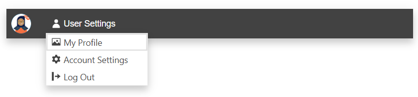
3. Configure the Avatar and DropDownButton Items
The next step is to integrate the Avatar and DropDownButton components by using the Template component.
    @using Kendo.Mvc.UI

    <div class="appbar-container">
        @(Html.Kendo().AppBar()
            .Name("appbar")
            .Position(AppBarPosition.Top)
            .PositionMode(AppBarPositionMode.Sticky)
            .ThemeColor(AppBarThemeColor.Dark)
            .Items(items=> {
                items.Add().Template(Html.Kendo().Template().AddComponent(avatar => avatar
                    .Avatar()
                    .Name("avatar")
                    .Type(AvatarType.Image)
                    .Size(ComponentSize.Medium)
                    .Rounded(Rounded.Full)
                    .Image(@Url.Content("~/shared/web/Kendoka-32.png"))
                )).Type(AppBarItemType.ContentItem);
                items.Add().Type(AppBarItemType.Spacer).Width("8px");
                items.Add().Template(Html.Kendo().Template().AddComponent(ddlbtn => ddlbtn
                    .DropDownButton()
                    .Name("userSettings")
                    .Text("User Settings")
                    .Icon("user")
                    .FillMode(FillMode.Flat)
                    .Rounded(Rounded.Full)
                    .Items(items=>{
                        items.Add().Id("profile").Text("My Profile").Icon("image");
                        items.Add().Id("settings").Text("Account Settings").Icon("gear");
                        items.Add().Id("logout").Text("Log Out").Icon("logout");
                    })
                )).Type(AppBarItemType.ContentItem);
            })
        )
    </div>
    @addTagHelper *, Kendo.Mvc

    <div class="appbar-container">
        <kendo-appbar name="appbar" position="AppBarPosition.Top"
        position-mode="AppBarPositionMode.Sticky"
        theme-color="AppBarThemeColor.Dark">
            <items>
                <appbar-item type="AppBarItemType.ContentItem">
                    <template>
                        <kendo-avatar name="avatar"
                            type="AvatarType.Image"
                            size="ComponentSize.Medium"
                            rounded="Rounded.Full"
                            image=@Url.Content("~/shared/web/Kendoka-32.png")>
                        </kendo-avatar>
                    </template>
                </appbar-item>
                <appbar-item width="8px" type="AppBarItemType.Spacer">
                </appbar-item>
                <appbar-item type="AppBarItemType.ContentItem">
                    <template>
                        <kendo-dropdownbutton name="userSettings" text="User Settings" icon="user" rounded="Rounded.Full" fill-mode="FillMode.Flat">
                            <dropdownbutton-items>
                                <item id="profile" text="My Profile" icon="image"></item>
                                <item id="settings" text="Account Settings" icon="gear"></item>
                                <item id="logout" text="Log Out" icon="logout"></item>
                            </dropdownbutton-items>
                        </kendo-dropdownbutton>
                    </template>
                </appbar-item>
            </items>
        </kendo-appbar>
    </div>
4. Handle the AppBar Events
The AppBar exposes the Resize event that you can handle and further customize the functionality of the component during its resizing. In this tutorial, you will use the Resize event to capture when the AppBar is resized and the viewport is less or equal to 400 pixels wide.
    @using Kendo.Mvc.UI

    <div class="appbar-container">
        @(Html.Kendo().AppBar()
            .Name("appbar")
            .Position(AppBarPosition.Top)
            .PositionMode(AppBarPositionMode.Sticky)
            .ThemeColor(AppBarThemeColor.Dark)
            .Events(ev => ev.Resize("oResize"))
            .Items(items=> {
                items.Add().Template(Html.Kendo().Template().AddComponent(avatar => avatar
                    .Avatar()
                    .Name("avatar")
                    .Type(AvatarType.Image)
                    .Size(ComponentSize.Medium)
                    .Rounded(Rounded.Full)
                    .Image(@Url.Content("~/shared/web/Kendoka-32.png"))
                )).Type(AppBarItemType.ContentItem);
                items.Add().Type(AppBarItemType.Spacer).Width("8px");
                items.Add().Template(Html.Kendo().Template().AddComponent(ddlbtn => ddlbtn
                    .DropDownButton()
                    .Name("userSettings")
                    .Text("User Settings")
                    .Icon("user")
                    .FillMode(FillMode.Flat)
                    .Rounded(Rounded.Full)
                    .Items(items=>{
                        items.Add().Id("profile").Text("My Profile").Icon("image");
                        items.Add().Id("settings").Text("Account Settings").Icon("gear");
                        items.Add().Id("logout").Text("Log Out").Icon("logout");
                    })
                )).Type(AppBarItemType.ContentItem);
            })
        )
    </div>
    @addTagHelper *, Kendo.Mvc

    <div class="appbar-container">
        <kendo-appbar name="appbar" position="AppBarPosition.Top" on-resize="onResize"
        position-mode="AppBarPositionMode.Sticky"
        theme-color="AppBarThemeColor.Dark">
            <items>
                <appbar-item type="AppBarItemType.ContentItem">
                    <template>
                        <kendo-avatar name="avatar"
                            type="AvatarType.Image"
                            size="ComponentSize.Medium"
                            rounded="Rounded.Full"
                            image=@Url.Content("~/shared/web/Kendoka-32.png")>
                        </kendo-avatar>
                    </template>
                </appbar-item>
                <appbar-item width="8px" type="AppBarItemType.Spacer">
                </appbar-item>
                <appbar-item type="AppBarItemType.ContentItem">
                    <template>
                        <kendo-dropdownbutton name="userSettings" text="User Settings" icon="user" rounded="Rounded.Full" fill-mode="FillMode.Flat">
                            <dropdownbutton-items>
                                <item id="profile" text="My Profile" icon="image"></item>
                                <item id="settings" text="Account Settings" icon="gear"></item>
                                <item id="logout" text="Log Out" icon="logout"></item>
                            </dropdownbutton-items>
                        </kendo-dropdownbutton>
                    </template>
                </appbar-item>
            </items>
        </kendo-appbar>
    </div>
    <script>
        function onReszie() {
            if (window.matchMedia("(max-width: 400px)").matches) {
                // Trigger custom JavaScript logic when the AppBar is resized and the viewport id up to 400px wide.
            }
        }
     </script>
5. (Optional) Reference Existing AppBar Instances
You can reference the AppBar instances that you have created and build on top of their existing configuration.
Use the id attribute of the component instance to get its reference.
    <script>
        $(document).ready(function() {
            var appBarReference = $("#appbar").data("kendoAppBar"); // appBarReference is a reference to the existing AppBar instance of the helper.
        });
    </script>
For more information on referencing specific helper instances, see the Methods and Events article.
Explore this Tutorial in REPL
You can continue experimenting with the code sample above by running it in the Telerik REPL server playground: