Getting Started with the Linear Gauge
This tutorial explains how to set up a basic Telerik UI for ASP.NET Core Linear Gauge and highlights the major steps in the configuration of the component.
You will initialize a Linear Gauge and set up the Scale property, which configures the visualization of the gauge. Then, you will use JavaScript to update the value of the Linear Gauge using its client-side reference. Finally, you can run the sample code in Telerik REPL and continue exploring the components.
Prerequisites
To successfully complete the tutorial, you need a project that is already configured to use the Telerik UI for ASP.NET Core components:
You can use the Telerik REPL playground and skip installing the components on your system and configuring a project.
-
You can prepare a Visual Studio project by following the following guide:
- Creating a new pre-configured project for the Telerik UI for ASP.NET Core components from a project template.
1. Prepare the CSHTML File
The first step is to add the required directives at the top of the .cshtml document:
-
To use the Telerik UI for ASP.NET Core HtmlHelpers:
@using Kendo.Mvc.UI -
To use the Telerik UI for ASP.NET Core TagHelpers:
@addTagHelper *, Kendo.Mvc
Optionally, you can structure the document by adding the desired HTML elements like headings, divs, and paragraphs. In this tutorial, you will also apply some styles to the gauge and its container.
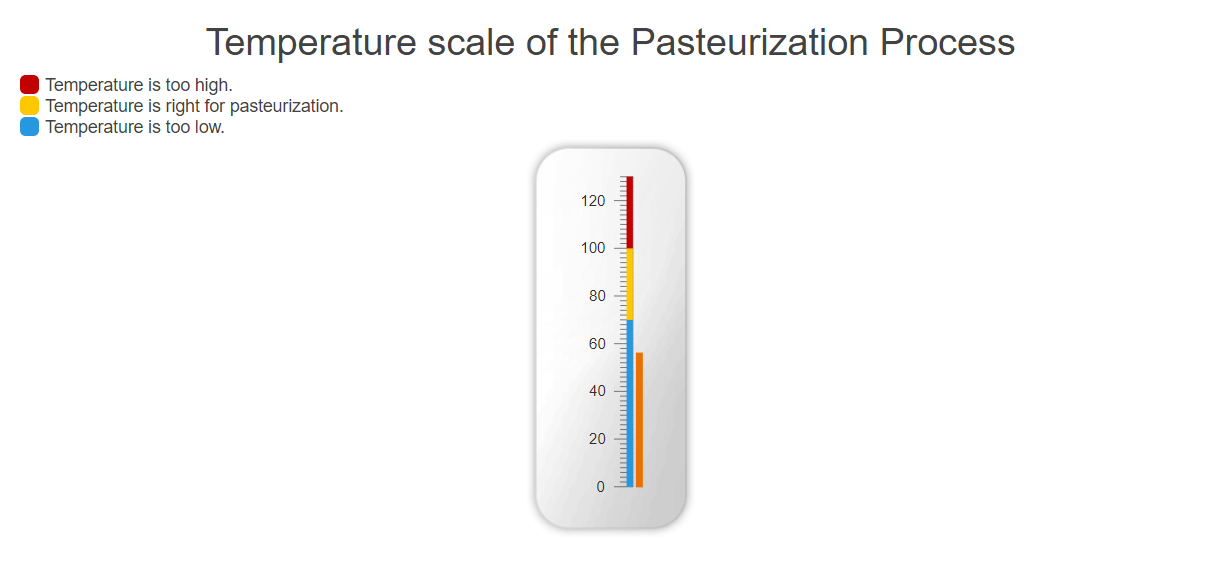
    <h2>Tempretature scale of the Pasteurization Process</h2>
    <div class="legend">
        <div class="legend-item">
            <span class="color red"></span>
                Temperature is too high.
        </div>
        <div class="legend-item">
            <span class="color yellow"></span>
                Temperature is right for pasteurization.
        </div>
        <div class="legend-item">
            <span class="color blue"></span>
                Temperature is too low.
        </div>
    </div>
    <div id="gauge-container">
            <!-- Component Configuration -->
    </div>
    <style>
        #gauge-container {
            text-align: center;
            margin: 0 auto;
            background: transparent url("@Url.Content("~/shared/dataviz/gauge/linear-gauge-container.png")") no-repeat 50% 50%;
            background-size: contain;
            background-position:bottom;
            padding: 18px;
            width: 320px;
            height: 320px;
        }

        #gauge {
            height: 100%;
            display: inline-block;
            zoom: 1;
        }
        h2{
            display:flex;
            justify-content:center;
        }
        .legend-item{
            display:flex;
            flex-direction: row;
        }
        .color{
            display:flex;
            width: 15px;
            height: 15px;
            margin-right:5px;
            border-radius:30%;
        }
        .red{
            background-color:#c20000;
        }
        .yellow{
            background-color:#ffc700;
        }
        .blue{
            background-color:#2798df;
        }
    </style>
2. Initialize the Linear Gauge
Use the Linear Gauge HtmlHelper or TagHelper to add the component to a page:
- The
Name()configuration method is mandatory as its value is used for theidand thenameattributes of the Linear Gauge element. - Utilize the
LinearGaugePointerBuilder'sValuemethod to set an initial value for the Linear Gauge.
    @using Kendo.Mvc.UI

   @(Html.Kendo().LinearGauge()
          .Name("gauge")
          .Pointer(pointer => pointer.Value(56))
    )
    @using Kendo.Mvc.UI
    @addTagHelper *, Kendo.Mvc

    <kendo-lineargauge name="gauge">
        <lineargauge-pointers>
            <pointer value="56"></pointer>
        </lineargauge-pointers>
    </kendo-lineargauge>
3. Configure the Linear Gauge
Configure the Scale configuration method of the Linear Gauge. It exposes the LinearGaugeScaleSettingsBuilder which allows you to set up the Min, Max, MajorTicks, MinorTicks, Labels and Ranges properties.
The Ranges property exposes the following configuration methods that are responsible for the graphics rendering of the component:
-
From— The start position of the range in scale units. -
To— The end position of the range in scale units. -
Color— The color of the range. Any valid CSS color string will work here, including hex and rgb. -
Opacity— The opacity of the range.
Finally, fine tune the size and the position of the component with the GaugeAreas's Height and Margin properties.
    @using Kendo.Mvc.UI

   @(Html.Kendo().LinearGauge()
          .Name("gauge")
          .Pointer(pointer => pointer.Value(56))
          .Scale(scale => scale
              .MajorUnit(20)
              .MinorUnit(2)
              .Min(0)
              .Max(130)
              .Ranges(ranges =>
              {
                  ranges.Add().From(0).To(70).Color("#2798df");
                  ranges.Add().From(70).To(100).Color("#ffc700");
                  ranges.Add().From(100).To(130).Color("#c20000");
              }
              )
          )
          .GaugeArea(g=>g.Height(280).Margin(m=>m.Top(30)))
    )
    @using Kendo.Mvc.UI
    @addTagHelper *, Kendo.Mvc

    <kendo-lineargauge name="gauge">
        <lineargauge-pointers>
            <pointer value="56"></pointer>
        </lineargauge-pointers>
        <scale major-unit="20" minor-unit="2" min="0" max="130">
            <lineargauge-scale-ranges>
                <range color="#2798df" from="0" to="70">
                </range>
                <range color="#ffc700" from="70" to="100">
                </range>
                <range color="#c20000" from="100" to="130">
                </range>
            </lineargauge-scale-ranges>
        </scale>
        <gauge-area height="280">
            <lineargauge-gauge-area-margin top="30"/>
        </gauge-area>
    </kendo-lineargauge>
4. (Optional) Reference Existing Linear Gauge Instances
You can reference the Linear Gauge instances that you have created and build on top of their existing configuration:
-
Use the
idattribute of the component instance to establish a reference.$(document).ready( function (e) { var lineargaugeReference = $("#gauge").data("kendoLinearGauge"); // lineargaugeReference is a reference to the existing Linear Gauge instance of the helper. }); -
Use the Linear Gauge client-side API to control the behavior of the component. In this example, you will use the
valuemethod to change the value of the Linear Gauge every second to ensure that the visualized thermometer is exact.setInterval(function(){ updateValue(temperatureSensor); // update the value of the Linear Gauge based on external input every second },1000) function updateValue(number) { var gauge = $("#gauge").data("kendoLinearGauge"); gauge.value(number); }
Explore this Tutorial in REPL
You can continue experimenting with the code sample above by running it in the Telerik REPL server playground: