Getting Started with the DateTimePicker
This tutorial explains how to set up a basic Telerik UI for ASP.NET Core DateTimePicker and highlights the major steps in the configuration of the component.
You will initialize a DateTimePicker control with a number of tools. Next, you will handle some of the DateTimePicker events. Finally, you can run the sample code in Telerik REPL and continue exploring the components.
Prerequisites
To successfully complete the tutorial, you need a project that is already configured to use the Telerik UI for ASP.NET Core components:
You can use the Telerik REPL playground and skip installing the components on your system and configuring a project.
-
You can prepare a Visual Studio project by following the following guide:
- Creating a new pre-configured project for the Telerik UI for ASP.NET Core components from a project template.
1. Prepare the CSHTML File
The first step is to add the required directives at the top of the .cshtml document:
-
To use the Telerik UI for ASP.NET Core HtmlHelpers:
@using Kendo.Mvc.UI -
To use the Telerik UI for ASP.NET Core TagHelpers:
@addTagHelper *, Kendo.Mvc
Optionally, you can structure the document by adding the desired HTML elements like headings, divs, paragraphs, and apply some basic styles.
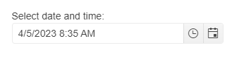
2. Initialize the DateTimePicker
Use the DateTimePicker HtmlHelper or TagHelper to add the component to a page:
The
Name()configuration method is mandatory as its value is used for theidand thenameattributes of the DateTimePicker element.The
Culture()configuration method specifies the culture info used by the widget.Dateandtimevalues typically vary by culture. For example, the"d"standard format string indicates that a date and time value is to be displayed using a short date pattern. For the invariant culture, this pattern is"MM/dd/yyyy". For thefr-FRculture, it is"dd/MM/yyyy". For theja-JPculture, it is"yyyy/MM/dd".The
Depthconfiguration method specifies the navigation depth. The available parameter settings aremonth,year,decade, andcentury.
@using Kendo.Mvc.UI

    @(Html.Kendo().DateTimePicker()
            .Name("datetimepicker")
            .Value(DateTime.Now)
            .Culture("fr-FR")
            .Depth(CalendarView.Month)
    )
@addTagHelper *, Kendo.Mvc

    <kendo-datetimepicker value="DateTime.Now" name="datetimepicker" culture="fr-FR" depth="CalendarView.Year">
    </kendo-datetimepicker>
3. Handle the DateTimePicker Events
The DateTimePicker exposes various events that you can handle and further customize the functionality of the component. In this tutorial, you will use the Open, Close, and Change events of the DateTimePicker.
@using Kendo.Mvc.UI

    @(Html.Kendo().DateTimePicker()
            .Name("datetimepicker")
            .Value(DateTime.Now)
            .Culture("fr-FR")
            .Depth(CalendarView.Month)
              .Events(e =>
              {
                  e.Change("change").Open("open").Close("close");
              })
    )

<script>
    function open(e) {
        console.log("Open :: " + e.view + "-view");
    }

    function close(e) {
        console.log("Close :: " + e.view + "-view");
    }

    function change() {
        console.log("Change :: " + kendo.toString(this.value(), 'g'));
    }
</script>
@addTagHelper *, Kendo.Mvc

        <kendo-datetimepicker value="DateTime.Now" name="datetimepicker" culture="fr-FR" depth="CalendarView.Year" on-change="change" on-open="open" on-close="close">
        </kendo-datetimepicker>

<script>
    function open(e) {
        console.log("Open :: " + e.view + "-view");
    }

    function close(e) {
        console.log("Close :: " + e.view + "-view");
    }

    function change() {
        console.log("Change :: " + kendo.toString(this.value(), 'g'));
    }
</script>
For more examples, refer to the demo on using the events of the DateTimePicker.
4. (Optional) Reference Existing DateTimePicker Instances
To use the client-side API of the DateTimePicker and build on top of its initial configuration, you need a reference to the DateTimePicker instance. Once you get a valid reference, you can call the respective API methods:
-
Use the
.Name()(idattribute) of the component instance to get a reference.<script> var dateTimePickerReference = $("#datetimepicker").data("kendoDateTimePicker"); // DateTimePicker Reference is a reference to the existing instance of the helper. </script> -
Use the client-side API of the DateTimePicker to control the behavior of the widget. In this example, you will use the
enablemethod to disable the DateTimePicker.<script> $(document).ready(function () { var dateTimePicker= $("#datetimepicker").data("kendoDateTimePicker"); dateTimePicker.enable(false); }) </script>
For more information on referencing specific helper instances, see the Methods and Events article.
Explore this Tutorial in REPL
You can continue experimenting with the code sample above by running it in the Telerik REPL server playground: