Getting Started with the ColorGradient
This tutorial explains how to set up a basic Telerik UI for ASP.NET Core ColorGradient and highlights the major steps in the configuration of the component.
You will initialize a ColorGradient component and use its Change event to dynamically change the color of the page's background. Finally, you can run the sample code in Telerik REPL and continue exploring the components.
Prerequisites
To successfully complete the tutorial, you need a project that is already configured to use the Telerik UI for ASP.NET Core components:
You can use the Telerik REPL playground and skip installing the components on your system and configuring a project.
-
You can prepare a Visual Studio project by following the following guide:
- Creating a new pre-configured project for the Telerik UI for ASP.NET Core components from a project template.
1. Prepare the CSHTML File
The first step is to add the required directives at the top of the .cshtml document:
-
To use the Telerik UI for ASP.NET Core HtmlHelpers:
@using Kendo.Mvc.UI -
To use the Telerik UI for ASP.NET Core TagHelpers:
@addTagHelper *, Kendo.Mvc
You will also add some sample data that the ColorGradient will display. Optionally, you can structure the content in the view by adding the desired HTML elements like headings, divs, paragraphs, and others.
<div class="main-container k-d-flex k-flex-col">
<div class="k-d-flex k-gap-3 k-align-items-center k-mb-5">
</div>
<div class="k-d-flex k-flex-col k-gap-1">
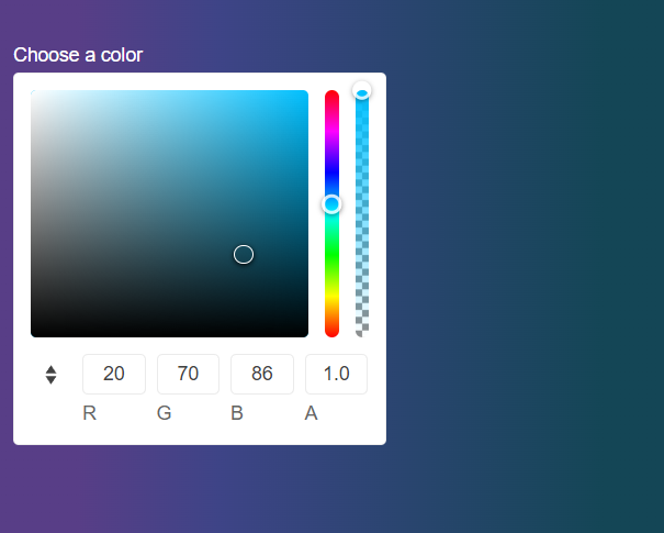
<label for="colorGradient">Choose a color</label>
</div>
</div>
<style>
label{
color:white;
}
body{
background: linear-gradient(90deg,#583e87ff 14%, #3e4487ff 34%, #3e7587ff 89%);
}
</style>
2. Initialize the ColorGradient
Use the ColorGradient HtmlHelper or TagHelper to add the component to the page:
- Assign a name to the component by using the
Name()configuration method—this is mandatory as the assigned value is used for theidand thenameattributes of the ColorGradient element. - Set the initial color selected by the control through its
Valueconfiguration method. - Use the
Opacityconfiguration method to enable the opacity slider and allow the users to adjust the transparency.
    @using Kendo.Mvc.UI

    <div class="main-container k-d-flex k-flex-col">
            <div class="k-d-flex k-gap-3 k-align-items-center k-mb-5">
            </div>
            <div class="k-d-flex k-flex-col k-gap-1">
                <label for="colorGradient">Choose a color</label>
                @(Html.Kendo().ColorGradient()
                    .Name("colorGradient")
                    .Value("#3e7587ff")
                    .Opacity(true)
                )
            </div>
    </div>
    <style>
        label{
            color:white;
        }
        body{
            background: linear-gradient(90deg,#583e87ff 14%, #3e4487ff 34%, #3e7587ff 89%);
        }
    </style>
    @addTagHelper *, Kendo.Mvc

    <div class="main-container k-d-flex k-flex-col">
            <div class="k-d-flex k-gap-3 k-align-items-center k-mb-5">
            </div>
            <div class="k-d-flex k-flex-col k-gap-1">
                <label for="colorGradient">Choose a color</label>

                <kendo-colorgradient name="colorGradient"
                        value="#3e7587ff"
                        opacity="true">
                </kendo-colorgradient>
            </div>
    </div>
    <style>
        label{
            color:white;
        }
        body{
            background: linear-gradient(90deg,#583e87ff 14%, #3e4487ff 34%, #3e7587ff 89%);
        }
    </style>
3. Configure the Format
The next step is to set the available formats through the Formats configuration and to select the one that is used by default through the Format method.
    @using Kendo.Mvc.UI

    <div class="main-container k-d-flex k-flex-col">
            <div class="k-d-flex k-gap-3 k-align-items-center k-mb-5">
            </div>
            <div class="k-d-flex k-flex-col k-gap-1">
                <label for="colorGradient">Choose a color</label>
                @(Html.Kendo().ColorGradient()
                    .Name("colorGradient")
                    .Value("#3e7587ff")
                    .Opacity(true)
                    .Formats(new string[] { "rgb", "hex" })
                    .Format(ColorGradientFormat.Rgb)
                )
            </div>
    </div>
    <style>
        label{
            color:white;
        }
        body{
            background: linear-gradient(90deg,#583e87ff 14%, #3e4487ff 34%, #3e7587ff 89%);
        }
    </style>
    @addTagHelper *, Kendo.Mvc
    @{
        var format_types = new string[] { "rgb", "hex" };
    }

    <div class="main-container k-d-flex k-flex-col">
            <div class="k-d-flex k-gap-3 k-align-items-center k-mb-5">
            </div>
            <div class="k-d-flex k-flex-col k-gap-1">
                <label for="colorGradient">Choose a color</label>
                <kendo-colorgradient name="colorGradient"
                        value="#3e7587ff"
                        opacity="true"
                        formats="format_types"
                        format="ColorGradientFormat.Rgb">
                </kendo-colorgradient>
            </div>
    </div>
    <style>
        label{
            color:white;
        }
        body{
            background: linear-gradient(90deg,#583e87ff 14%, #3e4487ff 34%, #3e7587ff 89%);
        }
    </style>
3. Handle a ColorGradient Event
The ColorGradient component exposes useful events for implementing custom requirements. In this example, you will use the Change() event in use to access the selected color of the ColorGradient and then apply that color to the background of the page.
    @using Kendo.Mvc.UI

    <div class="main-container k-d-flex k-flex-col">
            <div class="k-d-flex k-gap-3 k-align-items-center k-mb-5">
            </div>
            <div class="k-d-flex k-flex-col k-gap-1">
                <label for="colorGradient">Choose a color</label>
                @(Html.Kendo().ColorGradient()
                    .Name("colorGradient")
                    .Value("#3e7587ff")
                    .Opacity(true)
                    .Format(ColorGradientFormat.Rgb)
                    .Formats(new string[] { "rgb", "hex" })
                    .Events(e => e.Change("select"))
                )
            </div>
    </div>
    <style>
        label{
            color:white;
        }
        body{
            background: linear-gradient(90deg,#583e87ff 14%, #3e4487ff 34%, #3e7587ff 89%);
        }
    </style>
    @addTagHelper *, Kendo.Mvc

    @{
        var format_types = new string[] { "rgb", "hex" };
    }


    <div class="main-container k-d-flex k-flex-col">
            <div class="k-d-flex k-gap-3 k-align-items-center k-mb-5">
            </div>
            <div class="k-d-flex k-flex-col k-gap-1">
                <label for="colorGradient">Choose a color</label>

                <kendo-colorgradient name="colorGradient"
                                    value="#3e7587ff"
                                    opacity="true"
                                    format="ColorGradientFormat.Rgb"
                                    formats="format_types"
                                    on-change="select">
                </kendo-colorgradient>
            </div>
    </div>
    <style>
        label{
            color:white;
        }
        body{
            background: linear-gradient(90deg,#583e87ff 14%, #3e4487ff 34%, #3e7587ff 89%);
        }
    </style>
    <script>
        function select(e) {
            var selectedColor = e.value;
            var gradient =  `linear-gradient(90deg,#583e87ff 14%, #3e4487ff 34%, ${selectedColor} 89%)`;
            $("body").css('background',gradient);
        }
    </script>
5. (Optional) Reference Existing ColorGradient Instances
To use the client-side API of the ColorGradient and build on top of its initial configuration, you need a reference to the ColorGradient instance. Once you get a valid reference, you can call the respective API methods:
-
Use the
.Name()(idattribute) of the component instance to get a reference.<script> $(document).ready(function() { var colorgradientReference = $("#colorgradient").data("kendoColorGradient"); // colorgradientReference is a reference to the existing ColorGradient instance of the helper. }) </script> -
Use the ColorGradient client-side API to control the behavior of the control. In this example, you will use the
valuemethod to change the color programmatically.<script> $(document).ready(function() { var colorgradientReference = $("#colorgradient").data("kendoColorGradient"); // colorgradientReference is a reference to the existing ColorGradient instance of the helper. colorgradientReference.value("yellow"); }) </script>
Explore this Tutorial in REPL
You can continue experimenting with the code sample above by running it in the Telerik REPL server playground: