LayoutControlToolBoxView
LayoutControlToolBoxView is the control that represents the toolbox. This article demonstrates how to set it up and associate it with RadLayoutControl.
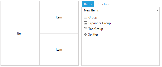
Example 1: Setting up the toolbox
 <StackPanel Orientation="Horizontal">
    <telerik:RadLayoutControl x:Name="layout" Width="300" Height="250">
        <Button Content="Item" />
        <telerik:LayoutControlGroup Orientation="Vertical">
            <Button Content="Item" />
            <Button Content="Item"/>
        </telerik:LayoutControlGroup>
    </telerik:RadLayoutControl>
    <telerik:LayoutControlToolBoxView LayoutControl="{Binding ElementName=layout}" Width="300" Height="250"/>
</StackPanel>
Figure 1: Final result
Dropping items from the toolbox into the layout control is allowed only if the layout control is in edit mode.
You can get, add or remove the elements from the toolbox using the NewItems and DeletedItems collections of the LayoutControlToolBoxView control.
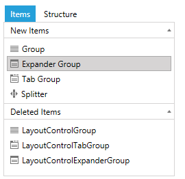
Tracking the deleted items
The toolbox allows you to track and restore the items that was removed from the layout. Once an item is deleted, it is added in the DeletedItems collection of the LayoutControlToolBoxView. You can restore the element back in the layout by drag/droping it from the Deleted Items to the RadLayoutControl.
This feature is disabled by default. You can enable it by setting the TrackDeletedItems property to True.
Example 2: Enabling the deleted items tracking
<telerik:LayoutControlToolBoxView TrackDeletedItems="True"/>
Figure 2: Deleted items
LayoutControlHierarchicalNodeProxy
LayoutControlHierarchicalNodeProxy is the model of the toolbox items. The LayoutControlToolBoxView element exposes two collections – one with the elements displayed in the New Items section and another one displayed in the Deleted Items section. The collections can be accessed respectively through the NewItems and DeletedItems properties which are of type ObservableCollection<LayoutControlHierarchicalNodeProxy>.
The proxy object contains information about the elements in the toolbox.
- Header: You can use this property to set a string that represents the header of the toolbox item.
- OriginalItemType: This property holds the type of the associated element.
- OriginalItem: This property holds the associated element.
By default the toolbox is populated with a collection that contains all available layout controls. But you can use the NewItems collection and the LayoutControlHierarchicalNodeProxy class to add custom UIElements in the toolbox. Read more about this in the Add Custom Element in the ToolBox article.