LayoutControlToolBox
LayoutControlToolBox can be used to embed the toolbox into the layout control. This article demonstrates how to set it up and associate it with RadLayoutControl.
- Setting up the toolbox
- Manually control the toolbox view visibility
- Customize the toolbox view
- Style the toolbox view host window
- Position the toolbox button
Setting up the toolbox
This section shows a sample toolbox definition.
Example 1: Setting up the toolbox in XAML
<telerik:RadLayoutControl x:Name="layout">
    <telerik:RadLayoutControl.AdditionalCanvasItems>
        <telerik:LayoutControlToolBox LayoutControl="{Binding ElementName=layout}" />
    </telerik:RadLayoutControl.AdditionalCanvasItems>
</telerik:RadLayoutControl>
Example 2: Setting up the toolbox in code
RadLayoutControl layoutControl = new RadLayoutControl();
var toolbox = new LayoutControlToolBox();
toolbox.LayoutControl = layoutControl;
layoutControl.AdditionalCanvasItems.Add(toolbox);
Dim layoutControl As New RadLayoutControl()
Dim toolbox = New LayoutControlToolBox()
toolbox.LayoutControl = layoutControl
layoutControl.AdditionalCanvasItems.Add(toolbox)
The toolbox can be associated with RadLayoutControl through its LayoutControl property (see Example 1).
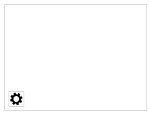
Initially, the LayoutControlToolBox displays a single toggle button (see Figure 1).
Figure 1: Closed toolbox
The toggle button will be displayed only if the layout control is in edit mode.
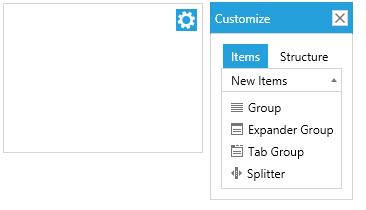
When the button is clicked the toolbox view will be opened in a popup.
Figure 2: Toolbox view
Manually control the toolbox view visibility
You can manually control the state of the toolbox through the IsOpen property of LayoutControlToolBox.
Example 3: Setting the IsOpen property in XAML
<telerik:LayoutControlToolBox IsOpen="True" />
Example 4: Setting the IsOpen property in code
layoutControlToolBox.IsOpen = true;
layoutControlToolBox.IsOpen = True;
Customize the toolbox view
The popup of the LayoutControlToolBox component contains a LayoutControlToolBoxView element. You can use the ToolBoxView property to get this element and modify it. Or to define a new toolbox view and assign it to the LayoutControlToolBox.
Example 5: Replacing the default toolbox view
<telerik:RadLayoutControl x:Name="layout">
    <telerik:RadLayoutControl.AdditionalCanvasItems>
        <telerik:LayoutControlToolBox LayoutControl="{Binding ElementName=layout}">
            <telerik:LayoutControlToolBox.ToolBoxView>
                <telerik:LayoutControlToolBoxView Opacity="0.5" Width="300" Height="300" />
            </telerik:LayoutControlToolBox.ToolBoxView>
        </telerik:LayoutControlToolBox>
    </telerik:RadLayoutControl.AdditionalCanvasItems>
</telerik:RadLayoutControl>
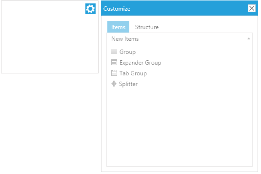
Figure 3: Modified toolbox view
Style the toolbox view host window
The toolbox view is displayed in a RadWindow element which can be customized through the WindowStyle property of LayoutControlToolBox.
Example 6: Setting custom window style
<telerik:RadLayoutControl x:Name="layout">
<telerik:RadLayoutControl.AdditionalCanvasItems>
<telerik:LayoutControlToolBox LayoutControl="{Binding ElementName=layout}">
<telerik:LayoutControlToolBox.WindowStyle>
<Style TargetType="telerik:RadWindow" BasedOn="{StaticResource LayoutControlToolBoxWindowStyle}">
<Setter Property="Width" Value="300" />
<Setter Property="Height" Value="300" />
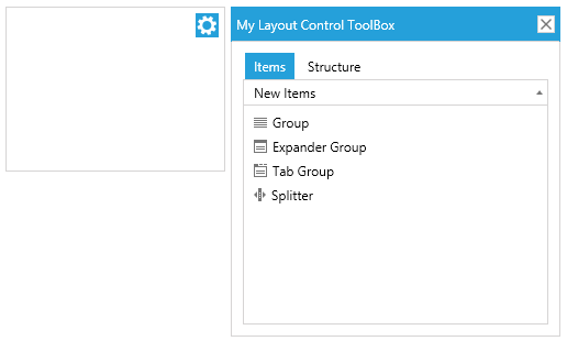
<Setter Property="Header" Value="My Layout Control ToolBox" />
</Style>
</telerik:LayoutControlToolBox.WindowStyle>
</telerik:LayoutControlToolBox>
</telerik:RadLayoutControl.AdditionalCanvasItems>
</telerik:RadLayoutControl>
The BasedOn setting is applicable only in a scenario with implicit styles. This attribute is set so that the custom style inherits the default toolbox window style. The LayoutControlToolBoxWindowStyle is located in the Telerik.Windows.Controls.Navigation.xaml ResourceDictionary.
Figure 4: Custom window style
Position the toolbox button
The button that opens the toolbox can be re-positioned in the additional items canvas of RadLayoutControl. This can be done via the Canvas.Left, Canvas.Top, Canvas.Right and Canvas.Bottom properties.
Example 7: Positioning the toggle button at the bottom-left side of the layout control
<telerik:RadLayoutControl>
    <telerik:RadLayoutControl.AdditionalCanvasItems>
        <telerik:LayoutControlToolBox Canvas.Left="0" Canvas.Bottom="0"
                                      LayoutControl="{Binding ElementName=layout}" />
    </telerik:RadLayoutControl.AdditionalCanvasItems>
</telerik:RadLayoutControl>
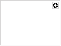
Figure 5: Bottom-right positioned button