Edit the Layout
Overview
RadLayoutControl supports rerranging and editing its layout at runtime. You can change the position, alignment and size of each layout group or UIElement that is direct child of a group or the control itself. Also, each group or UIElement can be removed from the layout. In order to do that the control should be in edit mode. This is done by setting the IsInEditMode property of RadLayoutControl to True.
Example 1: Setting IsInEditMode in XAML
<telerik:RadLayoutControl x:Name="layoutControl" IsInEditMode="True" />
Example 2: Setting IsInEditMode in code
this.layoutControl.IsInEditMode = true;
Setting the property to True will allow you to select the visual elements and groups, and drag them around.
Manipulation Pane
The manipulation pane allows control over the arrangement of the selected element. When the edit mode is enabled you can select the elements in the layout control. The pane will be displayed horizontally centered under the selected element.
Figure 1: RadLayoutControl Manipulation Pane
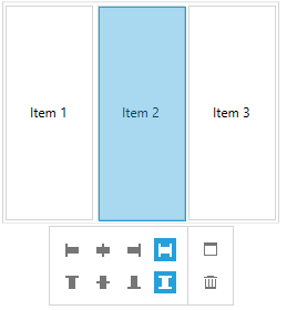
The following actions can be executed through the pane:
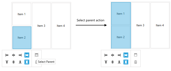
Delete: The element is removed from the layout control.
-
Select Parent: The selection is changed to the parent layout group__. If there is no parent group, the selection won't be changed.
Figure 2: Selecting the parent group
-
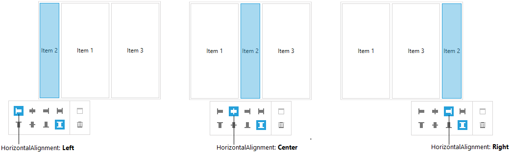
You can define the horizontal alignment of the selected element. There are the following options:
- Stretch (the default value): The element is horizontally stretched in the available space. Example 1 demonstrates stretch alignment.
- Center: The element is centered horizontally in the available space.
- Left: The element is horizontally left aligned in the available space.
- Right: The element is horizontally right aligned in the available space.
Figure 3: The horizontal alignment options
-
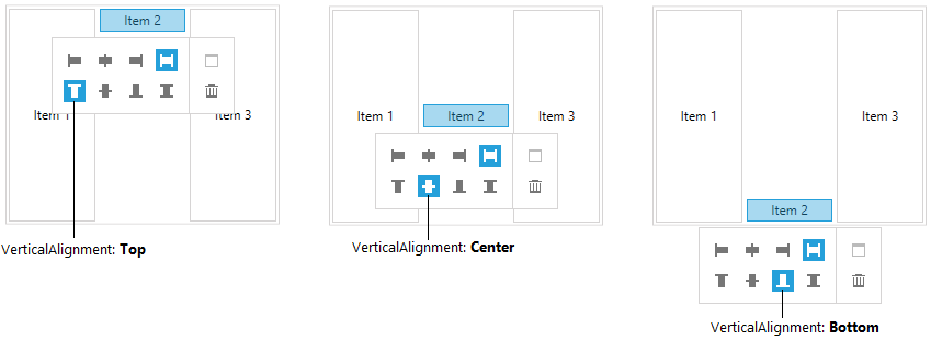
You can define the vertical alignment of the selected element. There are the following options:
- Stretch (the default value): The element is vertically stretched in the available space. Example 1 demonstrates stretch alignment.
- Center: The element is centered vertically in the available space.
- Top: The element is vertically left aligned in the available space.
- Bottom: The element is vertically right aligned in the available space.
Figure 4: The vertical alignment options
The alignment options work with the VerticalAlignment and HorizontalAlignment properties of the selected component. By default the elements are vertically and horizontally stretched. Setting the alignment properties manually will affect the selected option in the manipulation pane.
You can read more about the ordering and alignment of the items in the layout control in the Layout Panel help article.
Drag and Drop
The drag and drop feature of the control gives you the ability to rearrange the elements in the layout. When an item is selected you can drag and drop it over another position. The allowed positions where the dragged item can be dropped are displayed with the LayoutControlDropIndicator element.
Figure 5: Dragging an element triggers the logic that displays the drop indicators.
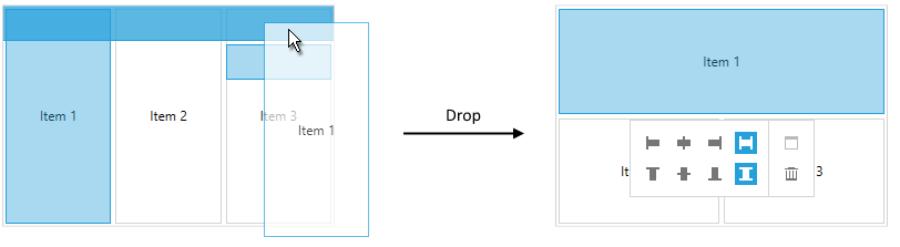
Depending on the drop position the layout control can change a panel's orientation or auto-generate additional layout groups.
Resizing
The items in the layout control can be resized by dragging their resize handles placed on their top, bottom, left and right borders.
Figure 6: Resizing
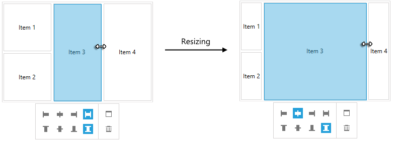
Setting the Height and Width of the selected element (UIElement or LayoutControlGroup) will also resize it.
The ManipulationPane of the control will always be horizontally aligned at the center of the selected element.