WinForms HeatMap Overview
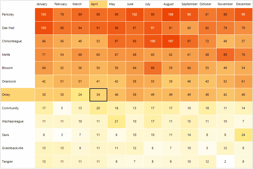
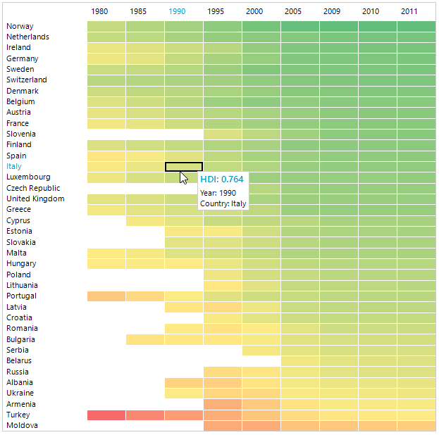
RadHeatMap can be used to visualize numeric data in a matrix like representation along two axes. Its purpose is to present the data in colored rectangles where the color of each represents the rectangle's value and makes it quite easy to perceive and compare all values.
The HeatMap is part of Telerik UI for WinForms, a
professional grade UI library with 160+ components for building modern and feature-rich applications. To try it out sign up for a free 30-day trial.
Key Features
Different visualization set up mechanisms: You can visualize the data differently based on the heat map definition. There are two definition types - Categorical and Horizontal/Vertical. Read more about this in the Definition Types article.
-
Colorizers: Each colorizer produces a collection of colors. RadHeatMap applies these colors to its children according to their values. You can choose from the following list of available colorizers to customize the way your HeatMap looks:
- HeatMapGradientColorizer: Represents a colorizer, which contains a set of GradientStops. It chooses the color to be applied to the RadHeatMap item's value and colorizer's gradient stops. Each GradientStop.Offset value can be absolute or relative (between 0 and 1) depending on the IsAbsolute property value.
- HeatMapRangeColorizer: Represents a colorizer, which contains a set of HeatMapRangeColor objects. It chooses the color to be applied according to the cell's value and the From and To values of each HeatMapRangeColor. The values of each HeatMapRangeColor can be absolute or relative (between 0 and 1) depending on the IsAbsolute property value.
- HeatMapDesaturationColorizer: Represents a colorizer, which reduces the level of saturation of a given StartColor depending on the HeatMapItem value. The level of desaturation can be controlled using From and To properties. Read more about this in the Colorizers article.
Selection: The control provides a visual selection of items. Read more about this in the Selection article.
Tooltips and ScreenTips: RadHeatMap supports tooltips or screentip for its items. You can further customize their content and display the details of the item itself. Read more about this in the ToolTip & ScreenTip article.
Row/Column Headers customization: You can easily customize the labels inside the row/column headers.
Labels: You can show labels in the cells generated for the plotted data.
Custom painting: RadHeatMap allows you to customize the appearance of the control as well as its elements. Read more about this in the Custom Painting article.
Legend: RadHeatMap offers built-in support for legend items – descriptions about the colorized values on the plot (released in R2 2023 SP1).
Get started with the control with its Getting Started help article that shows how to use it in a basic scenario.
Telerik UI for WinForms Learning Resources
- Telerik UI for WinForms Heatmap Homepage
- Get Started with the Telerik UI for WinForms Heatmap
- Telerik UI for WinForms API Reference
- Getting Started with Telerik UI for WinForms Components
- Telerik UI for WinForms Virtual Classroom (Training Courses for Registered Users)
- Telerik UI for WinForms Forum
- Telerik UI for WinForms Knowledge Base
Telerik UI for WinForms Additional Resources
- Telerik UI for WinForms Product Overview
- Telerik UI for WinForms Blog
- Telerik UI for WinForms Videos
- Telerik UI for WinForms Roadmap
- Telerik UI for WinForms Pricing
- Telerik UI for WinForms Code Library
- Telerik UI for WinForms Support
- What’s New in Telerik UI for WinForms