Visual Structure
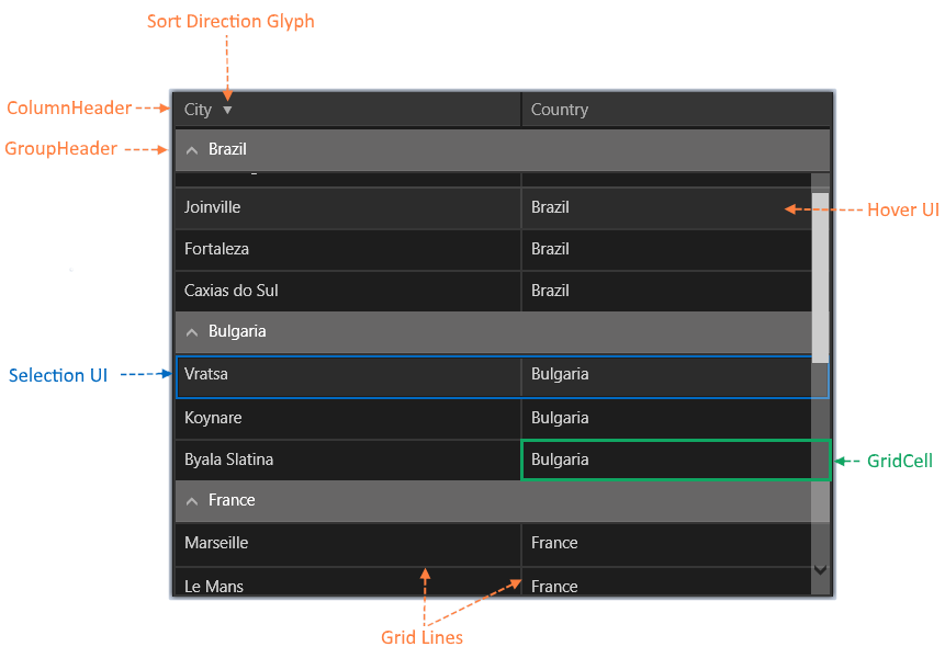
The following topic describes all visual elements and terms used in a standard RadDataGrid control.

Legend
- ColumnHeader: See how to set the Style of a ColumnHeader.
- SortingDirectionGlyph: This element displays the sort direction of the column elements if sorting is enabled. When clicked, it toggles between the column sorting options - accending/decsending/none.
- Filtering UI: Provides UI for applying filters to the grid rows depending on the data in the corresponding column.
- GroupHeader: See how to change the Style of a GroupHeader.
- Grouping UI:Provides UI for creating groups of grid items (rows). The items are grouped by the property in the specified column. Items can be grouped by more than one property.
- Expand/CollapseGroupButton: Expands or collapses the elements in a group. When collapsed, only the group header is displayed.
- Editing UI: Provides UI for editing the content of the grid cells.
- Selection UI: Provides UI for selecting grid items (rows).
- Hover UI: Provides UI for hovering grid items (rows).
- GridLine: Represents a single item from the grid ItemsSource.
- GridCell: Represents a property of a grid item. See how to change the Style of a GridCell content.