Inspecting the Padding
The padding property is essential when it comes to styling a component. This article demonstrates how to transfer the padding from the design to the component.
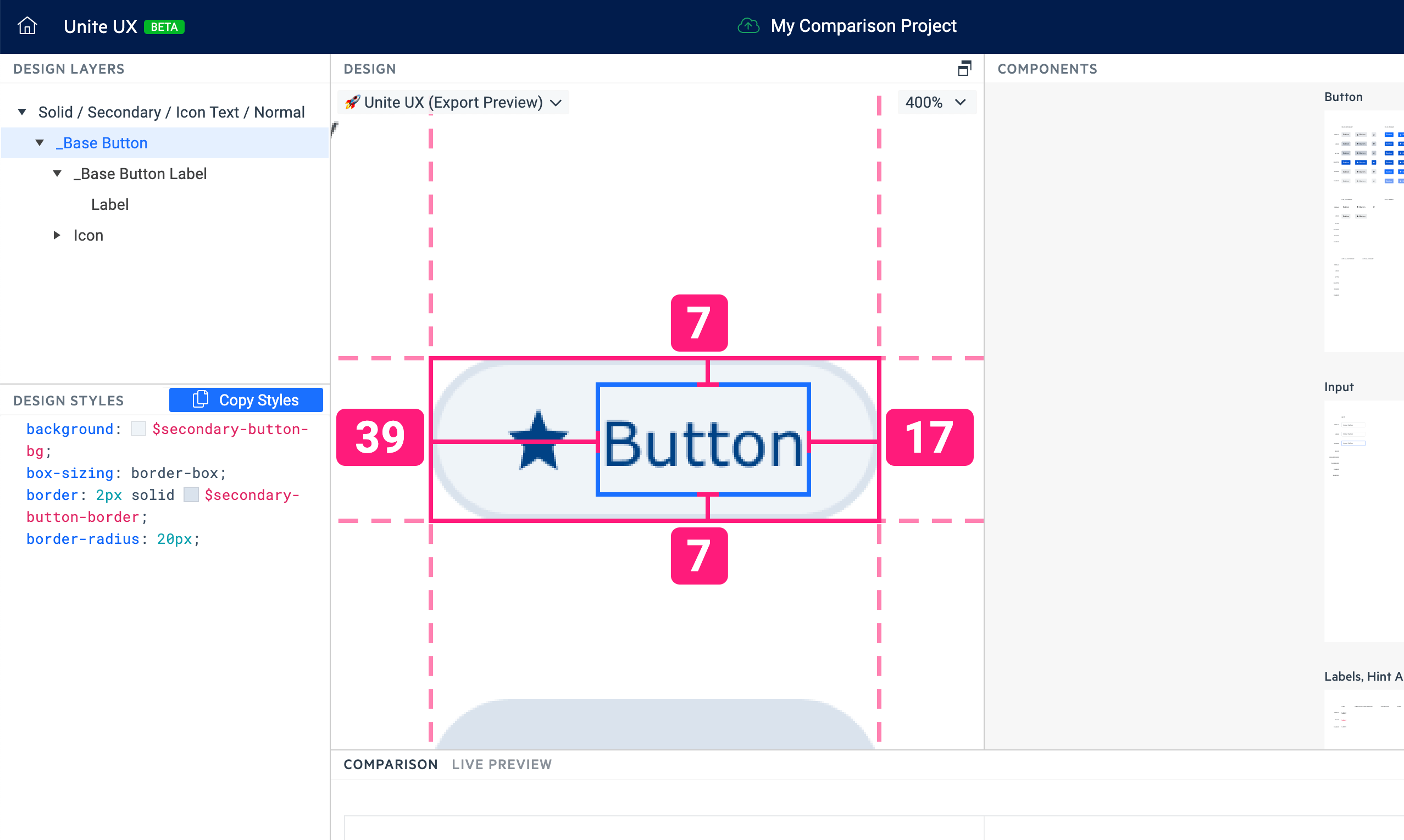
The image above shows how to inspect the design layer and to extract the information related to the padding:
- The distance between the text and the left end of the Button’s design is 39 px.
- The distance between the text and the right end of the Button’s design is 17px.
- The distance between the text and top and bottom of the Button’s design is 7 px.
- The Button has a 2px border (See the Design Styles pane).
To calculate the correct top and bottom padding for the UI component properties, you must apply a formula that considers the Figma metrics exporting nature. You must subtract the border width from the distance between the content and the end of the Button’s design.
Given the metrics from the screenshot above, the padding must be 5 px because:
- The distance between the text and top and bottom of the Button’s design is 7 px.
- The Button has a 2px border.
- 7 px - 2 px = 5 px.
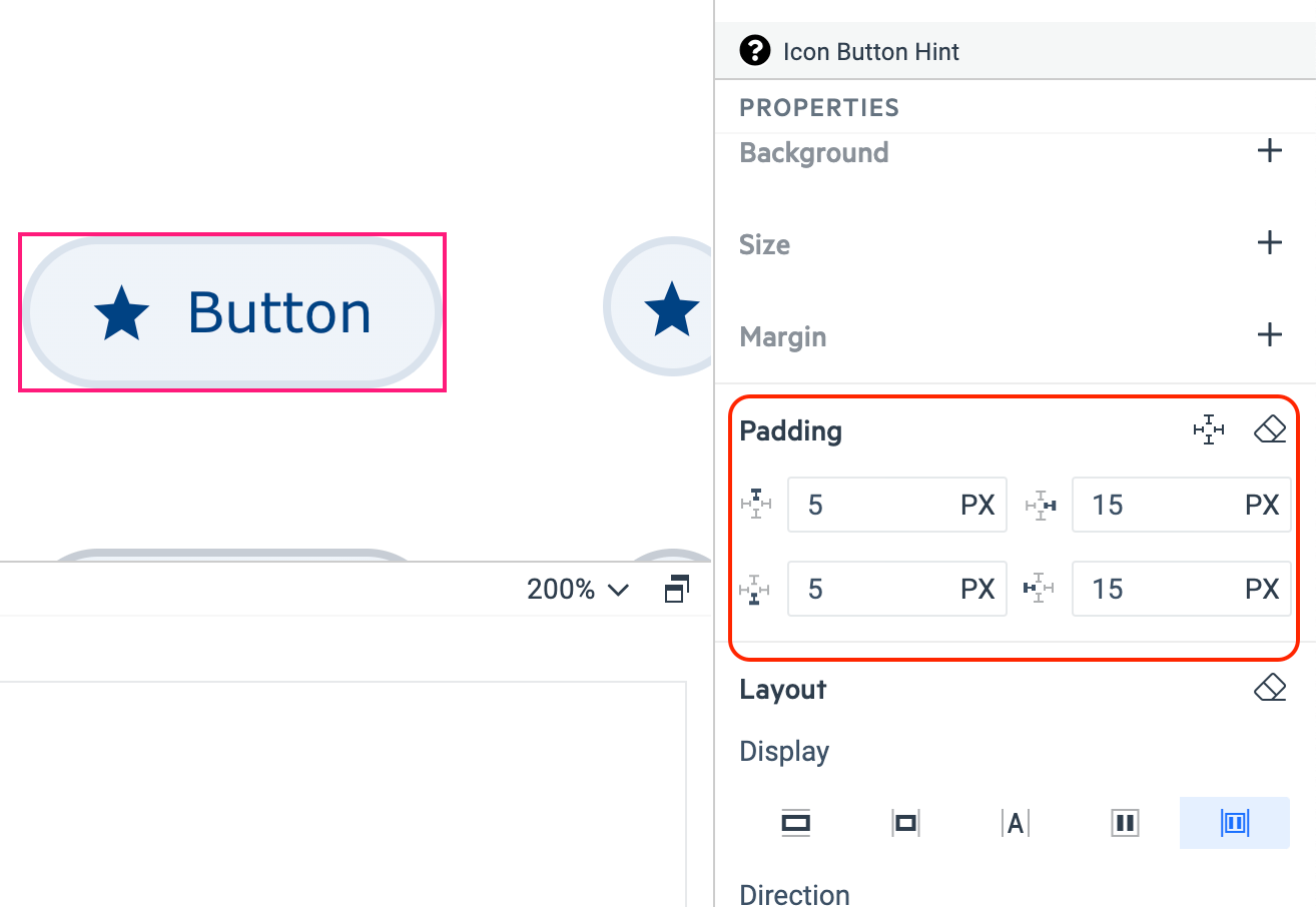
On the image below, you can see the resulting values for the Button's padding property.