Transitions
Transitions are the animation effects applied to the side drawer while it is being opened and closed.
Built-in Transitions
RadSideDrawer exposes several predefined transitions that can be used by customers. The desired transition can be set through DrawerTransitionType property of the SideDrawer.
DrawerTransitionType is enumeration which exposes the following members:
- Push (the default one)
- Fade
- Reveal
- ReverseSlideOut
- ScaleUp
- SlideAlong
- SlideInOnTop
- Custom
Here is a sample snippet on how you can set DrawerTransitionType property of RadSideDrawer:
<telerikPrimitives:RadSideDrawer x:Name="sideDrawer"
                                 DrawerTransitionType="SlideInOnTop">
    <telerikPrimitives:RadSideDrawer.MainContent>
        <StackLayout Orientation="Horizontal">
            <Label Text="Transition Type:" />
            <Label Text="SlideInOnTop" />
        </StackLayout>
    </telerikPrimitives:RadSideDrawer.MainContent>
    <telerikPrimitives:RadSideDrawer.DrawerContent>
        <Grid WidthRequest="220">
            <ListView x:Name="drawerList">
                <ListView.ItemsSource>
                    <x:Array Type="{x:Type x:String}">
                        <x:String>Inbox</x:String>
                        <x:String>Drafts</x:String>
                        <x:String>Sent Items</x:String>
                    </x:Array>
                </ListView.ItemsSource>
            </ListView>
        </Grid>
    </telerikPrimitives:RadSideDrawer.DrawerContent>
</telerikPrimitives:RadSideDrawer>
Add the following namespace:
xmlns:telerikPrimitives="clr-namespace:Telerik.XamarinForms.Primitives;assembly=Telerik.XamarinForms.Primitives"
In addition to the transition type, you can also control the transition duration and opacity value through DrawerTransitionDuration and DrawerTransitionFadeOpacity properties, respectively. For more details on this go to Properties topic.
Examples
Check below some of the predefined transitions of RadSideDrawer:
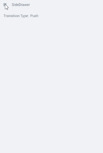
-
Default Push transition:
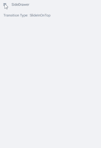
-
SlideInOnTop transition - the drawer goes over the main content:
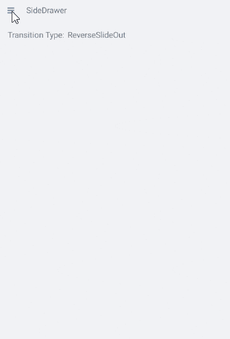
-
ReverseSlideOut transition:
A sample Transitions examples can be found in the SideDrawer/Features folder of the SDK Samples Browser application.
Create Custom Transition
If however, non of these predefined transitions fits users' scenario they are allowed to create custom animation effect. Next is a demonstration of how customers can create their own transition.
- Set the DrawerTransitionType property to Custom.
- Create custom SideDrawerRenderer (in both Android and iOS platforms) which will allow customers to apply custom transition.
- Create a class for each platform and register your custom renderer using the ExportRenderer assembly level attribute.
Create Custom Transition in Android
Creating custom renderer is simple. Just create a class and derive it from the SideDrawerRenderer. Furthermore, customers should override the CreateFadeLayer() and CreateCustomTransition() methods. Those methods are the necessary extensibility points for such customization. Here is a sample implementation of a custom renderer:
public class CustomSideDrawerRenderer : SideDrawerRenderer
{
    protected override Native.IDrawerFadeLayer CreateFadeLayer()
    {
        return new Native.BlurFadeLayer(Forms.Context, RenderScript.Create(Forms.Context))
        {
            Background = new Drawables.ColorDrawable(Color.FromRgb(255, 200, 255).ToAndroid())
        };
    }

    protected override Native.IDrawerTransition CreateCustomTransition()
    {
        return new FallDownTransition();
    }
}
BlurFadeLayer requires reference to Xamarin.Android.Support.v8.RenderScript
Once users have this class created, they need to register the renderer:
[assembly: ExportRenderer(typeof(RadSideDrawer), typeof(CustomSideDrawerRenderer))]
This must replace the registration of our SideDrawerRenderer
Create Custom Transition in iOS
In iOS the creation of custom animation effect is very similar to the process in Android. The steps are the same but are executed in a bit different way.
Create a class and derive it from the SideDrawerRenderer
When creating the custom renderer users should override only the CreateCustomTransition() method. Here is a sample implementation:
public class CustomSideDrawerRenderer : SideDrawerRenderer
{
    protected override TKSideDrawerTransition CreateCustomTransition(TKSideDrawer drawer)
    {
        return new CustomTransition(drawer);
    }
}
Once users have this class created, they need to register the renderer:
[assembly: ExportRenderer(typeof(RadSideDrawer), typeof(CustomSideDrawerRenderer))]