Properties
This article explains all configuration options that the SideDrawer control provides.
Content
Use the folloing properties to define content of the SideDrawer control:
-
DrawerContent(View)—Specifies the drawer (initially hidden) content. -
MainContent(View)—Specifies the (initially visible) content of the component.
Drawer behavior
-
IsOpen(bool)—Specifies a value indicating if the drawer content is visible. -
DrawerLength(double)—Defines how much the drawer content should be extended over the main content in opened position. -
DrawerLocation(SideDrawerLocation)—Specifies the location from which the drawer will be opened. The following options are available:-
Left RightTopBottom
-
DrawerTransitionDuration(double)—Defines the duration of the chosen transition.-
DrawerTransitionType(of typeTelerik.XamarinForms.Primitives SideDrawerTransitionType)—Defines the transition of the component. This property can be set to one of the following values:- Fade, Push, Reveal, ReverseSlideOut, ScaleUp, SlideAling, SlideInOnTop, Custom
DrawerTransitionFadeOpacity(double)—Defines the opacity of the fade layer of the component. This controls the fade layer opacity on Android or the dim opacity on iOS.AreGesturesEnabled(bool)—This is a mobile exclusive property which specifies ability for gestures to open and close the drawer.-
TouchTargetThreshold(double)—Defines the touchable area (number of pixels from the screen edges) that will allow to open the DrawerContent.
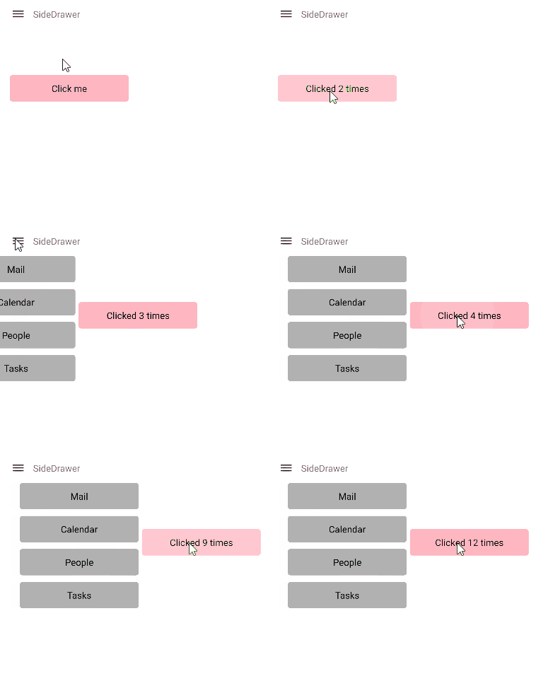
Keep Drawer open and main content area active
By default the SideDrawer Drawer Content closes when user clicks/taps outside of it. By setting the TapOutsideToClose(bool) to false, the drawer content remains open if the user taps/clicks outside of it and the main content area remains active. The default value of TapOutsideToClose is true.

A sample Location example can be found in the SideDrawer/Features folder of the SDK Samples Browser application.