GroupHeader Style
In addition to the Item Styles, RadListView gives the option to modify the visual appearance of its group headers when grouping is enabled. The feature is implemented through the ListView's GroupHeaderStyle property of type ListViewGroupStyle.
ListViewGroupStyle provides means for customizing the border as well as background and text color of the group headers. Below you can find a list of the available styling options:
- BackgroundColor (Color): sets the background of the group header(s).
- BorderColor (Color): sets the color of the border.
- BorderWidth (double): defines the width of the borer.
- BorderLocation (Location): defines an enumeration describing where the border should be visible.
- TextColor (Color): defines the text color of the ListView GroupHeader.
To learn more about the grouping functionality of RadListView check Grouping Overview topic.
Example
Let's have a simple City class:
public class City
{
    public string Name { get; set; }
    public string Country { get; set; }
}
And a sample ViewModel class:
public class ViewModel
{
    public ObservableCollection<City> Cities { get; set; }

    public ViewModel()
    {
        this.Cities = new ObservableCollection<City>()
        {
            new City() { Name = "Barcelona", Country = "Spain"},
            new City() { Name = "Madrid", Country = "Spain"},
            new City() { Name = "Rome", Country = "Italy"},
            new City() { Name = "Florence", Country = "Italy"},
            new City() { Name = "London", Country = "England"},
            new City() { Name = "Manchester", Country = "England"},
            new City() { Name = "New York", Country = "USA"},
            new City() { Name = "Boston", Country = "USA"}
         };
    }
}
Set it as BindingContext:
this.BindingContext = new ViewModel();
Lastly, add the RadListView definition with a GroupHeaderStyle applied:
<telerikDataControls:RadListView x:Name="listView"
                                 ItemsSource="{Binding Cities}">
    <telerikDataControls:RadListView.ItemTemplate>
        <DataTemplate>
            <telerikListView:ListViewTextCell Text="{Binding Name}"
                                              TextColor="#1263E5" />
        </DataTemplate>
    </telerikDataControls:RadListView.ItemTemplate>
    <telerikDataControls:RadListView.GroupHeaderStyle>
        <telerikListView:ListViewGroupStyle BackgroundColor="#1263E5"
                                            TextColor="#AAC7F6"
                                            BorderColor="#0A3A82"
                                            BorderWidth="1" />
    </telerikDataControls:RadListView.GroupHeaderStyle>
    <telerikDataControls:RadListView.GroupDescriptors>
        <telerikListView:PropertyGroupDescriptor PropertyName="Country" />
    </telerikDataControls:RadListView.GroupDescriptors>
</telerikDataControls:RadListView>
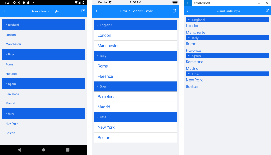
And here is the end result:
Figure 1: ListView with GroupHeaderStyle
You can find a working demo labeled GroupHeader Style in the ListView/Styling folder of the SDK Samples Browser application.