Animations
All gauge indicators are being animated upon initial load and upon value change. The animations are enabled by default and you have full control over them via the AnimationSettings property.
AnimationSettings property could be applied to the Gauge or separately to the indicators. By default the property of the indicator is null and in this case the AnimationSettings property of the gauge is taken into consideration. This allows you to control all animations by setting only one property - the property of the gauge. If you need an indicator to be animated differently, you can set its AnimationSettings property as it has a higher precedence than the gauge's property.
The AnimationSettings class contains the following properties:
- Duration (int): Defines the duration of the animation in milliseconds.
- Easing: Defines the easing of the animation.
- Enabled (bool): Specifies whether the animation will be enabled or not. By default the Enabled property is true.
Example
Here is an example how to set the AnimationSettings property:
<telerikGauges:RadRadialGauge x:Name="gauge1"
                              Grid.Row="1"
                              Grid.Column="1">
    <telerikGauges:RadRadialGauge.AnimationSettings>
        <telerikCommon:AnimationSettings x:Name="gauge1Animations" Easing="CubicOut" />
    </telerikGauges:RadRadialGauge.AnimationSettings>
    <telerikGauges:RadRadialGauge.Axis>
        <telerikGauges:GaugeLinearAxis Maximum="200"
                                       Minimum="0"
                                       Step="25" />
    </telerikGauges:RadRadialGauge.Axis>
    <telerikGauges:RadRadialGauge.Indicators>
        <telerikGauges:GaugeShapeIndicator Value="80" />
        <telerikGauges:GaugeBarIndicator Offset="30" Value="100" />
        <telerikGauges:GaugeNeedleIndicator Fill="Blue"
                                            Offset="30"
                                            Value="120" />
    </telerikGauges:RadRadialGauge.Indicators>
    <telerikGauges:RadRadialGauge.Ranges>
        <telerikGauges:GaugeRangesDefinition>
            <telerikGauges:GaugeRange Color="Green"
                                      From="0"
                                      To="150" />
            <telerikGauges:GaugeGradientRange From="150" To="200">
                <telerikCommon:RadGradientStop Offset="150" Color="Yellow" />
                <telerikCommon:RadGradientStop Offset="200" Color="Red" />
            </telerikGauges:GaugeGradientRange>
        </telerikGauges:GaugeRangesDefinition>
    </telerikGauges:RadRadialGauge.Ranges>
</telerikGauges:RadRadialGauge>
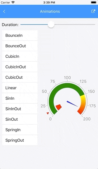
Here is a gif animation that shows all animations provided in the Gauge control:
SDK Samples Browser application contains Animations example that shows how the AnimationSettings property works. The example can be found in the Features section of the Gauge control.