Key Features
The purpose of this help article is to show you the key features of the RadEntry control.
Text
The following properties are related to the Entry Text appearance and alignment:
- Text(string): Defines the Text;
- TextColor(Color): Defines the color of the visible text of the RadEntry control.
- VerticalTextAlignment(of type Xamarin.Forms.TextAlignment): Specifies the vertical alignment of the RadEntry.Text;
- HorizontalTextAlignment(of type Xamarin.Forms.TextAlignment): Specifies the horizontal alignment of the RadEntry.Text;
- Padding(Thickness): Defines the Padding of the text;
Example
The example below shows how you can bind Text property of the Entry to a string property inside your ViewModel.
Here is the Entry definition:
<telerikInput:RadEntry WatermarkText="Enter sample text"
                       Text="{Binding MyEntryText, Mode=TwoWay}" />
And a sample ViewModel class which should implement INotifyPropertyChanged interface in order to update the UI when the string property is modified.
public class ViewModel : NotifyPropertyChangedBase
{
    private string myEntryText;

    public string MyEntryText
    {
        get { return this.myEntryText; }
        set { this.UpdateValue(ref this.myEntryText, value); }
    }
}
The ViewModel class inherits from Telerik.XamarinForms.Common.NotifyPropertyChangedBase which actually implements the INotifyPropertyChanged interface.
Last step is to set the ViewModel class as a BindingContext of the page:
this.BindingContext = new ViewModel();
Watermark
RadEntry exposes WatermarkText(string) property used to give guidance to the end user on what should be entered in the text input. The watermark text is displayed when the control is empty. Additionally, you could set WatermarkTextColor(Color) to customize the look of the watermark text.
<telerikInput:RadEntry WatermarkText="First Name" WatermarkTextColor="#6EA3FF" />
Where:
xmlns:telerikInput="clr-namespace:Telerik.XamarinForms.Input;assembly=Telerik.XamarinForms.Input"
Password
RadEntry provides IsPassword(bool) property, which when set to True, replaces the input with password hint character.
With Telerik UI for Xamarin version 2021.1.409.1 we have added an additional feature to the RadEntry control - The suggestion tab that is above the keyboard is hidden when IsPassword="True".
<telerikInput:RadEntry IsPassword="True" />
Read-Only State
With R1 2021 Service Pack, RadEntry control provides a feature which allows you to choose whether the control will be editable or not - Read-Only state.
-
IsReadOnly bool property: Specifies whether the control will be in edit mode. The default value is
False. If you want to restrict the control from editing, set theIsReadOnlytoTrue
Example
<telerikInput:RadEntry x:Name="telerikEntry" Text="Telerik UI for Xamarin Entry control" IsReadOnly="True"/>
You can find a working demo labeled Read-Only State in the Entry/Features folder of the SDK Samples Browser application.
Max Length
From r1 2021 Service Pack, the Radentry control has an additional feature, you can restrict the number of the symbols allowed to be entered in the input field.
- MaxLength (int) property: Specifies the maximum number of symbols allowed to be entered.
Example with MaxLength set to 10
<telerikInput:RadEntry x:Name="telerikEntry" WatermarkText="Enter text" MaxLength="10" />
You can find a working demo labeled Max Length in the Entry/Features folder of the SDK Samples Browser application.
Keyboard
The Keyboard property of type Xamarin.Forms.Keyboard allows you to define the type of the keyboard that will be visualized by the device.
<telerikInput:RadEntry x:Name="entry"
                       Keyboard="Numeric"
                       WatermarkText="Watermark Text" />
Text Selection
The following properties are related to the Entry text selection:
- CursorPosition(int) Specifies the starting position of the text selected in the entry.
- SelectionLength(int) Specifies the number of characters in the current selection in the entry control.
The next snippet shows how both could be applied in order to preselect part of the Text of the Entry when the control receives the focus:
<StackLayout Orientation="Horizontal">
    <telerikInput:RadEntry x:Name="selectEntry" Text="select some text" />
    <telerikInput:RadButton Text="Focus" Clicked="FocusButtonClicked" />
</StackLayout>
And the Clicked event handler:
private void FocusButtonClicked(object sender, System.EventArgs e)
{
    selectEntry.Focus();
    selectEntry.CursorPosition = 7;
    selectEntry.SelectionLength = 9;
}
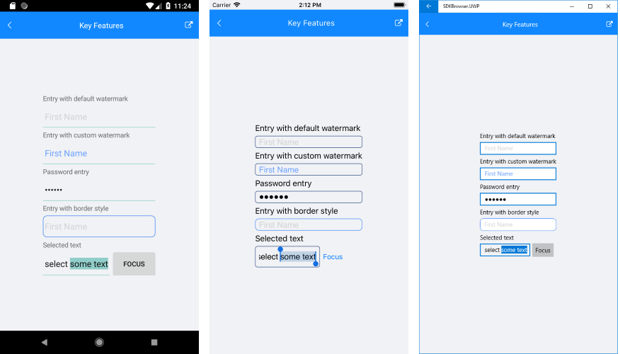
Here is the end result:
Font Options:
RadEntry control has the following properties for defining the Font Options:
- FontAttributes
- FontFamily
- FontSize
<StackLayout>
    <telerikInput:RadEntry Text="Normal Text" x:Name="entry"/>
    <telerikInput:RadEntry Text="Bold Text - Large" FontAttributes="Bold" FontSize="Large" />
    <telerikInput:RadEntry Text="Italic Text - Medium" FontAttributes="Italic" FontSize="Medium"/>
    <telerikInput:RadEntry Text="Italic and Bold Text - Small"  FontSize="Small" x:Name="smallEntry"/>
    <telerikInput:RadEntry Text="Micro Text"  FontSize="Micro" />
</StackLayout>
You can find a working demo labeled Key Features in the Entry/Features folder of the SDK Samples Browser application.
For a full list of the provided properties of RadEntry, check its API reference here: RadEntry Properties.