Styling
DateTimePicker Styling
Date and Time Picker control for Xamarin provides the following Style properties for customizing its look:
- SpinnerStyle(of type Style with target type telerikDataControls:RadSpinner): Defines the style applied to the spinner item and selected item.
- SpinnerHeaderStyle(of type Style with target type Xamarin.Forms.Label): Specifies the style applied to the spinner header labels.
- SelectionHighlightStyle(of type Style with target type telerikPrimitives:RadBorder): Specifies the style applied to the selection inside the popup.
- PlaceholderLabelStyle(of type Style with target type Xamarin.Forms.Label): Defines the style applied to the placeholder label.
- DisplayLabelStyle(of type Style with target type Xamarin.Forms.Label): Defines the style applied to the label which is visualized when date/time is selected.
- TabStripStyle(of type Style with target type telerikPrimitives:TabViewHeader)
- TabStripItemStyle(of type Style with target type telerikInput:DateTimeSelectorTabStripItem)
PickerContentView class exposes the following properties for styling the DateTimePicker Border and Background Color:
- BackgroundColor(Xamarin.Forms.Color): Defines the background color of the picker.
- BorderColor(Xamarin.Forms.Color): Defines the border color of the picker.
-
BorderThickness(Xamarin.Forms.Thickness): Specifies the border thickness of the picker. Default value is
new Thickness(0,0,0,1). - CornerRadius(Xamarin.Forms.Thinckness): Specifies the corner radius of the picker.
Popup Styling
Using the SelectorSettings property (of type Telerik.XamarinForms.Input.PickerPopupSelectorSettings) of the DateTimePicker you can modify the appearance of the dialog (popup). PickerPopupSelectorSettings class exposes the following Style properties:
- PopupViewStyle(of type Style with target type telerikInput:PickerPopupContentView): Defines the popup view style.
- HeaderStyle(of type Style with target type telerikInput:PickerPopupHeaderView): Defines the popup header style.
- HeaderLabelStyle(of type Style with target type Xamarin.Forms.Label): Defines the popup header label style.
- FooterStyle(of type Style with target type telerikInput:PickerPopupFooterView): Defines the popup footer style.
- AcceptButtonStyle(of type Style with target type Xamarin.Forms.Button): Defines the Accept button style.
- CancelButtonStyle(of type Style with target type Xamarin.Forms.Button): Defines the Cancel button style.
The SelectorSetting also provides the following properties for popup customization:
- PopupOutsideBackgroundColor(Xamarin.Forms.Color): Defines the color outside of the popup.
-
IsPopupModal(bool): Defines a boolean value indicating if the popup should be closed when tapped outside of the popup. By default the value of the IsPopupModal is false.
- When IsPopupModal="True" the UI behind the popup gets inactive and cannot be used until the popup is closed.
- When IsPopupModal="False" the popup could be closed when clicking outside the popup.
- HeaderLabelText(string): Specifies the text visualized in the popup header.
- IsHeaderVisible(bool): Specifies whether the Popup header is currently visible. By default the valuse is False.
- IsFooterVisible(bool): Specifies whether the Popup footer is currently visible. By default the valuse is True.
- AcceptButtonText(string): Defines the text visualized for the accept button. By default the text is OK.
- CancelButtonText(string): Defines the text visualized for the cancel button. By default the text is Cancel.
Namespaces
Using TabStripItemStyle, PopupViewStyle, HeaderStyle, FooterStyle you will need to add the following namespace:
xmlns:telerikInput="clr-namespace:Telerik.XamarinForms.Input;assembly=Telerik.XamarinForms.Input"
Using SelectionHighlightStyle, TabStripStyle you need to add the following namespace:
xmlns:telerikPrimitives="clr-namespace:Telerik.XamarinForms.Primitives;assembly=Telerik.XamarinForms.Primitives"
Using SpinnerStyle you need to add the following namespace:
xmlns:telerikDataControls="clr-namespace:Telerik.XamarinForms.DataControls;assembly=Telerik.XamarinForms.DataControls"
Example
Here is a sample example that shows how the styling properties are applied.
A sample DateTime Picker definition:
<telerikInput:RadDateTimePicker SpinnerHeaderStyle="{StaticResource spinnerHeaderStyle}"
                                SpinnerStyle="{StaticResource spinnerStyle}"
                                SelectionHighlightStyle="{StaticResource selectionHighlightStyle}"
                                SpinnerFormat="d"
                                AreSpinnerHeadersVisible="True"
                                DisplayLabelStyle="{StaticResource displayLabelStyle}"
                                PlaceholderLabelStyle="{StaticResource placeholderLabelStyle}">
    <telerikInput:RadDateTimePicker.SelectorSettings>
        <telerikInput:PickerPopupSelectorSettings PopupOutsideBackgroundColor="#D9D9D9CC"
                                                  PopupViewStyle="{StaticResource popupViewStyle}"
                                                  HeaderStyle="{StaticResource headerStyle}"
                                                  HeaderLabelText="Date Picker"
                                                  HeaderLabelStyle="{StaticResource headerLabelStyle}"
                                                  FooterStyle="{StaticResource footerStyle}"
                                                  AcceptButtonStyle="{StaticResource acceptButtonStyle}"
                                                  CancelButtonStyle="{StaticResource cancelButtonStyle}"/>
    </telerikInput:RadDateTimePicker.SelectorSettings>
</telerikInput:RadDateTimePicker>
and here are how the styles are defined in the page resources
Spinner Style
<Style TargetType="telerikDataControls:RadSpinner" x:Key="spinnerStyle">
    <Setter Property="ItemStyle">
        <Setter.Value>
            <Style TargetType="telerikDataControls:SpinnerItemView">
                <Setter Property="TextColor" Value="#4A4949"/>
            </Style>
        </Setter.Value>
    </Setter>
    <Setter Property="SelectedItemStyle">
        <Setter.Value>
            <Style TargetType="telerikDataControls:SpinnerItemView">
                <Setter Property="TextColor" Value="Black"/>
                <Setter Property="FontAttributes" Value="Bold"/>
            </Style>
        </Setter.Value>
    </Setter>
</Style>
SpinnerHeader Style
<Style TargetType="Label" x:Key="spinnerHeaderStyle">
    <Setter Property="TextColor" Value="Black"/>
    <Setter Property="FontAttributes" Value="Bold"/>
    <Setter Property="HorizontalOptions" Value="FillAndExpand"/>
    <Setter Property="VerticalOptions" Value="FillAndExpand"/>
    <Setter Property="HorizontalTextAlignment" Value="Center"/>
    <Setter Property="VerticalTextAlignment" Value="Center"/>
</Style>
SelectionHighlight Style
<Style TargetType="telerikPrimitives:RadBorder" x:Key="selectionHighlightStyle">
    <Setter Property="BackgroundColor" Value="Transparent"/>
    <Setter Property="BorderColor" Value="#00B5DC"/>
    <Setter Property="BorderThickness" Value="1"/>
    <Setter Property="Padding" Value="0,6,0,6"/>
    <Setter Property="HeightRequest" Value="40"/>
    <Setter Property="VerticalOptions" Value="Center"/>
</Style>
PlaceholderLabel Style
<Style TargetType="Label" x:Key="placeholderLabelStyle">
    <Setter Property="TextColor" Value="#4A4949"/>
    <Setter Property="VerticalTextAlignment" Value="Center"/>
    <Setter Property="HorizontalTextAlignment" Value="Center"/>
    <Setter Property="HeightRequest" Value="50"/>
</Style>
DisplayLabel Style
<Style TargetType="Label" x:Key="displayLabelStyle">
    <Setter Property="TextColor" Value="Black"/>
    <Setter Property="VerticalTextAlignment" Value="Center"/>
    <Setter Property="HorizontalTextAlignment" Value="Center"/>
    <Setter Property="HeightRequest" Value="50"/>
</Style>
PopupView Style
<Style TargetType="telerikInput:PickerPopupContentView" x:Key="popupViewStyle">
    <Setter Property="BackgroundColor" Value="White"/>
    <Setter Property="WidthRequest" Value="270"/>
</Style>
Header Style
<Style TargetType="telerikInput:PickerPopupHeaderView" x:Key="headerStyle">
    <Setter Property="BackgroundColor" Value="#00B5DC"/>
    <Setter Property="HeightRequest" Value="60"/>
    <Setter Property="Margin" Value="0"/>
    <Setter Property="Padding" Value="0"/>
    <Setter Property="HorizontalOptions" Value="FillAndExpand"/>
    <Setter Property="VerticalOptions" Value="FillAndExpand"/>
</Style>
HeaderLabel Style
<Style TargetType="Label" x:Key="headerLabelStyle">
    <Setter Property="TextColor" Value="White"/>
    <Setter Property="HorizontalOptions" Value="Center"/>
    <Setter Property="VerticalOptions" Value="Center"/>
    <Setter Property="FontSize" Value="Title"/>
</Style>
Footer Style
<Style TargetType="telerikInput:PickerPopupFooterView" x:Key="footerStyle">
    <Setter Property="BackgroundColor" Value="Transparent"/>
</Style>
AcceptButton Style
<Style TargetType="Button" x:Key="acceptButtonStyle">
    <Setter Property="BackgroundColor" Value="Transparent"/>
    <Setter Property="Text" Value="OK"/>
    <Setter Property="TextColor" Value="#00B5DC"/>
</Style>
CancelButton Style
<Style TargetType="Button" x:Key="cancelButtonStyle">
    <Setter Property="BackgroundColor" Value="Transparent"/>
    <Setter Property="Text" Value="X"/>
    <Setter Property="TextColor" Value="#00B5DC"/>
</Style>
Namespaces
In addition, add the following namespaces:
xmlns:telerikInput="clr-namespace:Telerik.XamarinForms.Input;assembly=Telerik.XamarinForms.Input"
xmlns:telerikDataControls="clr-namespace:Telerik.XamarinForms.DataControls;assembly=Telerik.XamarinForms.DataControls"
xmlns:telerikPrimitives="clr-namespace:Telerik.XamarinForms.Primitives;assembly=Telerik.XamarinForms.Primitives"
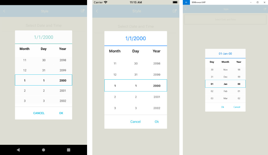
This is how the Date and Time Picker control looks when the styles described above are applied:
A sample Styling example can be found in the DateTimePicker/Features folder of the SDK Samples Browser application.