Templates
If the default templates of the control do not suit your needs, you can easily define custom ones. The available templates for customizing are:
-
PlaceholderTemplate(ControlTemplate): Defines the template visualized for the placeholder.
- DisplayTemplate(ControlTemplate): Defines the template visualized when the picked date/time is displayed.
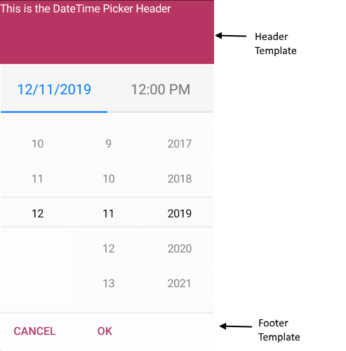
- HeaderTemplate(ControlTemplate): Defines what will be displayed inside the dialog(popup) header.
- FooterTemplate(ControlTemplate): Defines what will be displayed inside the dialog(popup) footer.
Example
The snippet below shows a simple RadDateTimePicker definition:
<telerikInput:RadDateTimePicker MinimumDate="2019,12,11"
                                MaximumDate="2020,02,14"
                                PlaceholderTemplate="{StaticResource placeholderTemplate}"
                                DisplayTemplate="{StaticResource displayTemplate}">
    <telerikInput:RadDateTimePicker.SelectorSettings>
        <telerikInput:PickerPopupSelectorSettings HeaderTemplate="{StaticResource headerTemplate}"
                                                  HeaderLabelText="This is the Header Template"
                                                  FooterTemplate="{StaticResource footerTemplate}"/>
    </telerikInput:RadDateTimePicker.SelectorSettings>
</telerikInput:RadDateTimePicker>
Now lets add the templates definition to the page resources:
PlaceholderTemplate
<ControlTemplate x:Key="placeholderTemplate">
    <Label Text="{TemplateBinding Placeholder}"
           FontAttributes="Bold"
           TextColor="White"
           BackgroundColor="#B73562"
           HeightRequest="50"
           VerticalTextAlignment="Center"
           HorizontalTextAlignment="Center">
        <Label.GestureRecognizers>
            <TapGestureRecognizer Command="{TemplateBinding ToggleCommand}" />
        </Label.GestureRecognizers>
    </Label>
</ControlTemplate>

DisplayTemplate
<ControlTemplate x:Key="displayTemplate">
    <Label Text="{TemplateBinding DisplayString}"
           TextColor="White"
           BackgroundColor="#7BAEFF"
           HeightRequest="50"
           VerticalTextAlignment="Center"
           HorizontalTextAlignment="Center">
        <Label.GestureRecognizers>
            <TapGestureRecognizer Command="{TemplateBinding ToggleCommand}" />
        </Label.GestureRecognizers>
    </Label>
</ControlTemplate>

HeaderTemplate
<ControlTemplate x:Key="headerTemplate">
    <Label Text="{TemplateBinding HeaderLabelText}"
           TextColor="White"
           VerticalTextAlignment="Center"
           HorizontalTextAlignment="Center"
           BackgroundColor="#B73562"/>
</ControlTemplate>
FooterTemplate
<ControlTemplate x:Key="footerTemplate">
    <StackLayout Orientation="Horizontal" Spacing="0" HorizontalOptions="FillAndExpand" BackgroundColor="#B73562">
        <Button Text="{TemplateBinding CancelButtonText}"
                TextColor="White"
                BackgroundColor="Transparent"
                Command="{TemplateBinding CancelCommand}" />
        <Button Text="{TemplateBinding AcceptButtonText}"
                TextColor="White"
                BackgroundColor="Transparent"
                Command="{TemplateBinding AcceptCommand}" />
    </StackLayout>
</ControlTemplate>
In addition to this, you need to add the following namespace:
xmlns:telerikInput="clr-namespace:Telerik.XamarinForms.Input;assembly=Telerik.XamarinForms.Input"
A sample Custom Templates example can be found in the DateTimePicker/Features folder of the SDK Samples Browser application.