Columns Styling
RadDataGrid component provides styling mechanism for customizing the look of the columns and their cells.
The styling mechanism is represented by the following properties:
- HeaderStyle (DataGridColumnHeaderStyle)
- CellContentStyle (DataGridTypedColumn)
- CellDecorationStyle (DataGridBorderStyle)
- CellEditorStyle (DataGridTypedColumn)
HeaderStyle
HeaderStyle defines the appearance of the column header. The DataGridColumnHeaderStyle exposes properties for styling its header, filter indicator, indicator, options button, sorting indicator.
Header Styling
To style the RadDataGridColumnHeader use the following properties:
- TextColor and BackgroundColor: Define the colors of the text part/background respectively.
- BorderColor and BorderThickness: Define the style of the border around the column header.
- Font Options (TextFontAttributes, TextFontFamily, TextFontSize): Define the font options to the text part of the ColumnHeader.
- Text Alignment (TextMargin, HorizontalTextAlignment, VerticalTextAlignment): Define the positioning for the text part of the ColumnHeader.
FilterIndicator Styling
Use the following properties for styling the FilterIndicator of the ColumnsHeader.
- FilterIndicator Font Options (FilterIndicatorFontAttributes, FilterIndicatorFontFamily, FilterIndicatorFontSize): Define the font options for the ColumnHeader filter symbol.
- FilterIndicatorMargin: Defines the margin of the filter symbol of the ColumnHeader.
- FilterIndicatorText: Defines the text for the filter symbol of the ColumnHeader.
- FilterIndicatorTextColor: Defines the color of the normal state of the filter symbol.
Please note that once the filter operation is applied, the filter indicator will be visible in the ColumnHeader cell. Also, by default the FilterIndicator is using an internal symbol font family. To show text instead of symbol, set a font family to the FilterIndicatorFontFamily property and set a text to the FilterIndicatorText property. For more details on the filtering feature go here.
SortIndicator Styling
The Indicator is shown once the RadDataGridColumnHeader is sorted (tapped/clicked on the ColumnHeader cell) and can be styled with the following properties:
-
IndicatorColor: Defines the color for the indicator part of the ColumnHeader.
- Indicator Font Options (IndicatorFontAttributes, IndicatoFontFamily, IndicatoFontSize): Define the font options for the ColumnHeader indicator.
- IndicatorMargin: Defines the margin of the indicator part of the ColumnHeader.
- IndicatorText: Defines the text of the indicator part of the ColumnHeader.
- SortIndicatorAscendingText: Defines the text of the sort indicator when the sorting is ascending.
- SortIndicatorDescendingText: Defines the text of the sort indicator when the sorting is descending.
By default, the indicator is represented by a string symbol that could be changed using IndicatorText and IndicatorFontFamily properties. For more details on the sorting feature check here.
OptionsButton Styling
The OptionsButton of the RadDataGridColumnHeader refers to the FilteringUI of the DataGrid. Using the OptionsButton you can open the Filtering UI control.
The style of the options button can be customized using the following properties:
- OptonsButton Font Options (OptonsButtonFontAttributes, OptionsButtonFontFamily, OptionsButtonFontSize): Define the font options for the ColumHeaders options button,
- OptionsButtonMargin: Defines the margin of the ColumnsHeader options button
- OptionsButtonText: Defines the text of the ColumnHeaders options button.
- OptionsButtonTextColor: Defines the text color of the ColumnHeaders options button.
In order to change the OptionsButton visibility you can set the
IsOptionsButtonVisibleboolproperty. By default its value isTruewhich means that the OptionsButton is visible by default.

<telerikGrid:DataGridTextColumn.HeaderStyle>
    <telerikGrid:DataGridColumnHeaderStyle IsOptionsButtonVisible="False"
                                           TextColor="Black"
                                           BorderColor="Black"
                                           BorderThickness="2"/>
</telerikGrid:DataGridTextColumn.HeaderStyle>
By default the options button is represented by a string symbol that could be changed through OptionsButtonText and OptionsButtonFontFamily properties.
An example how to set the HeaderStyle property is shown below:
<telerikGrid:DataGridTextColumn.HeaderStyle>
    <telerikGrid:DataGridColumnHeaderStyle BackgroundColor="LightSkyBlue"
                                           TextColor="Black"
                                           BorderColor="Black"
                                           BorderThickness="2"/>
</telerikGrid:DataGridTextColumn.HeaderStyle>
CellContentStyle
CellContentStyle property defines the appearance of each cell associated with the column. The target type of the Style object depends on the type of the column. For example, for DataGridTextColumn it will be TextBlock type. You could go to Column Types section (Text Column, for example) to check the TargetType of each column type. The following properties can be used to define the style of the text cell elements:
- Font Options (FontAttributes, FontFamily, FontSize): Define the font of the cell text.
- TextColor/SelectedTextColor: Defines the color of the cells text, you could set different value for the selected cell.
- Text Alignment (TextMargin, HorizontalTextAlignment, VerticalTextAlignment): Define the positioning of the Text inside the cell.
The
CellContentStyledoes not apply forTemplateColumn. Also, the property is not applied to the built-in colums whenCellContentTemplateis used.
Here is an example how to set the CellContentStyle property:
<telerikGrid:DataGridTextColumn.CellContentStyle>
    <telerikGrid:DataGridTextCellStyle TextColor="DarkOliveGreen"
                                       FontSize="12"
                                       TextMargin="2"
                                       VerticalTextAlignment="Center"
                                       HorizontalTextAlignment="Center"
                                       SelectedTextColor="Brown">
    </telerikGrid:DataGridTextCellStyle>
</telerikGrid:DataGridTextColumn.CellContentStyle>
CellDecorationStyle
To style the border of each cell associated with the column the CellDecorationStyle property is used. CellDecorationStyle is of type DataGridBorderStyle which provides the following properties: BackgroundColor, BorderColor, BorderTickness.
Here is an example how to set those properties on a column:
<telerikGrid:DataGridTextColumn.CellDecorationStyle>
    <telerikGrid:DataGridBorderStyle BorderColor="DarkBlue"
                                     BorderThickness="3"
                                     BackgroundColor="LightBlue" />
</telerikGrid:DataGridTextColumn.CellDecorationStyle>
CellEditorStyle
CellEditorStyle defines the style that will be applied to the cell editor.
Here is an example how to set this property:
<telerikGrid:DataGridTextColumn.CellEditorStyle>
    <Style TargetType="Entry">
        <Setter Property="FontSize" Value="Large"/>
        <Setter Property="FontAttributes" Value="Bold"/>
    </Style>
</telerikGrid:DataGridTextColumn.CellEditorStyle>
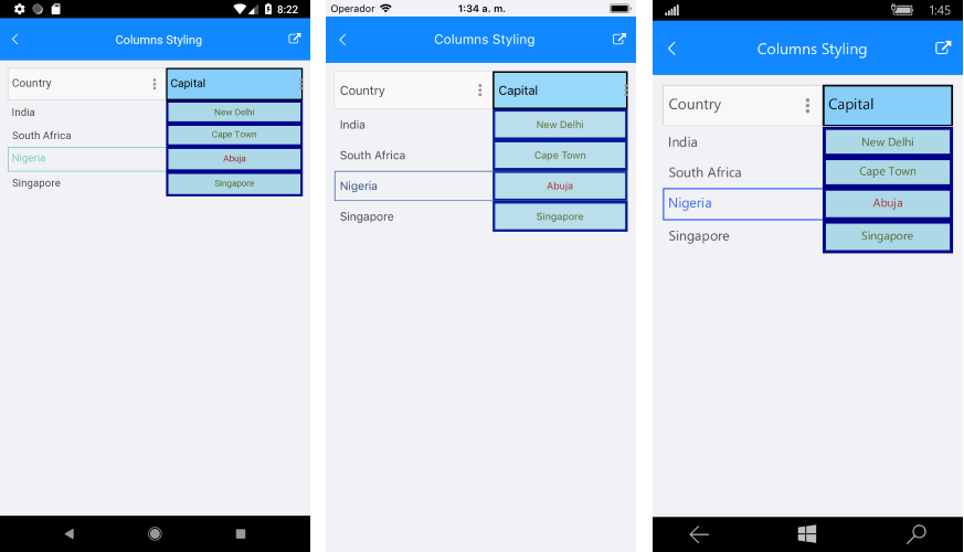
And this is how the column style looks when the properties are applied for customizing the column are applied:
FooterStyle
FooterStyle defines the appearance of the column footer. The DataGridColumnFooterStyle exposes the following properties for styling:
-
TextColorandBackgroundColor—Define the colors of the text part/background respectively. -
BorderColorandBorderThickness—Define the style of the border around the column footer. -
Font Options(TextFontFamily,TextFontAttributes,TextFontSize)—Define the font options to the text part of theColumnFooter. -
Text Alignment(TextMargin,HorizontalTextAlignment,VerticalTextAlignment)—Define the positioning for the text part of theColumnFooter.
SDK Samples Browser application contains Columns Styling example in the DataGrid/Styling folder.