DataGrid PickerColumn
The DataGridPickerColumn uses a Picker control in Edit mode to select a value from list of possibilities.
Important Properties
Here are the specific properties defined for DataGridPickerColumn:
- ItemsSource (IEnumerable
- ItemsSourcePath (string): This property is used to specify a property of your data class to be used as source for the Picker control.
- ItemDisplayBindingPath (string): Sets the display path of the items in the Picker selector. It points to a field in the items from the ItemsSource collection of the Picker.
- PropertyName: Defines the name of the property of the object type that represents each row within the grid.
- HeaderText: Defines the content to be displayed in the Header UI that represents the column.
- CellContentStyle: Defines the Style object that defines the appearance of each cell associated with this column. The TargetType of the Style should be TextBlock type.
- CellContentStyleSelector: Defines the StyleSelector instance that allows for dynamic appearance on a per cell basis.
- CellContentFormat: Defines the custom format for each cell value. The String.Format routine is used and the format passed should be in the form required by this method.
- CellContentTemplate (DataTemplate): Defines the appearance of each cell associated with the concrete column. CellContenTemplate gives you the opportunity to wrap the text inside each datagrid column. You can add a Label as a content of the Text, Template Column and wrap its text using the Label's LineBreakMode property.
- CellEditTemplate (DataTemplate): Defines the editor associated with the concrete column. The CellEditTemplate is displayed when the cell is in edit mode.
- FilterControlTemplate(DataTemplate): Specifies the user defined template used for Filtering UI. The template must contain an instance of the Telerik.XamarinForms.DataGrid.DataGridFilterControlBase class
More information about CellDecorationStyle and CellDecorationStyleSelector can be found in Columns Styling topic.
CellContentTemplate, CellEditTemplate and FilterControlTemplate properties are part of the DataGrid features from R2 2020 Official Release. For more details on celledit and cell content templates features check the Cell Templatesarticle. For more details on filtercontrol template please review the FilterControl Template section.
CellContentFormat uses the format string provided by the framework. For more details check the String.Format article.
The
CellContentStyleis not applied whenCellContentTemplateis used.
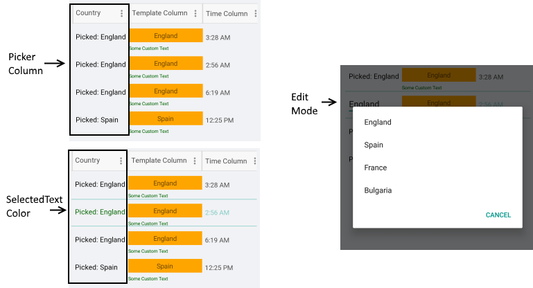
Example
<telerikGrid:DataGridPickerColumn PropertyName="Country"
                                  HeaderText="Country"
                                  CellContentFormat="Picked: {0}"
                                  ItemsSourcePath="Countries">
    <telerikGrid:DataGridPickerColumn.CellContentStyle>
        <telerikGrid:DataGridTextCellStyle SelectedTextColor="DarkGreen"
                                           TextColor="Black"
                                           FontSize="15" />
    </telerikGrid:DataGridPickerColumn.CellContentStyle>
</telerikGrid:DataGridPickerColumn>