Styling
The purpose of this help article is to show you the styling options of the RadCheckBox control.
Colors
RadCheckBox exposes a few useful Color properties for customizing its visual appearance. You could set the color of the check mark as well as the control itself in each of the available states.
- Background/Border Colors
- CheckedColor: Defines the Color applied to the control when it is checked. This is both the border and background color.
- UncheckedColor: Defines the Color applied to the control when it is unchecked. This is the border color only, the background is transparent when unchecked.
- IndeterminateColor: Defines the Color applied to the control when it is in Indeterminate state. This is both the border and background color.
- Symbol Colors
- CheckedSymbolColor: Defines the Color applied to the check symbol of the control when it is in Checked state.
- IndeterminateSymbolColor: Defines the Color applied to the Indeterminate symbol of the control.
Example
Here is an example how to apply indeterminate color and indeterminate symbol color:
Checked Color
<telerikPrimitives:RadCheckBox CheckedColor="Aqua" />
UncheckedColor
<telerikPrimitives:RadCheckBox UncheckedColor="DarkBlue" />
CheckedSymbol
<telerikPrimitives:RadCheckBox CheckedSymbolColor="Black" />
Indeterminate and IndeterminateSymbol Color
<telerikPrimitives:RadCheckBox x:Name="checkbox" IsChecked="{x:Null}" IndeterminateColor="Brown" IndeterminateSymbolColor="Coral" />
Here is the result at runtime with all of the above examples:
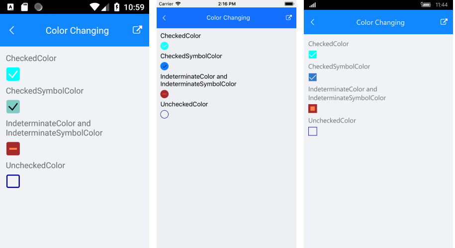
RadCheckBox follows the guidelines of the operating system, meaning that on iOS it is visualized as circle and on Android and UWP - as square.
Theme
Telerik UI for Xamarin allows you to override the default theme and provide an entire set of colors across all the controls in a custom theme. Visit the Modifying the Default Theme article for more instructions.
The colors you can set in the custom theme are as follows
<!-- CheckBox -->
<Color x:Key="TelerikCheckBoxCheckedColor">#3148CA</Color>
<Color x:Key="TelerikCheckBoxCheckedSymbolColor">White</Color>
<Color x:Key="TelerikCheckBoxIndeterminateColor">#3148CA</Color>
<Color x:Key="TelerikCheckBoxIndeterminateSymbolColor">White</Color>
<Color x:Key="TelerikCheckBoxUncheckedColor">#919191</Color>
To use the custom theme on any RadCheckBox instance, set the StyleClass="Telerik", here's an example:
<primitives:RadCheckBox StyleClass="Telerik" />