RadAutoComplete control has been replaced with RadAutoCompleteView and will be removed from the suite soon. You can read about the differences between both components and how to migrate to the new RadAutoCompleteView in the kb article here: Replace AutoComplete with AutoCompleteView
Key Features
The purpose of this help article is to show you the key features of the RadAutoComplete control.
Tokens Support
With AutoComplete you could enable users to search for and select several items. These items appear as tokens that can easily be deselected using their close button.
DisplayMode property determines whether a single or multiple selection is enabled. The default DisplayMode is “Plain”, for multiple selection you would need to set it to “Tokens”.
Tokens support is available only for Android and iOS platforms.
<telerikInput:RadAutoComplete x:Name="autoCompleteTokens"
                         ItemsSource="{Binding Source}"
                         TextSearchPath="Name"
                         DisplayMode="Tokens"/>
Figure 1: Tokens Support

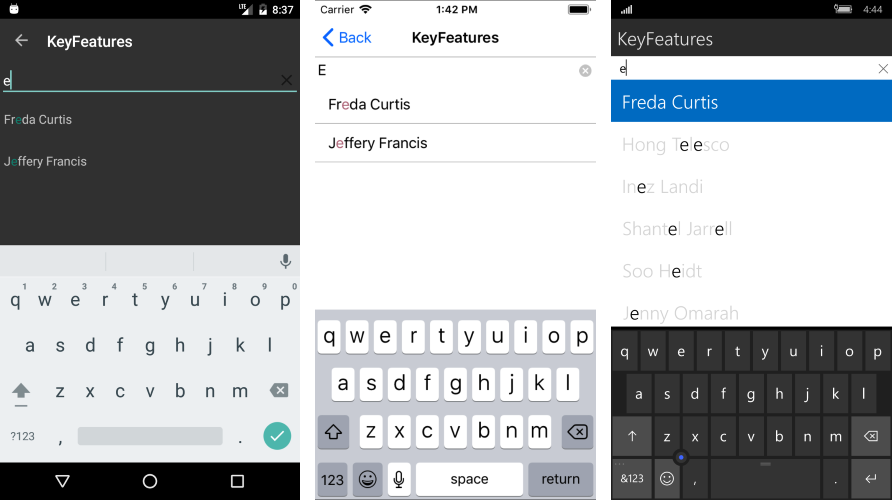
Filtering Options
You can determine the filtering behavior of RadAutoComplete through the CompletionMode property. The available completion modes are "StartsWith" (default) and "Contains".
In data-binding scenarios you will also need to set TextSearchPath property, which defines the name of the property the search function will be executed against. For more details check the Data Binding topic.
<telerikInput:RadAutoComplete x:Name="autoCompleteFilter"
                        ItemsSource="{Binding Source}"
                        TextSearchPath="Name"
                        CompletionMode="Contains"/>
Figure 2: Filtering options
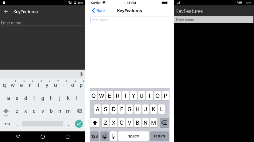
Watermark
RadAutoComplete exposes Watermark property which is used to give guidance to the end user on what should be entered in the text input. The watermark text is displayed when the control is empty.
<telerikInput:RadAutoComplete x:Name="autoCompleteWatermark"
                         ItemsSource="{Binding Source}"
                         TextSearchPath="Name"
                         Watermark="Enter name..."/>
Figure 3: Watermark
Clear Button Visibility
The Clear button, which appears at the right side of the input field when the AutoComplete is in focus, gives the end-user the option to quickly clear the entered values. You could control the visibility of the button through the IsClearButtonVisible property.
NoResults Message
The NoResults message appears in the popup used for the list of suggestions whenever the control cannot find any matching items. You could easily customize it through the NoResultsMessage property.
<telerikInput:RadAutoComplete x:Name="autoCompleteNoResults"
                        ItemsSource="{Binding Source}"
                        TextSearchPath="Name"
                        NoResultsMessage="there are no matching items..."/>
Figure 3: NoResultsMessage

Search Threshold
By default the search is triggered as soon as the user types into the input field. By using SearchThreshold you can configure AutoComplete to trigger the search after a certain number of letters is entered.
<telerikInput:RadAutoComplete x:Name="autoCompleteSearchTreshold"
                         ItemsSource="{Binding Source}"
                         TextSearchPath="Name"
                         SearchThreshold="3" />
Show/hide the SuggestionView
With the ShowSuggestionView boolean property you can determine the visibility of the popup containing the search results of the AutoComplete.
<telerikInput:RadAutoComplete x:Name="autoCompleteSuggestionView"
                        ItemsSource="{Binding Source}"
                        TextSearchPath="Name"
                        ShowSuggestionView="False" />
FilteredItems collection
FilteredItems bindable property allows you to access the collection containing the search results of the AutoComplete. The property can be used in scenarios where the search results are visualized at a different place or inside another container.