BusyIndicator for Xamarin Mobile Blazor Bindings
Telerik BusyIndicator for Xamarin Mobile Blazor Bindings allows you to display a notification whenever a longer-running process is being handled by the application. This makes the UI more informative and the user experience smoother.
Figure 1: RadBusyIndicator Overview
Key features
Built-in Animations
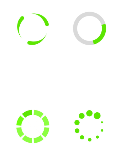
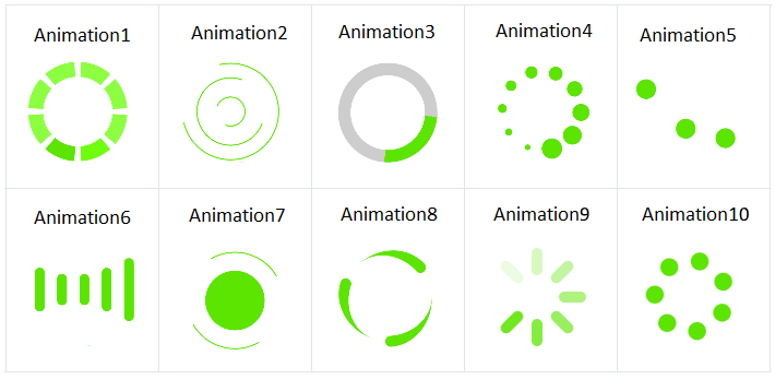
The busy indicator component provides few built-in animations which you can use. RadBusyIndicator provides a set of built-in animations which you can use. They can be changed via the AnimationType property.
The property is an enum called AnimationType and it accepts values named Animation1 to Animation10. Animation1, Animation2, Animation3, etc. to Animation10. Animation1 is the default one.
-
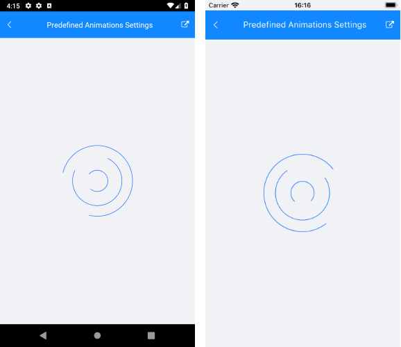
Changing animation size and color: You can set the size of the animation content, which is the animated element. This can be done via the
AnimationContentWidthRequestandAnimationContentHeightRequestproperties. By default the size of the default animation content is 25x25 pixels.
You can also change the color of the animation with the AnimationContentColor property.
The snippet below shows how you can configure the predefined animations of RadBusyIndicator:
<RadBusyIndicator AnimationContentHeightRequest="100"
                  AnimationContentWidthRequest="100"
                  AnimationType="Telerik.XamarinForms.Primitives.AnimationType.Animation2"
                  AnimationContentColor="Color.Blue"
                  IsBusy="true"/>
and the result:
BusyContent
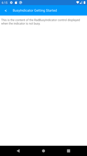
Content which is displayed when the IsBusy it false:
<RadBusyIndicator AnimationContentHeightRequest="100"
                  AnimationContentWidthRequest="100"
                  IsBusy="false">
    <Content>
        <Telerik.XamarinForms.Blazor.Primitives.BusyIndicator.Content>
            <Label Text="This is the content of the RadBusyIndicator control displayed when the indicator is not busy." />
        </Telerik.XamarinForms.Blazor.Primitives.BusyIndicator.Content>
    </Content>
</RadBusyIndicator>
and the result:
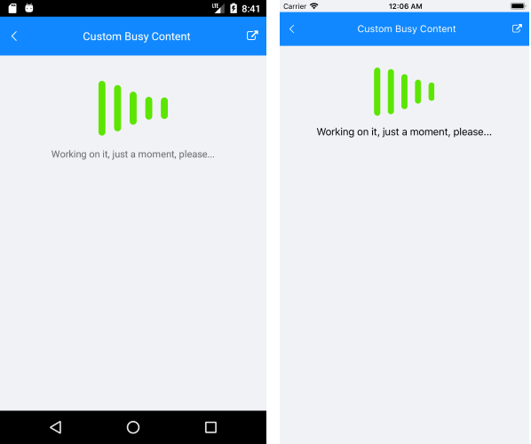
Custom Busy Content
Setting BusyContent property of RadBusyIndicator allows you to display any content together with the built-in animations while the control is in Busy state.
<RadBusyIndicator AnimationContentHeightRequest="100"
                    AnimationContentWidthRequest="100"
                    AnimationType="Telerik.XamarinForms.Primitives.AnimationType.Animation6"
                    IsBusy="true">
    <BusyContent>
        <Telerik.XamarinForms.Blazor.Primitives.BusyIndicator.BusyContent>
            <Label Text="This is the content of the RadBusyIndicator control displayed when the indicator is not busy." />
        </Telerik.XamarinForms.Blazor.Primitives.BusyIndicator.BusyContent>
    </BusyContent>
</RadBusyIndicator>
and the result: