Wizard Pages
In order to add pages to RadWizard, you have to use its WizardPages collection. It consists of the following page types:
- WizardPage: Represents a wizard's page and by default it will have the “Previous”, ”Next” and “Cancel” buttons visible. This behavior can be controlled through the ButtonsVisibilityMode enumeration.
- WelcomeWizardPage: Represents a welcome page. It derives directly from WizardPage and the only difference is that it will have the “Next” and “Cancel” buttons visible by default.
- CompletionWizardPage: Represents a completion page. It derives directly from WizardPage and the only difference is that it will have the “Previous”, “Cancel” and “Finish” buttons visible by default.
For each wizard page you are able to define a header, title, side header and change the default footer by setting the following properties:
- Header : Enables you to define anything as a header.
- Title : Provides you a way to define a title for the page.
- SideHeader : Enables you to define anything as a side header on the left side of the page.
- Content : Contains the page content (WizardPage derives directly from ContentControl).
Despite that the WizardPage is a ContentControl it will propagate its DataContext to its child containers including the elements defined as a Content. Thus, the source of the binding has to be explicitly set if needed.
Setting HeaderTemplate, SideHeaderTemplate and FooterTemplate
All these properties can be used to get or set the data template, respectfully, for the header, side header and footer. So, if you want to change those default elements for a particular wizard page, you may define them as in Example 1.
Example 1: Setting the HeaderTemplate, SideHeaderTemplate__ and __FooterTemplate properties in XAML
<telerik:RadWizard x:Name="radWizard" >
    <telerik:RadWizard.WizardPages>
        <telerik:WizardPage Content="My Wizard Page Content" SideHeaderWidth="100" HeaderHeight="100">
            <telerik:WizardPage.HeaderTemplate>
                <DataTemplate>
                    <Image Source="Images/BrandMark_Telerik_Black.png" Width="200" Height="100" />
                </DataTemplate>
            </telerik:WizardPage.HeaderTemplate>
            <telerik:WizardPage.SideHeaderTemplate>
                <DataTemplate>
                    <TextBlock Text="My Side Header" />
                </DataTemplate>
            </telerik:WizardPage.SideHeaderTemplate>
            <telerik:WizardPage.FooterTemplate>
                <DataTemplate>
                    <StackPanel Orientation="Horizontal">
                        <telerik:RadButton Content="Back"
                                               Width="70" Height="25"
                                               Command="wizard:RadWizardCommands.MoveCurrentToPrevious"
                                               CommandParameter="{Binding}" />
                        <telerik:RadButton Content="Next" Width="70" Height="25"
                                               Command="wizard:RadWizardCommands.MoveCurrentToNext"
                                               CommandParameter="{Binding}" />
                    </StackPanel>
                </DataTemplate>
            </telerik:WizardPage.FooterTemplate>
        </telerik:WizardPage>
    </telerik:RadWizard.WizardPages>
</telerik:RadWizard>
In order to use the built-in commands, you should define the following namespace: xmlns:wizard="clr-namespace:Telerik.Windows.Controls.Wizard;assembly=Telerik.Windows.Controls.Navigation"
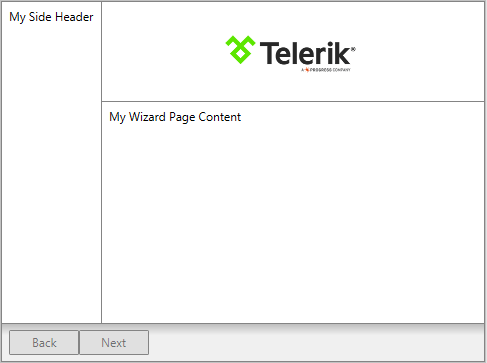
Figure 1: The wizard page defined in Example 1 will be displayed as follows:

Preserve WizardPage Content
By default, RadWizard reuses a single ContentPresenter for holding the currently selected page. Each time the selection is changed, the content of the last active page is unloaded in order to load the content of the newly selected page, thus the content of the pages is not persisted.
As of Q3 2015 RadWizard exposes a new property - IsContentPreserved. Its default value is "False", meaning that the content of the selected pages would not be persisted. In order to save the content of each page, you need to set the property to "True".
Example 2: Setting IsContentPreserved property to "True"
<telerik:RadWizard x:Name="radWizard" IsContentPreserved="True">
    <telerik:RadWizard.WizardPages>
        <telerik:WizardPage Content="My First Wizard Page Content" />
        <telerik:WizardPage Content="My Second Wizard Page Content" />
    </telerik:RadWizard.WizardPages>
</telerik:RadWizard>