Styles and Templates
This section is intended to give you a broad understanding of the possible ways in which you can change the visual appearance of the RadTreeMap and RadPivotMap.
You can modify the look of the RadTreeMap by using the RadTreeMap.DefaultItemTemplate and TypeDefinition.ItemTemplate properties. For the RadPivotMap you can use RadPivotMap.LeafItemStyle and GroupDefinition.ItemStyle properties. You can also use the TypeDefiniton.ItemStyle which is common for both.
The following small practical samples will show you how to use this properties to customize your control:
RadPivotMap
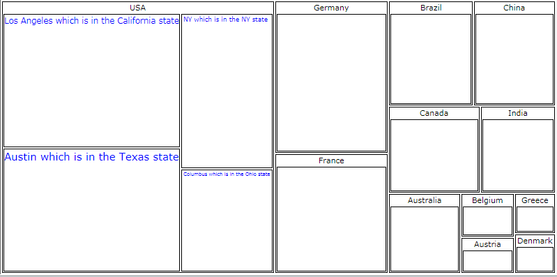
There could be cases in RadPivotMap when the text per rectangle is chopped due to the size of the rectangles calculated, it is not adjustable by just tuning the text length and size because the rectangle size is recalculated every time when window size is changed. To have a fully readable labels you may wrap your TextBlock in a control like ViewBox for example which resizes itself based on the size of its content and put it in the header of your rectangle using LeafTemplate like this:
<telerik:RadPivotMap x:Name="pivotMap" LayoutStrategy="Squarified" ValuePath="Gdp" LabelPath="City">
    <telerik:RadPivotMap.LeafTemplate>
        <DataTemplate>
            <Viewbox>
                <TextBlock Text="{Binding Label}" Foreground="Blue" />
            </Viewbox>
        </DataTemplate>
    </telerik:RadPivotMap.LeafTemplate>
    <telerik:RadPivotMap.GroupDefinitions>
        <telerik:GroupDefinition Member="Country" />
    </telerik:RadPivotMap.GroupDefinitions>
</telerik:RadPivotMap>
This is the full source code of the sample:
public MainPage()
{
    InitializeComponent();
    pivotMap.ItemsSource = this.GetData();
}

public class GdpInfo
{
    public string Continent { get; set; }
    public string Country { get; set; }
    public string City { get; set; }
    public double Gdp { get; set; }
}

public List<GdpInfo> GetData()
{
    List<GdpInfo> data = new List<GdpInfo>()
    {
        new GdpInfo() { Country = "Australia", Gdp = 1146 },
        new GdpInfo() { Country = "Austria", Gdp = 385.1 },
        new GdpInfo() { Country = "Belgium", Gdp = 468.6 },
        new GdpInfo() { Country = "Brazil", Gdp = 1749 },
        new GdpInfo() { Country = "Canada", Gdp = 1565 },
        new GdpInfo() { Country = "China", Gdp = 1700 },
        new GdpInfo() { Country = "Denmark", Gdp = 318.1 },
        new GdpInfo() { Country = "France", Gdp = 2669 },
        new GdpInfo() { Country = "Germany", Gdp = 3402 },
        new GdpInfo() { Country = "Greece", Gdp = 329 },
        new GdpInfo() { Country = "India", Gdp = 1290 },
        new GdpInfo() { Country = "USA", City = "NY which is in the NY state ", Gdp = 3000 },
        new GdpInfo() { Country = "USA", City = "Columbus which is in the Ohio state", Gdp = 2000 },
        new GdpInfo() { Country = "USA", City = "Los Angeles which is in the California state", Gdp = 5000 },
        new GdpInfo() { Country = "USA", City = "Austin which is in the Texas state", Gdp = 4600 },
    };
    return data;
}
  Public Sub New()
    InitializeComponent()
    pivotMap.ItemsSource = Me.GetData()
End Sub

Public Class GdpInfo
    Public Property Continent() As String
    Public Property Country() As String
    Public Property City() As String
    Public Property Gdp() As Double
End Class

Public Function GetData() As List(Of GdpInfo)
    Dim data As New List(Of GdpInfo)() From {New GdpInfo() With {.Country = "Australia", .Gdp = 1146},
    New GdpInfo() With {.Country = "Austria", .Gdp = 385.1},
    New GdpInfo() With {.Country = "Belgium", .Gdp = 468.6},
    New GdpInfo() With {.Country = "Brazil", .Gdp = 1749},
    New GdpInfo() With {.Country = "Canada", .Gdp = 1565},
    New GdpInfo() With {.Country = "China", .Gdp = 1700},
    New GdpInfo() With {.Country = "Denmark", .Gdp = 318.1},
    New GdpInfo() With {.Country = "France", .Gdp = 2669},
    New GdpInfo() With {.Country = "Germany", .Gdp = 3402}, New GdpInfo() With {.Country = "Greece", .Gdp = 329},
    New GdpInfo() With {.Country = "India", .Gdp = 1290}, New GdpInfo() With {.Country = "USA", .City = "NY which is in the NY state ", .Gdp = 3000},
    New GdpInfo() With {.Country = "USA", .City = "Columbus which is in the Ohio state", .Gdp = 2000},
    New GdpInfo() With {.Country = "USA", .City = "Los Angeles which is in the California state", .Gdp = 5000},
    New GdpInfo() With {.Country = "USA", .City = "Austin which is in the Texas state", .Gdp = 4600}}
    Return data
End Function
Since you wrapped the TextBlock in a ViewBox, the Size of the Text will change according to the space available which will lead to texts with different size (shown on the image below). If you don't want such appearance, you should consider removing the ViewBox and using TextWrapping and MaxWidth for the TextBlock-s.
The result is shown below:
RadTreeMap
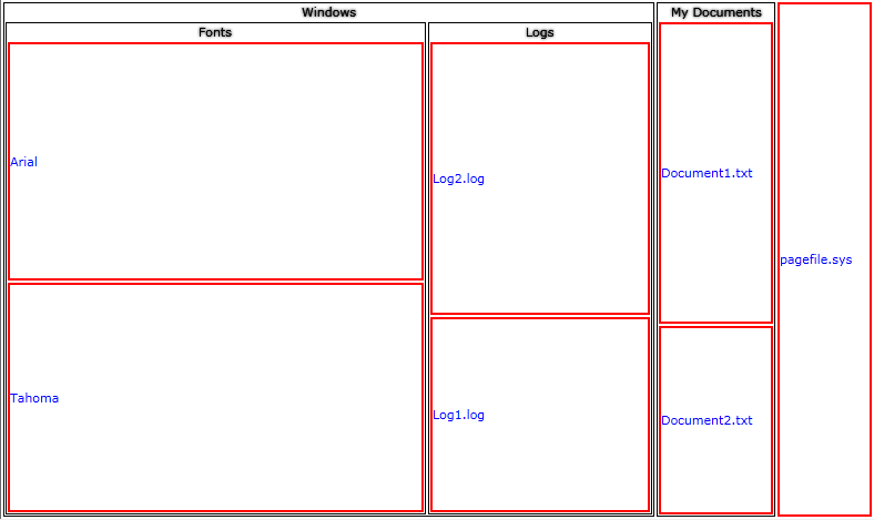
You can customize the way RadTreeMap Items look like per TypeDefinition. This is where the TypeDefinition's ItemStyle comes in handy. For example you want every Label to be colored Blue and to have a Red Border per every Item with TypeDefinition where the TargetTypeName is File.
Please refer to the Populating With Data RadTreeMap for the full source code of the sample.
<telerik:RadTreeMap Name="treeMap1">
    <telerik:RadTreeMap.TypeDefinitions>
        <telerik:TypeDefinition TargetTypeName="File" ValuePath="Size" LabelPath="Name">
            <telerik:TypeDefinition.ItemStyle>
                <Style TargetType="telerik:RadTreeMapItem" >
                    <Setter Property="Control.Foreground" Value="Blue" />
                    <Setter Property="Template">
                        <Setter.Value>
                            <ControlTemplate>
                                <Border BorderBrush="Red" BorderThickness="2">
                                    <TextBlock Text="{Binding Label}" VerticalAlignment="Center"/>
                                </Border>
                            </ControlTemplate>
                        </Setter.Value>
                    </Setter>
                </Style>
            </telerik:TypeDefinition.ItemStyle>
        </telerik:TypeDefinition>
        <telerik:TypeDefinition TargetTypeName="Folder" ValuePath="Size" ChildrenPath="Children" LabelPath="Name" />
    </telerik:RadTreeMap.TypeDefinitions>
</telerik:RadTreeMap>
The result is shown on the following image: