Data Binding
The goal of this article is to demonstrate how to populate a RadOutlookBar with business objects. Basically the control can be data bound to a collection of objects through its ItemsSource property and dynamically create RadOutlookBarItems.
The ItemsSource property allows RadOutlookBar to be bound to any collection that implements the IEnumerable interface. By default the content of the generated RadOutlookBarItems will be set to the value returned by the ToString() method of the business object.
In order to bind a RadOutlookBar to a collection of business objects you can perform the following steps:
-
Define a RadOutlookBar in XAML.
Example 1: Defining RadOutlookBar in XAML
<telerik:RadOutlookBar x:Name="radOutlookBar"/> -
Create a business object
Example 2: The MenuItem class
    public class MenuItem
    {
        public string Header { get; set; }
        public string Content { get; set; }
        public string ImageSourcePath { get; set; }
    }
Public Class MenuItem Public Property Header() As String Get Return m_Header End Get Set(value As String) m_Header = Value End Set End Property Private m_Header As String Public Property Content() As String Get Return m_Content End Get Set(value As String) m_Content = Value End Set End Property Private m_Content As String Public Property ImageSourcePath() As String Get Return m_ImageSourcePath End Get Set(value As String) m_ImageSourcePath = Value End Set End Property Private m_ImageSourcePath As String End Class -
Create a view model class which will contains only a collection business objects
Example 3: The MailMenuViewModel class
    public class MailMenuViewModel : ViewModelBase
    {
        public ObservableCollection<MenuItem> MenuItems { get; set; }

        private MenuItem selectedItem;
        public MenuItem SelectedItem
        {
            get { return this.selectedItem; }
            set
            {
                if (this.selectedItem != value)
                {
                    this.selectedItem = value;
                    this.OnPropertyChanged("SelectedItem");
                }
            }
        }

        public MailMenuViewModel()
        {
            this.MenuItems = new ObservableCollection<MenuItem>();
            this.MenuItems.Add(new MenuItem() { Content = "Mails content", Header = "Mail", ImageSourcePath = "/images/mailBig.png" });
            this.MenuItems.Add(new MenuItem() { Content = "Contacts content", Header = "Contacts", ImageSourcePath = "/images/contactsBig.png" });
            this.MenuItems.Add(new MenuItem() { Content = "Calendar content", Header = "Calendar", ImageSourcePath = "/images/calendarBig.png" });

            this.selectedItem = this.MenuItems[0];
        }
    }
Public Class MailMenuViewModel Inherits ViewModelBase Public Property MenuItems() As ObservableCollection(Of MenuItem) Get Return m_MenuItems End Get Set(value As ObservableCollection(Of MenuItem)) m_MenuItems = Value End Set End Property Private m_MenuItems As ObservableCollection(Of MenuItem) Private m_selectedItem As MenuItem Public Property SelectedItem() As MenuItem Get Return Me.m_selectedItem End Get Set(value As MenuItem) If Me.m_selectedItem <> value Then Me.m_selectedItem = value Me.OnPropertyChanged("SelectedItem") End If End Set End Property Public Sub New() Me.MenuItems = New ObservableCollection(Of MenuItem)() Me.MenuItems.Add(New MenuItem() With { _ Key .Content = "Mails content", _ Key .Header = "Mail", _ Key .ImageSourcePath = "/images/mailBig.png" _ }) Me.MenuItems.Add(New MenuItem() With { _ Key .Content = "Contacts content", _ Key .Header = "Contacts", _ Key .ImageSourcePath = "/images/contactsBig.png" _ }) Me.MenuItems.Add(New MenuItem() With { _ Key .Content = "Calendar content", _ Key .Header = "Calendar", _ Key .ImageSourcePath = "/images/calendarBig.png" _ }) Me.m_selectedItem = Me.MenuItems(0) End Sub End Class -
Set the DataContext of the RadOutlookBar to a new instance of the created view model
Example 4: Setting the DataContext of the RadOutlookBar
    public MainWindow()
    {
        InitializeComponent();
        this.radOutlookBar.DataContext = new MailMenuViewModel();
    }
Public Sub New() InitializeComponent() Me.radOutlookBar.DataContext = New MailMenuViewModel() End Sub -
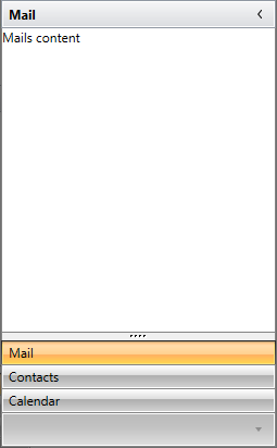
Then bind the ItemsSource property to the collection of the view model and set the ItemTemplate, ContentTemplate and TitleTemplate to display the proper information.
Example 5: Configure the RadOutlookBar
    <telerik:RadOutlookBar x:Name="radOutlookBar" ItemsSource="{Binding MenuItems}">
        <telerik:RadOutlookBar.ItemTemplate>
            <DataTemplate>
                <TextBlock Text="{Binding Header}" />
            </DataTemplate>
        </telerik:RadOutlookBar.ItemTemplate>
        <telerik:RadOutlookBar.ContentTemplate>
            <DataTemplate>
                <TextBlock Text="{Binding Content}" />
            </DataTemplate>
        </telerik:RadOutlookBar.ContentTemplate>
        <telerik:RadOutlookBar.TitleTemplate>
            <DataTemplate>
                <TextBlock Text="{Binding Header}" />
            </DataTemplate>
        </telerik:RadOutlookBar.TitleTemplate>
    </telerik:RadOutlookBar>
You can see the end result bellow:
Using Custom Templates
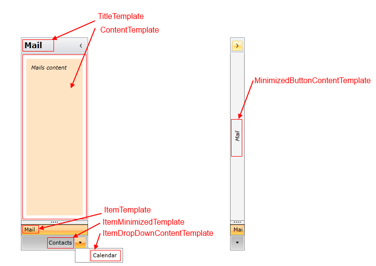
The RadOutlookBar has few properties of type DataTemplate that can be used in order to control its items appearance.
Each property accepts a DataTemplate as a value that determines the visual appearance of the RadOutlookBarItems and the RadOutlookBar itself. The properties that can be used are the following:
- ItemTemplate
- ItemMinimizedTemplate
- ItemDropDownTemplate
- TitleTemplate
- MinimizedButtonContentTemplate
- ContentTemplate
There are also template selectors for all of the listed templates except for the MinimizedButtonContentTemplate.
In Example 5 we already set the ItemTemplate, ContentTemplate and TitleTemplate properties.
To customize the project that we developed so far you can also set the rest of the available templates:
-
ItemMinimizedTemplate: This is the DataTemplate that describes each RadOutlookBarItem that is placed in the minimized area of the RadOutlookBar:
<DataTemplate x:Key="outlookBarItemMinimizedTemplate"> <TextBlock Text="{Binding Header}" VerticalAlignment="Center" /> </DataTemplate> -
ItemDropDownContentTemplate: This is the DataTemplate applied to the items in the drop down which contains the minimized items that cannot fit in the minimized area:
<DataTemplate x:Key="outlookBarItemDropDownTemplate"> <TextBlock Text="{Binding Header}" /> </DataTemplate> -
MinimizedButtonContentTemplate: This is the DataTemplate that describes the button which is displayed when you minimize the RadOutlookBar:
<DataTemplate x:Key="outlookBarMinimizedBtnTemplate"> <TextBlock Text="{Binding Header}" FontStyle="Italic" TextDecorations="Underline" FontWeight="Bold"/> </DataTemplate> -
Let's also extend the ContentTemplate from Example 5: This is the DataTemplate that describes the content of the selected item:
<DataTemplate x:Key="outlookBarContentTemplate"> <Grid Background="Bisque" Margin="10"> <TextBlock Text="{Binding Content}" FontStyle="Italic" Margin="10" /> </Grid> </DataTemplate> -
After you define your templates you can set the appropriate properties of the RadOutlookBar
     <telerik:RadOutlookBar SelectedItem="{Binding SelectedItem, Mode=TwoWay}"
                           ItemsSource="{Binding MenuItems}"
                           ItemMinimizedTemplate="{StaticResource outlookBarItemMinimizedTemplate}"
                           ItemDropDownContentTemplate="{StaticResource outlookBarItemDropDownTemplate}"
                           ContentTemplate="{StaticResource outlookBarContentTemplate}"
                           MinimizedButtonContentTemplate="{StaticResource outlookBarMinimizedBtnContentTemplate}"
                           MinimizedButtonContent="{Binding SelectedItem}">
        <telerik:RadOutlookBar.ItemTemplate>
            <DataTemplate>
                <TextBlock Text="{Binding Header}" />
            </DataTemplate>
        </telerik:RadOutlookBar.ItemTemplate>
        <telerik:RadOutlookBar.TitleTemplate>
            <DataTemplate>
                <TextBlock Text="{Binding Header}" />
            </DataTemplate>
        </telerik:RadOutlookBar.TitleTemplate>
    </telerik:RadOutlookBar>
Find a runnable project of the previous example in the WPF Samples GitHub repository.
You can see the end result on the screenshots below.