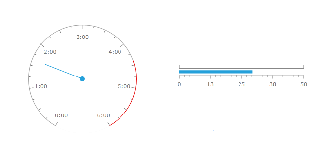
WPF Gauge Overview
Thank you for choosing RadGauge!
If you are building business dashboards or you just need graphical indicators, you will find the new RadGauge control indispensable. With the rich assortment of circular, linear and numeric gauge types and the powerful customization capabilities of the control you are free to build the exact dynamic data visualization tool that you need.
The RadGauge is part of Telerik UI for WPF, a
professional grade UI library with 160+ components for building modern and feature-rich applications. To try it out sign up for a free 30-day trial.

RadGauge's key features include:
Completely Stylable, Lookless Control - RadGauge introduces an innovative approach that completely separates functionality from appearance. This allows you to completely restyle the control without changing a single line of code. You are free to customize the appearance of your gauges with your own theme or you can use one of the several themes shipped with the control. Restyling the RadGauge control with the available themes is as simple as changing a property. Furthermore almost all gauge elements can be modified according to your needs.
Radial Gauges - radial gauge is a circular scale with numbers and ticks. It can display multiple scales and ranges.
Linear Gauges - linear gauge is a linear scale, which can display multiple scales and ranges.
Indicators - RadGauge by Telerik features 5 types of indicators:
Needle – points to a value along a scale and can be associated with a radial scale only
Marker - a scale indicator that points to a value along a scale. It is a small shape that can be located around the scale bar
Bar – a colored bar that is drawn around scale bar. One of the ends of this bar points to the scale value
Numeric – an indicator that displays its Value property as digital indicator device
State – a shape with arbitrary size located anywhere in the scale. If state indicator's value put into one of the scale ranges then shape is filled with brush of this range.
Rich Customization Capabilities- the gauges are extremely customizable with a variety of built-in behaviors starting from scales, indicators, labels, ticks etc.
Flexible Inner Layout - RadGauge control allows flexible inner layout. Any control can be inserted and precisely positioned inside the gauge controls. Also the control gives the possibility to insert several gauges in a single container.
Animations - All gauges are smoothly animated out of the box.
Events - indicator value changes generate the ValueChanged and range based events.
Telerik UI for WPF Support and Learning Resources
- Telerik UI for WPF Gauge Homepage
- Get Started with the Telerik UI for WPF Gauge
- Telerik UI for WPF API Reference
- Getting Started with Telerik UI for WPF Components
- Telerik UI for WPF Virtual Classroom (Training Courses for Registered Users)
- Telerik UI for WPF Gauge Forums
- Telerik UI for WPF Knowledge Base