State Indicator
The State Indicator is a shape with arbitrary size located anywhere in the scale. It gets colored in the same color as the range to which the indicator's value belong. Via the ScaleObject.RelativeWidth and ScaleObject.RelativeHeight attachable properties of the indicator you can specify its size. To position it, use the ScaleObject.RelativeX and ScaleObject.RelativeY attachable properties.
These properties are relative to the cell size of the gauge. To learn more about it read the Relative Measurements topic.
To learn more about the common features for the RadGauge's indicators, read the Basics topic.
As the ranges can be described also as the states a RadGauge can go through, the StateIndicator is built to work with them. It gets colored with the range to which the current value belongs.
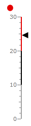
As the indicator should display the state of the current value, you can bind it to one of the other indicator types. Here is an example where a Marker is used to point the value and a StateIndicator is used to display its state.
<telerik:RadVerticalLinearGauge telerik:StyleManager.Theme="Windows8" Width="100" Height="250">
    <telerik:VerticalLinearScale Min="0" Max="30"
                         MajorTicks="3"
                         IsInteractive="True"
                         RangeLocation="Outside"
                         MajorTickOffset="0.02"
                         MiddleTickOffset="0.02"
                         MinorTickOffset="0.02">
        <telerik:VerticalLinearScale.Ranges>
            <telerik:GaugeRange Background="#FFA3A3A3"
                                StartWidth="0.02"
                                EndWidth="0.02"
                                Min="0" Max="10"
                                IndicatorBackground="#FFA3A3A3"/>
            <telerik:GaugeRange Background="#FF000000"
                                StartWidth="0.02"
                                EndWidth="0.02"
                                Min="10" Max="20"
                                IndicatorBackground="#FF000000" />
            <telerik:GaugeRange Background="#FFE50000"
                                StartWidth="0.02"
                                EndWidth="0.02"
                                Min="20" Max="30"
                                IndicatorBackground="#FFE50000" />
        </telerik:VerticalLinearScale.Ranges>
        <telerik:VerticalLinearScale.Indicators>
            <telerik:Marker Name="marker" Value="25"
                                         telerik:ScaleObject.RelativeHeight="0.05"
                                         telerik:ScaleObject.RelativeWidth="0.12"/>
            <telerik:StateIndicator Value="{Binding Value, ElementName=marker}"
                                         telerik:ScaleObject.RelativeHeight="0.05"
                                         telerik:ScaleObject.RelativeWidth="0.12*"
                                         telerik:ScaleObject.RelativeY="0.05"
                                         telerik:ScaleObject.RelativeX="0.2"
                                         UseRangeColor="True"/>
        </telerik:VerticalLinearScale.Indicators>
    </telerik:VerticalLinearScale>
</telerik:RadVerticalLinearGauge>
Here is a snapshot of the result: