Marker
The Marker is one of the indicator types that the RadGauge control introduces. It directly inherits the InteractiveIndicator class and doesn't introduce any specific features.
To learn more about the base features of the indicators read this topic.
The Marker control is represented by a triangle shape. The appearance and the shape can be easily modified.
You can change the background and the border color of the Marker via its Background and BorderBrush properties.
The Marker indicator can be used in both linear and radial scales.
Indicators should always be placed inside a Indicators property of the scale object.
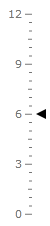
Here is an example of a Marker definition:
<telerik:RadVerticalLinearGauge telerik:StyleManager.Theme="Windows8">
    <telerik:VerticalLinearScale Min="0" Max="12">
        <telerik:VerticalLinearScale.Indicators>
            <telerik:Marker Value="6"
                    telerik:LinearScale.RotateForVertical="True"
                    telerik:ScaleObject.RelativeWidth="0.1"
                    telerik:ScaleObject.RelativeHeight="0.04"
                    telerik:ScaleObject.Offset="0.04*" />
        </telerik:VerticalLinearScale.Indicators>
    </telerik:VerticalLinearScale>
</telerik:RadVerticalLinearGauge>
Here is a snapshot of the result: