Templating the Point Marks
There is a set of predefined PointMark shapes, but you are allowed to create your own via templating the PointMark control. To learn more about the predefined shapes and how to manipulate them take a look at the Chart Point Marks topic.
To learn more about styling the point marks read here.
To template and change the shape of the mark point you have to use Expression Blend. Open the UserControl containing your RadChart in it. You have to use a dummy control to create a template for the point mark. Go to the Assets tab and from Controls -> All select the PointMark control. Draw an instance of it on the scene, next to your RadChart control. Select the PointMark control that you've just created and right-click on it. Form the context menu select Edit Template -> Edit a Copy. You will be prompted for the name of the style and where to be placed within your application.
If you choose to define the style in Application, it would be available for the entire application. This allows you to define a style only once and then reuse it where needed.
After clicking the OK button, a style with target type PointMark will be created and the Expression Blend will bring you into editing the control's template.
Take a look at the 'Objects and Timeline' pane. Select the PART_PointMarkPath. This path defines the shape of the point mark. If you want to change its shape, you have to set its Data property to an appropriate value. Take a look at the generated XAML.
<Style x:Key="PointMarkStyle" TargetType="telerik:PointMark">
    <Setter Property="Size" Value="10" />
    <Setter Property="Template">
        <Setter.Value>
            <ControlTemplate TargetType="telerik:PointMark">
                <Canvas>
                    <Path x:Name="PART_PointMarkPath"
                          Canvas.Left="{TemplateBinding PointMarkCanvasLeft}"
                          Canvas.Top="{TemplateBinding PointMarkCanvasTop}"
                          Width="{TemplateBinding Size}"
                          Height="{TemplateBinding Size}"
                          Stretch="Fill"
                          Style="{TemplateBinding ShapeStyle}" />
                </Canvas>
            </ControlTemplate>
        </Setter.Value>
    </Setter>
</Style>
You can see that the Data property of the Path is not set. Create the data for your custom shape and set it. Here is a sample data for the path.
<Path x:Name="PART_PointMarkPath"
      Canvas.Left="{TemplateBinding PointMarkCanvasLeft}"
      Canvas.Top="{TemplateBinding PointMarkCanvasTop}"
      Width="{TemplateBinding Size}"
      Height="{TemplateBinding Size}"
      Data="F1 M 6.5,3.5 L 3.5,0.5 0.5,3.5 3.5,6.5 0.5,9.5 3.5,12.5 6.5,9.5 9.5,12.5 12.5,9.5 9.5,6.5 12.5,3.5 9.5,0.5 6.5,3.5 Z"
      Stretch="Fill"
      Style="{TemplateBinding ShapeStyle}" />
To learn more about creating shapes via the Path class in read herehere.
After that set the created PointMark style to the DefaultSeriesDefinition of your RadChart and delete the dummy controls.
this.radChart.DefaultSeriesDefinition = new LineSeriesDefinition();
this.radChart.DefaultSeriesDefinition.PointMarkItemStyle = this.Resources["PointMarkStyle"] as Style;
Me.radChart.DefaultSeriesDefinition = New LineSeriesDefinition()
Me.radChart.DefaultSeriesDefinition.PointMarkItemStyle = TryCast(Me.Resources("PointMarkStyle"), Style)
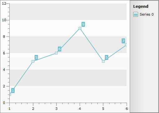
Here is a snapshot of the result.
Here is the resulting XAML for the PointMarkItem's Style:
<Style x:Key="PointMarkStyle" TargetType="telerik:PointMark">
    <Setter Property="Size" Value="10" />
    <Setter Property="Template">
        <Setter.Value>
            <ControlTemplate TargetType="telerik:PointMark">
                <Canvas>
                    <Path x:Name="PART_PointMarkPath"
                          Canvas.Left="{TemplateBinding PointMarkCanvasLeft}"
                          Canvas.Top="{TemplateBinding PointMarkCanvasTop}"
                          Width="{TemplateBinding Size}"
                          Height="{TemplateBinding Size}"
                          Data="F1 M 6.5,3.5 L 3.5,0.5 0.5,3.5 3.5,6.5 0.5,9.5 3.5,12.5 6.5,9.5 9.5,12.5 12.5,9.5 9.5,6.5 12.5,3.5 9.5,0.5 6.5,3.5 Z"
                          Stretch="Fill"
                          Style="{TemplateBinding ShapeStyle}" />
                </Canvas>
            </ControlTemplate>
        </Setter.Value>
    </Setter>
</Style>