Display Labels And Tooltips For Annotations
Annotations like MarkedZone or CustomGridLine allows you to customize their appearance using the Background, Stroke or StrokeThickness properties. However it is common scenario that you would like to have Label or Tooltip for your annotations and this is what this help topic will demonstrate.
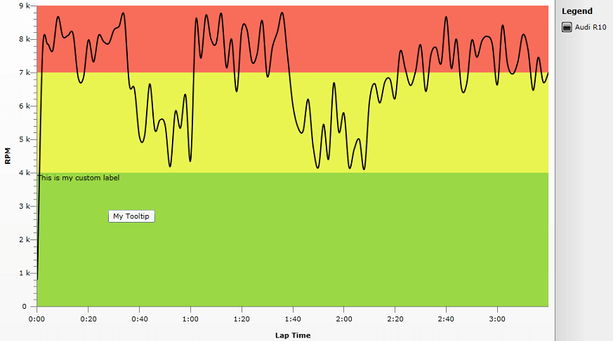
The article demonstrates how to set Tooltip and Label for MarkedZone but the approach is the same for the other Annotations. Adding Tooltip
1. To be able to see the Tooltips for MarkedZones you should re-template the Chart Area and put the Annotations Layer within the Zoom Layer. Then by using TooltipService.ToolTip property of the MarkedZone you can set custom tooltip:
<Style x:Key="ChartAreaStyle" TargetType="telerik:ChartArea">
                <Setter Property="Template2D">
                    <Setter.Value>
                        <ControlTemplate TargetType="telerik:ChartArea">
                            <Border Padding="{TemplateBinding Padding}"
                            Margin="{TemplateBinding Margin}"
                            Background="{TemplateBinding Background}"
                            BorderBrush="{TemplateBinding BorderBrush}"
                            BorderThickness="{TemplateBinding BorderThickness}">
                                <Grid>
                                    <Grid.RowDefinitions>
                                        <RowDefinition Height="auto" />
                                        <RowDefinition Height="" />
                                        <RowDefinition Height="auto" />
                                    </Grid.RowDefinitions>
                                    <Grid.ColumnDefinitions>
                                        <ColumnDefinition Width="auto" />
                                        <ColumnDefinition Width="" />
                                        <ColumnDefinition Width="auto" />
                                    </Grid.ColumnDefinitions>

                                    <telerik:AxisX2D x:Name="PART_AxisX"
                                    Style="{TemplateBinding AxisXStyle}"  Grid.Row="2" Grid.Column="1" />

                                    <telerik:AxisY2D x:Name="PART_AxisY"
                                        Style="{TemplateBinding AxisYStyle}" Grid.Row="1" Grid.Column="0" />

                                    <telerik:AdditionalAxes2DContainer x:Name="PART_AdditionalHorizontalAxesPanel"
                                StackOrientation="Vertical"
                                Grid.Row="0" Grid.Column="1"/>
                                    <telerik:AdditionalAxes2DContainer x:Name="PART_AdditionalVerticalAxesPanel"
                                StackOrientation="Horizontal"
                                Grid.Row="1" Grid.Column="2"/>

                                    <telerik:RadTransitionControl x:Name="PART_RadTransitionControl"
                                                                                  Grid.Row="1" Grid.Column="1"
                                                                                  Style="{TemplateBinding TransitionControlStyle}">

                                        <telerik:ClipPanel x:Name="PART_PlotAreaPanel" Style="{TemplateBinding PlotAreaStyle}">
                                            <telerik:HorizontalStripLines2D x:Name="PART_HorizontalStripLines"  />
                                            <telerik:VerticalStripLines2D x:Name="PART_VerticalStripLines"  />

                                            <telerik:VerticalMinorGridLines2D x:Name="PART_VerticalMinorGridLines" />
                                            <telerik:HorizontalMinorGridLines2D x:Name="PART_HorizontalMinorGridLines" />
                                            <telerik:HorizontalGridLines2D x:Name="PART_HorizontalGridLines"  />
                                            <telerik:VerticalGridLines2D x:Name="PART_VerticalGridLines" />
                                            <telerik:AdditionalPlotAreaAxes2DContainer x:Name="PART_AdditionalPlotAreaHorizontalAxesPanel"
                                                        StackOrientation="Vertical"/>
                                            <telerik:AdditionalPlotAreaAxes2DContainer x:Name="PART_AdditionalPlotAreaVerticalAxesPanel"
                                                        StackOrientation="Horizontal" />

                                            <telerik:DragZoomLayerControl x:Name="PART_DragZoomLayer" Style="{TemplateBinding DragZoomLayerControlStyle}">
                                                <Grid>
                                                    <telerik:AnnotationLayer x:Name="PART_AnnotationLayer" ItemsSource="{TemplateBinding Annotations}" />
                                                    <ItemsPresenter />
                                                </Grid>
                                            </telerik:DragZoomLayerControl>

                                            <telerik:PlotAreaAxisY2D x:Name="PART_PlotAreaAxisY"
                                                            Style="{TemplateBinding PlotAreaAxisYStyle}" />
                                            <telerik:PlotAreaAxisX2D x:Name="PART_PlotAreaAxisX"
                                                                Style="{TemplateBinding PlotAreaAxisXStyle}" />
                                            <telerik:LabelsPanel x:Name="PART_LabelsPanel" />
                                        </telerik:ClipPanel>

                                    </telerik:RadTransitionControl>

                                    <telerik:NoDataControl x:Name="PART_NoData"
                                                Style="{TemplateBinding NoDataControlStyle}"
                                                Grid.RowSpan="3" Grid.ColumnSpan="3" />
                                </Grid>
                            </Border>
                        </ControlTemplate>
                    </Setter.Value>
                </Setter>
            </Style>
2. Set the re-templated ChartArea Style to the RadChart. Then create new MarkedZone and set custom string for it's TooltipService.ToolTip property:
<telerik:RadChart x:Name="RadChart1" ItemsSource="{Binding Data}" BorderThickness="1,0,1,1" BorderBrush="Black">
            <telerik:RadChart.PaletteBrushes>
                <SolidColorBrush Color="Black" />
            </telerik:RadChart.PaletteBrushes>
            <telerik:RadChart.SeriesMappings>
                <telerik:SeriesMapping LegendLabel="Audi R10">
                    <telerik:SeriesMapping.SeriesDefinition>
                        <telerik:SplineSeriesDefinition ShowItemLabels="False" ShowPointMarks="False" ShowItemToolTips="True" />
                    </telerik:SeriesMapping.SeriesDefinition>
                    <telerik:SeriesMapping.ItemMappings>
                        <telerik:ItemMapping FieldName="Time" DataPointMember="XValue"/>
                        <telerik:ItemMapping FieldName="RPM" DataPointMember="YValue"/>
                    </telerik:SeriesMapping.ItemMappings>
                </telerik:SeriesMapping>
            </telerik:RadChart.SeriesMappings>
            <telerik:RadChart.DefaultView>
                <telerik:ChartDefaultView>
                    <telerik:ChartDefaultView.ChartArea>
                        <telerik:ChartArea LegendName="CustomLegend" Style="{StaticResource ChartAreaStyle}">
                            <telerik:ChartArea.Annotations>
                                <telerik:MarkedZone StartY="0" EndY="4000" Background="#FF9AD846" ToolTipService.ToolTip="My Tooltip"  />
                                <telerik:MarkedZone StartY="4000" EndY="7000" Background="#FFEAF451" />
                                <telerik:MarkedZone StartY="7000" EndY="9000" Background="#FFF86D5A" />
                            </telerik:ChartArea.Annotations>
                            <telerik:ChartArea.AxisX>
                                <telerik:AxisX Title="Lap Time"
                                               DefaultLabelFormat="#VAL{m:ss}" />
                            </telerik:ChartArea.AxisX>
                            <telerik:ChartArea.AxisY>
                                <telerik:AxisY MajorGridLinesVisibility="Visible"
                                               MinorTicksVisibility="Visible"
                                               Title="RPM"
                                               AutoRange="False"
                                               MinValue="0"
                                               MaxValue="9000"
                                               Step="1000">
                                </telerik:AxisY>
                            </telerik:ChartArea.AxisY>
                        </telerik:ChartArea>
                    </telerik:ChartDefaultView.ChartArea>
                    <telerik:ChartDefaultView.ChartLegend>
                        <telerik:ChartLegend x:Name="CustomLegend" UseAutoGeneratedItems="True" BorderThickness="1,0,0,0" />
                    </telerik:ChartDefaultView.ChartLegend>
                </telerik:ChartDefaultView>
            </telerik:RadChart.DefaultView>
        </telerik:RadChart>
Adding Label
1. You can show any text in annotation zone by re-templating it and adding TextBlock in it's ControlTemplate. For this purpose the Rectangle and the newly added TextBlock are placed in a Grid. The retemplated MarkedZone's Style is as follows*:
<Style x:Key="NewMarkedZones" TargetType="telerik:MarkedZone">
                <Setter Property="Background" Value="#33333333" />
                <Setter Property="Template" >
                    <Setter.Value>
                        <ControlTemplate TargetType="telerik:MarkedZone">
                            <Grid>
                                <Rectangle Grid.ColumnSpan="3"
                                   Fill="{TemplateBinding Background}"
                                   Stroke="{TemplateBinding Stroke}"
                                   StrokeThickness="{TemplateBinding StrokeThickness}"
                                   Margin="{TemplateBinding ElementMargin}"
                                   Style="{TemplateBinding ElementStyle}" />
                                <TextBlock Grid.Column="0" TextWrapping="Wrap" Text="{Binding}" Margin="{TemplateBinding ElementMargin}"/>
                            </Grid>
                        </ControlTemplate>
                    </Setter.Value>
                </Setter>
            </Style>
Additionally the TextWrapping property of the MarkedZone's Text Block is set to Wrap - this way the overflowed text does not clips.
2. Set the newly created Style to your MarkedZone and provide Label's content using the DataContext property:
<telerik:MarkedZone StartY="0" EndY="4000" Style="{StaticResource NewMarkedZones}" DataContext="This is my custom label" Background="#FF9AD846" />
The result image shows the tooltip and the label:
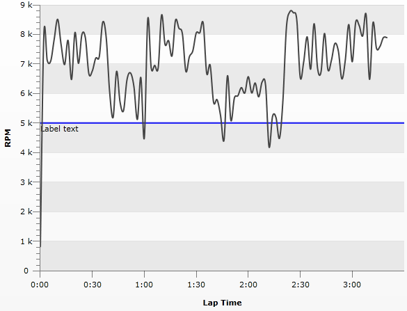
The same can be achieved with CustomGridLines like this:
     <SolidColorBrush x:Key="AxisStroke" Color="#FF000000" />

        <Style x:Key="gridLineStyle"
            TargetType="telerik:CustomGridLine" >
            <Setter Property="Stroke" Value="{StaticResource AxisStroke}" />
            <Setter Property="StrokeThickness" Value="1" />
            <Setter Property="Template" >
                <Setter.Value>
                    <ControlTemplate TargetType="telerik:CustomGridLine">
                        <Grid>
                            <Line X1="{TemplateBinding ElementX1}"
                              X2="{TemplateBinding ElementX2}"
                              Y1="{TemplateBinding ElementY1}"
                              Y2="{TemplateBinding ElementY2}"
                              Stroke="{TemplateBinding Stroke}"
                              StrokeThickness="{TemplateBinding StrokeThickness}"
                              Style="{TemplateBinding ElementStyle}" />
                            <Canvas>
                                <TextBlock TextWrapping="Wrap" Text="{Binding}" Canvas.Left="{TemplateBinding ElementX1}" Canvas.Top="{TemplateBinding ElementY1}">
                            </TextBlock>
                            </Canvas>
                        </Grid>
                    </ControlTemplate>
                </Setter.Value>
            </Setter>
        </Style>
Note that the position of the TextBlock is controlled via X1 and Y1 properties (the starting point of the GridLine) as taken using TemplateBinding. The result can be seen below: