Themes
This help article will demonstrate a step by step tutorial how to customize the ControlDefault theme for RadTabbedForm.
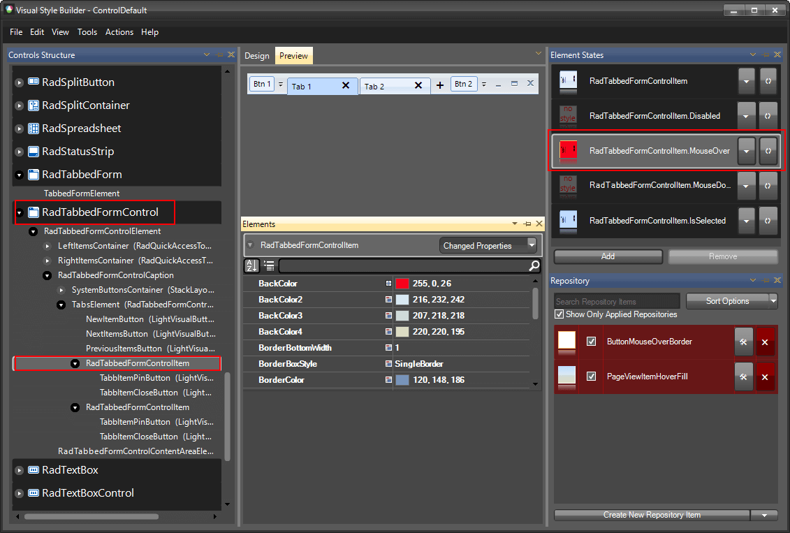
Styling RadTabbedFormControl
The RadTabbedFormControl item in Visual Style Builder gives you access to the title bar, the tabs and all the default buttons.
Open VisualStyleBuilder: Start menu (Start >> Programs >> Telerik >> UI for WinForms [version] >> Tools).
Export the built-in themes in a specific folder by selecting File >> Export Built-in Themes.
Load a desired theme from the just exported files by selecting File >> Open Package.
-
Select RadTabbedFormControl in Controls Structure on the left side. Then, select MouseOver in the Element States section.
-
Modify the BackColor and the Gradient Style of the item. Now, when a tab is hovered its back color will be red.

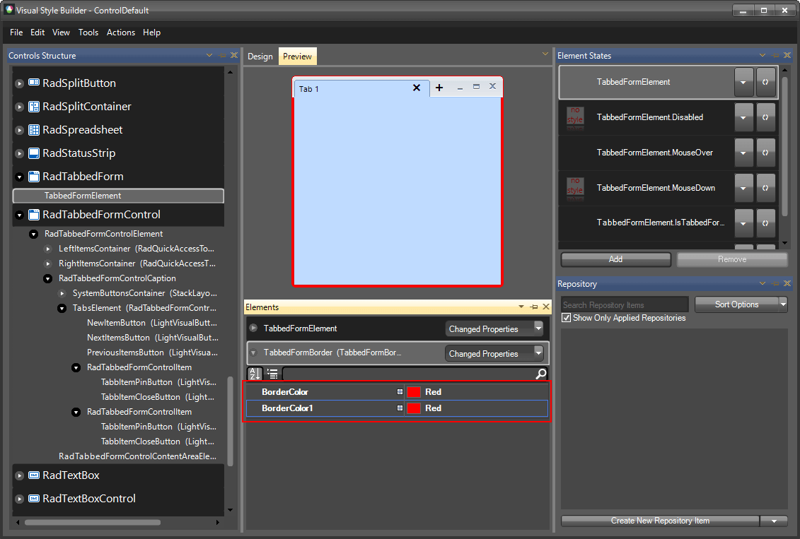
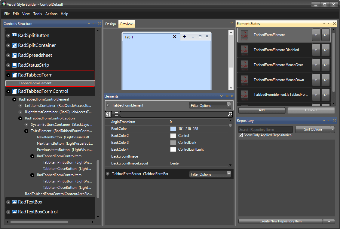
Styling RadTabbedForm
The RadTabbedForm item in Visual Style Builder gives you access to the content area and the border of the form.
Open VisualStyleBuilder: Start menu (Start >> Programs >> Telerik >> UI for WinForms [version] >> Tools).
Export the built-in themes in a specific folder by selecting File >> Export Built-in Themes.
Load a desired theme from the just exported files by selecting File >> Open Package.
-
Select RadTabbedFormElement in Controls Structure on the left side.
-
Modify the BorderColor of the item.